The Good, the Bad, and the Ugly of eCommerce UX
Storyblok is the first headless CMS that works for developers & marketers alike.
User experience (UX) is at the core of any online shopping journey. It’ll look different for each individual store, which can make it difficult to know how to approach your own. Fortunately, there are a few key aspects that you can consider when designing your eCommerce store to deliver the best UX to your customers.
The importance of good UX
User experience (UX) is the overall journey you provide customers with while they’re interacting with your brand. It includes a large number of things, including but not limited to:
- How understandable it is to navigate your site
- How appealing the graphic design is
- How easy it is to go through the checkout process
In addition to being essential to the customer experience, eCommerce UX is also an important part of brand consistency. Visitors constantly expect high-quality interactions with your site. Failing to provide that even once can alter how they view your organization. Given that customers are willing to pay up to 31% more for businesses that receive excellent reviews (opens in a new window), maintaining your brand identity’s UX can directly impact your organization's success
3 tips and examples to improve your UX
Here are a few ways to make sure your eCommerce UX ends up firmly in the ‘good’ category.
1. Don’t make your pages too busy
Images are a huge part of promoting your products and creating the feel of your website as a whole. Because it plays such a big role, it can be tempting to include as many aspects of visual design as possible. However, this can lead to some serious clutter. With too much going on, customers may find it hard to navigate your site, getting distracted and overwhelmed before they even have a chance to view a product.
For an example of what this bad eCommerce UX choice can look like, consider Shein (opens in a new window):

When there's too much going on, it can be hard for a user to focus on what you're selling.
There are many flashy graphics all trying to grab attention, two different navigation menus, and a side menu pop-up. With so much going on, where are shoppers supposed to click first?
Fortunately, it’s possible to include several visual elements without overwhelming your users. Take Chabo (opens in a new window) as an example:

When it comes to the graphics part of your eCommerce UX, sometimes less is more.
Chabo offers direct links to collections that are effectively advertised using high-quality visuals. There’s only one navigation menu at the top which is clean and well-organized. This creates a visually appealing page that is not overly busy, making it a more polished and professional introduction to the brand.
As an added bonus, simplified design can lead to simpler code. Not only can this make it easier on your developers, but it can also lead to better performance as there are no unnecessary extras weighing it down.
2. Be selective about your graphics
Visuals are an effective way to communicate with your audience instantaneously. They make catching attention easy, so guiding their journey is that much easier as well. However, it’s not as simple as placing photos wherever you have a blank space. Carefully positioning your graphics to have the largest impact is important.
You can take the Xlash (opens in a new window) website as an example. Originally, it featured a mosaic of images, which successfully communicated the many ways one could use the product:
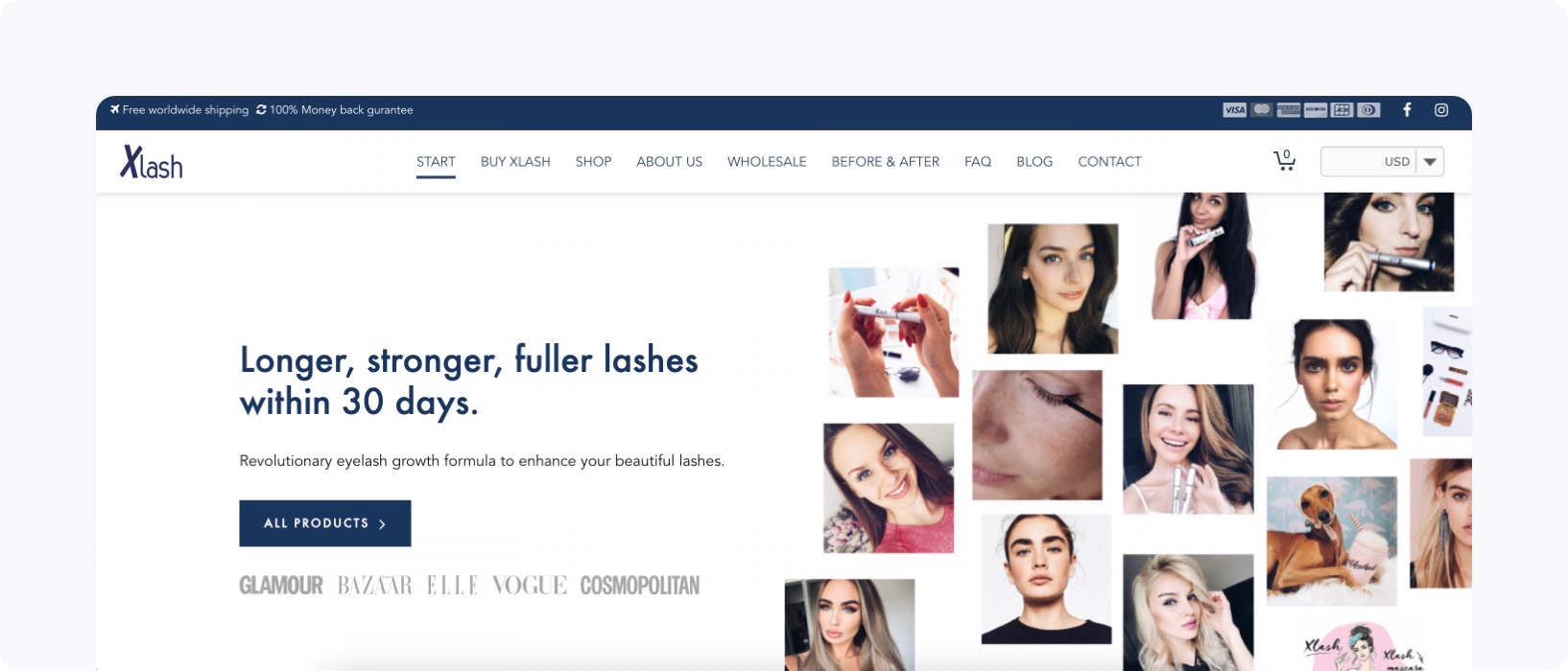
Xlash's original homepage relied on multiple images to tell one story.
Nevertheless, Xlash decided to go in a different direction once they switched to Storyblok with one large image:

One large image can make a bigger impression than several small ones.
While both were high-quality pages, the second one does a better job of catching attention. The sheer size alone establishes authority on the page while also featuring a product in use. It centers its focus more intentionally, both on the image itself as well as the “shop now” button embedded into it. By simplifying from many images to one, Xlash improved the eCommerce UX in a subtle yet effective way.
3. Localize, localize, localize
Localization is the process of customizing content to cater to specific locations. Simply put, different audiences have different tastes. One-size-fits-all websites may not do a good enough job of catering to a diverse customer base offering plenty of potential business. Providing that specific content can make stronger connections with your customer by delivering more relevant products and offers.
For instance, the Swedish lifestyle brand Stronger (opens in a new window) is available all over the world: over 120 countries, 8 languages, and 7 currencies. This eCommerce UX choice greatly expands their potential reach and provides a seamless experience for their customers no matter where they’re coming from.

Providing an option to change localization settings is an easy way to cater to a larger audience.
Keep in mind that a solid localization strategy doesn’t happen overnight. It needs to be a part of your plan from the start to make sure your organization is ready and able to reach new markets. This includes steps such as conducting market research and choosing technology that’s ready to scale (opens in a new window).
3 eCommerce UX mistakes to avoid
It’s not just about knowing the right steps – you have to be prepared to avoid the wrong ones, too. Here are a few of the uglier choices that you should avoid making for the sake of your UX.
1. Auto-playing audio
We’ve talked about how multiple images can be distracting. If you take that choice one step further, you’d get to auto-playing audio. Sudden noise can be a startling, unwelcome occurrence that puts users off from whatever product is being advertised. It could even backfire to make them leave your site entirely.
Instead of autoplaying audio, consider autoplaying silent videos instead. This helps you use movement to catch users’ attention without being too intrusive. Additionally, you can always add the option to turn on audio if they want to learn more.
For example, TimeMoto (opens in a new window) applies an eye-catching video on their page that takes up space but does not use sound. It acts as an impressive introduction to their brand, but not one that demands all of the users’ attention instantly. Nevertheless, clicking on the video provides the option to view one in a new window where sound is optional.
This is an eCommerce UX mistake that is especially to be avoided when dealing with pop-ups. Many users already find these a bit intrusive, so adding a sound element will only make it worse.
2. Skimping on the product information
Minimalism has been a popular trend in the past few years. However, there’s a time and a place for limiting what information you’re communicating – and your product pages are not one of them! You need to be communicating as much relevant information as possible.
Nevertheless, it’s not all about the word count, either. Adding unnecessary information can work against you as it provides an intimidating wall of text that will make visitors’ eyes glaze over. It’s admittedly hard to find the balance here, but it’s also important. Consider seeking out reviews to see what product elements are getting the most attention. You can then prioritize answering any questions about it right within the description.
This is another place to consider your visuals, too. Photos are an important part of advertising what you have to offer. However, today users are expecting more than static imagery. There should be photos from multiple angles at minimum. You may also want to take it a step further with product videos that can show a 360º view.
Finally, consider using social proof in your images. 62% of shoppers (opens in a new window) are more likely to buy a product after seeing other customer photos and videos. Including those directly in your product makes it a more direct way to provide the information while also advertising how popular it is.
3. Making your site inaccessible
If you’re trying to reach the most users possible, an accessible site is a must. This ensures that everyone can consume your content without having to worry about unnecessary barriers. This includes making sure you’re completing several key tasks, including:
- Making sure each image has alt text that clearly describes what it is
- Using well-organized content headings, which are easier for screen readers to understand
- Choosing correct color contrasts

Choosing the right contrast ratio is a simple way to make your website easier to use.
Accessibility also plays another role besides eCommerce UX: SEO! Accessibility is a key consideration for Google Lighthouse scores. Bringing that score up means you’re more likely to be found by search engines. Additionally, alt text containing relative keywords can also boost on-page SEO. Just be sure to avoid including keywords unnecessarily for the sole purpose of increasing your ranking.
Key takeaways
eCommerce UX is a complex concept that includes every part of your site. Tackling such a large concept can be intimidating. However, by following these pieces of advice and learning from the sites that get it right – and the ones that get it wrong – you can create a strategy that fosters a successful customer journey.