Skill Issue: storyblok-implement-figma

Storyblok is the first headless CMS that works for developers & marketers alike.
Does your agent look at a Figma file, choose a framework without asking, and rebuild every repeated pattern from scratch? Does it invent a content model without checking what already exists, make up URLs the design never provided, overwrite the story at the target slug, and publish everything before you’ve reviewed it?
Drumroll…
Introducing storyblok-implement-figma!
A skill that turns a Figma design into a real Storyblok-backed page: it reads the design, builds a content inventory, gets the schema modeled, uploads the assets, creates the story, and generates the frontend that renders it.
The Storyblok agent skills library is an open source set of skills that teach an AI coding agent how to work with Storyblok: when to use the CLI vs the MCP server, modeling schemas, reading and writing content through the Storyblok MCP server, turning a design into a page, and more.
How the skill expects your Figma file to be structured
For the best possible outcome, these are the best practices when building Figma files.
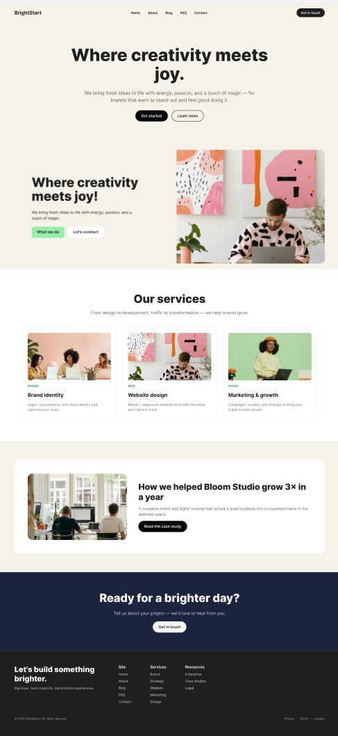
- One top-level frame per section. The skill reads a section in one pass, never card by card or instance by instance inside it. The frames in the below example: Nav, Hero, Hero Banner, Services Grid, Case Study, CTA Section, Footer, seven frames, stacked in that order.
- Position sets the order, not the layer panel. Sections stack down the page in ascending
y. Items across a row run left to right in ascendingx. Layer and fetch order don't count. - Repeated cards need to actually repeat. Same shape, different copy, as real siblings or block instances. A one-off frame that only looks similar to its neighbors gets read as a one-off frame.
- Keep real copy on real layers. A heading, a body paragraph, a button, a card grid, never gets flattened into an image. Flatten only when two or more line up: overlapping shapes with no auto-layout, a photo baked into vector art, junk layer names like
Group 13998sitting next to a real one likeHeading. - Every link and button needs a destination. A CTA, a navigating card, underlined text mid-paragraph, each becomes a link field. None of them get a real one if the design never gave it one.
- Nav, footer, and cookie banners still belong in the file. They default to code, not a schema field, but the skill can only build them from copy that's actually there to read.
Why use this skill?
To show the benefits of utilizing this skill, two separate builds were created from the same Figma homepage design:
create this homepage: <https://www.figma.com/design/:id/:name?node-id=:id>
in space 123 and create a new project
Tested with:
Claude Code v2.1.267
Opus 5
Storyblok MCP server
Storyblok Skills package: 0.1.0
This is the minimal Figma design used for both runs: a hero, a hero banner, a three-card services grid, a case study feature, a closing call-to-action banner, plus a nav and a footer:
Both spaces started from a newly created space with the default schema: a page content type and three nestable blocks, feature, grid, and teaser, none of them holding any real content. One agent built the homepage without the use of any skills. The other used Storyblok’s official skills package and ran through storyblok-implement-figma, which then delegated the modeling work to storyblok-model-content.
Run 1 did not use any skills.
Run 2 used the official Storyblok skills package.
The interactions
Run 1 made every decision without any input. Run 2 followed the skill's own interactive process instead: it asked before choosing a framework, presented a full content model plan and waited for confirmation before writing anything.
Decision point | Run 1 | Run 2 |
|---|---|---|
Framework | Not asked. Chose Next.js, TypeScript, and Tailwind unilaterally. | Asked directly: Next.js, Astro, Nuxt, or something else. Next.js was chosen. |
Schema Location | Not asked. No code-mode concept in play, went straight at the space. | Asked directly: model in the Storyblok UI, or as code pushed by the CLI? Code was chosen. |
Content model plan | Not presented. Went straight to | Full plan presented, plus a |
Existing "Home" story | Not flagged. Overwritten in place, immediately, then published. | Flagged. Overwritten in place as part of the confirmed plan, left unpublished. |
Publish | Not asked. Published as part of the same write. | Not asked. Left story as draft. |
Using the skill still keeps a human in the loop and give the user more control.
The schema
Run 1 never checked what the space already had and built ten new blocks. The sitewide blocks: nav and a footer were nested right into the page, sharing one link block named footer_link, even though nav.links reuses that same block too, a name that only describes half of what it actually holds. None of the four blocks that need a button, hero, hero_banner, cta_section, case_study, share one either; each writes its own flat cta_label/cta_link pair from scratch.
Run 2 audited the space first and determined that none of the existing blocks were a fit for the newly proposed schema. Twelve blocks were created: a block whitelist was added to the existing page content type, one button block was modeled and reused instead of four flat CTA pairs being added every place one was needed. The sitewide blocks, navigation and footer, were defined as nestable blocks accepted inside the newly created config content type, making it so that changes to each of them propagate sitewide instead of having to manually update every story.
Learn more: Skill Issue №2: /storyblok-model-content.
One button to rule them all
The button block is a great example of what this skill provides. It follows atomic design: a button is an atom, the smallest reusable piece a design system defines once and composes everywhere else needs one, a hero, a card, a footer, a nav, rather than redefining it fresh in each place it shows up.
That one-to-one mapping carries straight through to the frontend. The project registers exactly one Button component for the button Storyblok block, and nothing else:
---
const { blok } = Astro.props;
const style = blok.style === 'ghost' ? 'ghost' : 'primary';
---
<a href={href} class={`cta-button cta-button--${style}`} {...storyblokEditable(blok)}>
	{blok.label}
</a>
Every button on the rendered page, inside the hero, the hero banner, the CTA section, the case study, the nav, resolves through this exact same component. The variant field the schema defined is the switch that decides which CSS class renders; the button isn’t duplicated across content entries or code files.
This provides a centralized way of managing the button block: adding a third variant, giving every button a loading state, changing what padding or corner radius a button should have, and it results in one field, one block, one place to update. Do the same thing to Run 1's four separate flat cta_label/cta_link pairs, and it results in four separate schema edits and four separate pieces of frontend code to keep in sync by hand. (yes, run 1 duplicated the same button fields in every block that had them).
The frontend
Run 1 built its frontend from scratch. Run 2 started from the official Storyblok CLI template and changed only what the design required.
Dimension | Run 1 | Run 2 |
|---|---|---|
Scaffolding |
| Official |
Language | TypeScript | Astro's own TypeScript frontmatter convention, the blueprint's default |
Styling | Tailwind CSS utilities | Native CSS custom properties and scoped component styles. The blueprint's own shared stylesheet was dropped rather than extended, its fixed-width, centered body conflicted with the design's full-bleed sections |
Composability | A lot of code was repeated as it followed the same repetition found in the created schema (ex: Button) | Composable architecture: one component per block, reusable across the project. (ex: Button) |
SDK version | Latest available ( | Whatever the blueprint pins ( |
Chrome | Nav and Footer designed as nested blocks within a story | Nav and Footer designed as blocks inside one singleton config story, fetched once by the layout |
Type-checking | Not run |
|
Visual verification | Curl requests and string matches only | A real screenshot, compared against the design |
Learn more: Skill Issue: /storyblok-build-frontend.
The content
The Figma file did not contain real urls or destinations for buttons or links. Run 1 overwrote the existing seed homepage, published the new homepage, and created fake urls that lead to 404s. Whereas run 2 also overwrote the existing homepage, but only after it was presented in the plan and the user agreed, created the new page in draft - ready for human review, and defined placeholder # destinations for all buttons and links since there was no clear destination/logic that was specified from the user or Figma.
The result
Run 2’s content model follows Storyblok best practices: existing blocks get extended instead of duplicated, a button becomes one reusable atom instead of four hand-copied field pairs, and site-wide chrome becomes blocks inside one singleton story instead of nested straight into the page. Each choice is composable: change the button once and every instance updates; change the nav once and it propagates sitewide.
That discipline carries into the code too. Run 2 starts from Storyblok's own official CLI blueprint, not a framework built from scratch and wired up by hand, and its component architecture mirrors the content model exactly: one Button component reused everywhere a button appears, not four separate implementations to keep in sync manually. It shows in the smaller decisions as well: an honest placeholder instead of an invented URL, a draft awaiting review instead of a page published without anyone checking it.
Run 1 produces a working homepage once. Run 2 produces one built to scale, to a second page, a new variant, the next redesign, without revisiting a decision that was only ever made correctly in one place.
Get the skills
To make use of the skill library in your projects, simply install the Storyblok Agent Plugin; it sets up everything your agent needs to perform at the level of an experienced Storyblok Developer.
We want your feedback
We would love to hear back from you on how you use these skills and how they are working for you! Let us know in our Discord.