Optimize your Design to Get the Best Results from the Figma to Storyblok Plugin
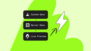
Storyblok is the first headless CMS that works for developers & marketers alike.
Designing for a headless CMS requires clarity, consistency, and predictable structure. The Figma to Storyblok plugin brings these principles into the design workflow, allowing you to help developers convert your design into code as quickly and precisely as possible.
The key to a smooth conversion is to treat Figma components as visual representations of Storyblok blocks (also known as components), and ensure your design is schema-ready.
To get the most out of the plugin and create a joyful developer handoff, your Figma file should follow a well-defined structure.
Below is a recommended setup that our very own design team uses to keep things scalable, predictable, and plugin-friendly.
Start with a component
The plugin works best when your components are clean, intentional, and properly nested. You don’t need to create new components specifically for the plugin. Just make sure that the components you already use in your design system follow a predictable structure.

A well-defined component follows these guidelines:
- Each layer/component represents a logical Storyblok block
- Internal layers represent Storyblok fields (such as
text,image,link, etc.). The plugin will recognize them automatically - Naming is consistent and readable
- No unnecessary wrapper layers (although the plugin automatically skips them)
- No mixed visual elements inside field containers
- Responsive design using Auto layout. Avoid random groups
Nesting matters
Nested components help the plugin understand hierarchical relationships, just like Storyblok’s schema-based code structure.
Below is a breakdown of a sample hero component created in Figma:
Hero
├ Eyebrow (text)
├ Title (text)
├ Description (richtext)
├ Button (nested component, automatically recognized)
  └ Label (text)
  └ Link (link)
├ Image (asset)
The plugin extracts these elements and translates them into a matching schema in Storyblok, which would look similar to the following snippet:
{
	"hero": { //Nestable block
		"eyebrow": {
			"text": "Optimize your Design"
		},
		"title": {
			"text": "Get the Best Results from the Figma to Storyblok Plugin"
		},
		"description": {
			"richtext": "The key to a smooth conversion is to treat Figma components as visual representations of Storyblok blocks (aka, components), and ensure your design is schema-ready."
		},
		"image": {
			"fieldtype": "asset",
			"filename": "https://a.storyblok.com/f/12345/800x400/5ab900/young-professionals.jpeg"
		},
		"button": { //Nestable block
			"label": "Try it now",
			"link": {
					"url": "https://storyblok.com"
				}
			}
		}
	}
}
Adopt logical naming conventions
When editors create stories, they rely on blocks with consistent and meaningful names. When you use our Figma plugin, the layer names become the schema field names, so clarity matters.
Recommended naming conventions
- Component/Block names: Hero, FeatureGrid, TestimonialCard
- Field groups: heading, description, CTA, image, FAQ
- Nested reusable blocks: link, button, slider
Avoid meaningless, auto-generated names like Frame 42, Group Copy, and auto layout containers named “Auto layout 199”. The plugin won’t break, but your schema will become a nightmare.
Prefer frames over groups
Frames in Figma act as containers, and Storyblok schema relies on containers. Meanwhile, groups can behave unpredictably.
Always use frames when the layer represents a field (like text or asset), a container (for example, CTA), or a block (such as FeatureCard).
Use groups only when you want to group icons outside schema fields, or when you want the plugin to ignore the contents.
Takeaways
A well-structured Figma file makes the Storyblok Figma Plugin much more powerful. Keep components clean, follow consistent naming conventions, and align frames with block structure to streamline schema generation, and guarantee smooth developer handoff.
Not sure where to start? Check out our Figma design template to learn how we structure pages, maintain naming conventions, and create ready-to-use component patterns optimized for Storyblok.