Build a Blog application in Android using Storyblok and Jetpack Compose
Storyblok is the first headless CMS that works for developers & marketers alike.
In this tutorial, we'll build a blog application where the content of the blog is managed in Storyblok.
This tutorial assumes you're comfortable with Kotlin and Jetpack Compose.
This tutorial has been tested with the following package versions:
- Minimum Android SDK
30 com.storyblok:storyblok-compose0.4.0com.storyblok:storyblok-material30.4.0
If you want to familiarize yourself with the Storyblok Android SDK first, refer to the official Android guide.
What we'll build
Storyblok allows you to deliver omnichannel content experiences to your users. You can use a single Storyblok space to deliver content on the web as well as in an Android application. In this tutorial, we'll build a blog application that delivers dynamic content that is hosted on Storyblok.
We'll start by building an individual blog post page. We'll also add support for rich text to display our blog posts. Then, we'll add code for listing all blog posts and implement navigation using the Navigation 3 library.
How Storyblok works with Jetpack Compose
Before diving in, it helps to know how the pieces fit together. In Storyblok, content is made of blocks, which are reusable content types such as a page, a teaser, or an article. In our app, we'll mirror each block with two things: a Kotlin data model class that describes its fields, and a UI composable that renders it. A block provider links them together. The Storyblok Android SDK then fetches a story from the Content Delivery API and, using that provider, renders the right composable for each block it finds, which includes nested blocks.
Set up the app and render a story
First, let's install the required dependencies and render a sample story to verify that the setup works.
Create a new Android Studio project by following the official installation guide. In the Minimum SDK version dropdown, choose API 30, as it is required by the Android SDK.
If you already have a Storyblok account, go to app.storyblok.com or log in with GitHub to continue. Create a new blank space to follow the tutorial from scratch.
In the dependencies section of the app module's build.gradle.kts file, add dependencies for storyblok-compose and storyblok-material3:
dependencies {
	implementation(libs.storyblok.compose.android)
	implementation(libs.storyblok.material3.android)
}
Then, in the version catalog file (libs.versions.toml), configure the versions of the libraries:
Under the [versions] section, add:
storyblok = "0.4.0"Add the following under [libraries]:
storyblok-compose-android = { group = "com.storyblok", name = "storyblok-compose", version.ref = "storyblok" }
storyblok-material3-android = { group = "com.storyblok", name = "storyblok-material3", version.ref = "storyblok" }
The storyblok-compose library provides compose utilities for integrating Storyblok into the application, and storyblok-material3 contains utilities for rendering rich text.
Note: Make sure to enable the INTERNET permission in the application. It is required to fetch data from Storyblok's APIs.
We'll need to serialize responses from the Storyblok Content Delivery API into Kotlin objects, so also install the kotlinx.serialization library using the official install instructions.
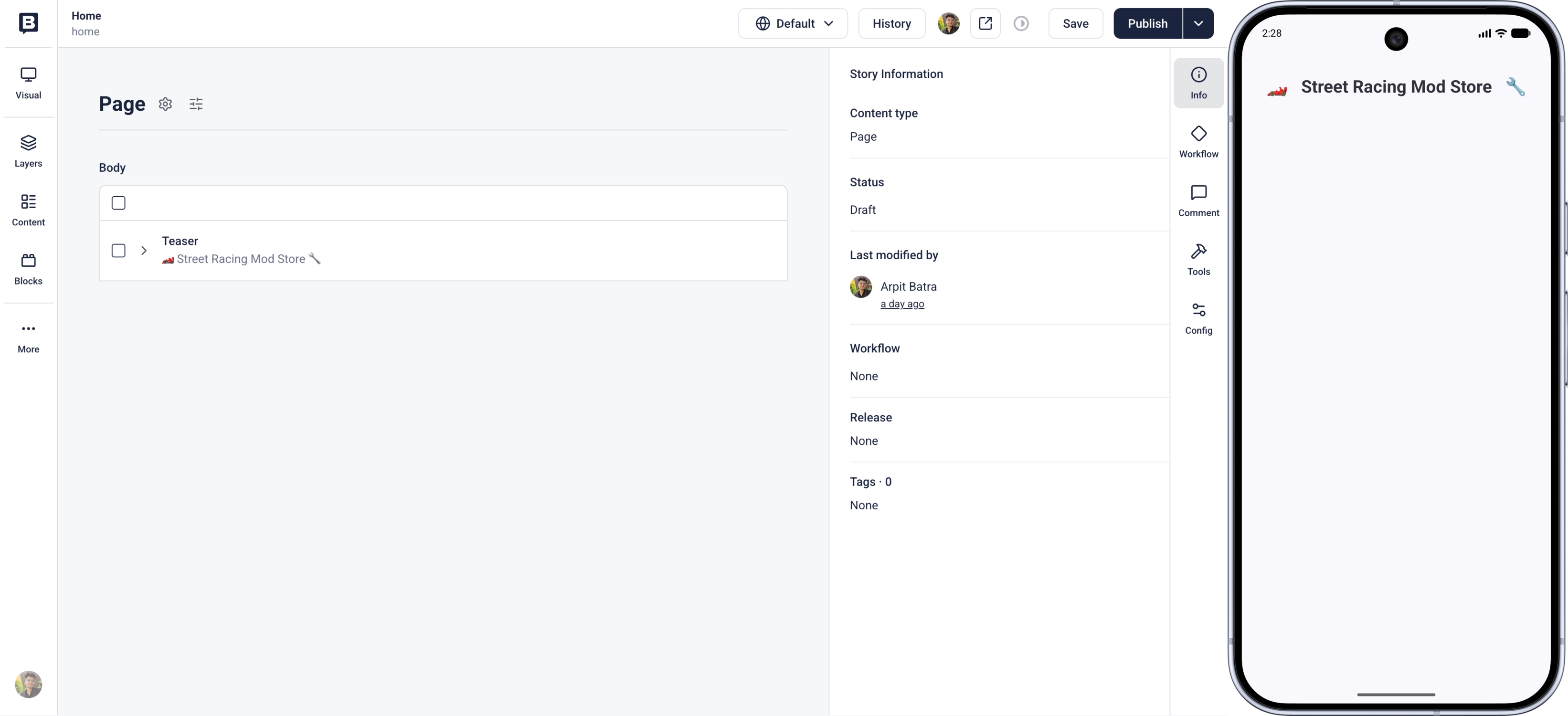
A new Storyblok space is initialized with a standard set of blocks, namely: Feature, Grid, Page, and Teaser. The default home story also includes instances of these blocks. To get started, navigate to the home story, delete all existing blocks, and add only a Teaser block. Fill the headline field of the Teaser block with some sample text.
Inside the application module, create a new model package and then a Page.kt class. This file will contain the data model for the Page block from Storyblok.
// Replace with the app's package name
package com.storyblok.androidblueprint.model

import com.storyblok.cdn.schema.Component
import kotlinx.serialization.SerialName
import kotlinx.serialization.Serializable

@Serializable
@SerialName("page")
data class Page(
    val body: List<Component> = emptyList(),
) : Component()
The Page class above contains the body field, which is a field from the schema of this component in Storyblok. The body is a blocks field, and therefore it is typed using the Component type imported from the Android SDK.
Let's now define the data model for the Teaser block in the same model package:
// Replace with the app's package name
package com.storyblok.androidblueprint.model

import com.storyblok.cdn.schema.Component
import kotlinx.serialization.SerialName
import kotlinx.serialization.Serializable

@Serializable
@SerialName("teaser")
data class Teaser(
    val headline: String = "",
) : Component()
Next, let's define how individual blocks are rendered inside the application. Similar to the model package above, create a components package inside the ui folder.
Define a Page component in Page.kt:
package com.storyblok.androidblueprint.ui.components

import androidx.compose.foundation.layout.Arrangement
import androidx.compose.foundation.layout.Column
import androidx.compose.foundation.layout.fillMaxSize
import androidx.compose.runtime.Composable
import androidx.compose.ui.Alignment
import androidx.compose.ui.Modifier
import com.storyblok.androidblueprint.model.Page
import com.storyblok.compose.BlockScope

@Composable
fun BlockScope.Page(page: Page, modifier: Modifier = Modifier) {
    Column(
        modifier = modifier.fillMaxSize(),
        horizontalAlignment = Alignment.CenterHorizontally,
        verticalArrangement = Arrangement.Top
    ) {
        page.body.forEach { component ->
            Block(content = component)
        }
    }
}
The Page component is a standard Jetpack composable, with some additional imports from Storyblok. BlockScope from Storyblok provides functions for rendering nested content. This is useful because the Page component contains other components, in this case the Teaser.
Furthermore, the Page model defined in the previous step is used to access the body field of the Storyblok Page component. The Block composable supplied by the BlockScope is used to render individual nested components.
Similarly, create the Teaser component in Teaser.kt:
package com.storyblok.androidblueprint.ui.components

import androidx.compose.foundation.layout.padding
import androidx.compose.material3.MaterialTheme
import androidx.compose.material3.Text
import androidx.compose.runtime.Composable
import androidx.compose.ui.Modifier
import androidx.compose.ui.text.font.FontWeight
import androidx.compose.ui.text.style.TextAlign
import androidx.compose.ui.unit.dp
import com.storyblok.androidblueprint.model.Teaser

@Composable
fun Teaser(teaser: Teaser, modifier: Modifier = Modifier) {
    Text(
        text = teaser.headline,
        modifier = modifier.padding(32.dp),
        style = MaterialTheme.typography.headlineSmall,
        fontWeight = FontWeight.Bold,
        textAlign = TextAlign.Center
    )
}
With the models and UI components in place, we can now fetch the story from the Storyblok Content Delivery API and render it in the application.
First, set up a blockProvider. This provider will be used to connect Storyblok blocks received from the API to UI components.
In MainActivity.kt, import the models and components defined earlier:
import com.storyblok.androidblueprint.model.Page
import com.storyblok.androidblueprint.model.Teaser
import com.storyblok.androidblueprint.ui.components.Page as PageComponent
import com.storyblok.androidblueprint.ui.components.Teaser as TeaserComponent

// Also import the Storyblok composer and blockProvider
import com.storyblok.compose.Storyblok
import com.storyblok.compose.provider.blockProvider

// Import BuildConfig and the content version constants
import com.storyblok.androidblueprint.BuildConfig
import com.storyblok.ktor.Api.Config.Version.Draft
import com.storyblok.ktor.Api.Config.Version.Published
Then, write the implementation of the blockProvider:
private val appBlockProvider = blockProvider(
    fallback = { component, modifier ->
        Text("Unknown component: ${component.component}", modifier)
    }
) {
    block<Page> { page, modifier ->
        PageComponent(page = page, modifier = modifier)
    }
    block<Teaser> { teaser, modifier ->
        TeaserComponent(teaser = teaser, modifier = modifier)
    }
}
The blockProvider from Storyblok supports a fallback property, which is used when the provider comes across a component that is not yet configured. In this case, the fallback renders a Text composable with a message.
Next, we will set up the core of the application, which is the code for fetching data from the API and connecting the received data with the blockProvider.
Append the following code to MainActivity.kt:
class MainActivity : ComponentActivity() {
    override fun onCreate(savedInstanceState: Bundle?) {
        super.onCreate(savedInstanceState)
        enableEdgeToEdge()
        setContent {
            StoryblokAndroidBlueprintTheme {
                StoryblokApp()
            }
        }
    }
}


@Composable
fun StoryblokApp() {
    Storyblok(
        accessToken = "YOUR_ACCESS_TOKEN",
        version = if (BuildConfig.DEBUG) Draft else Published,
        blockProvider = appBlockProvider
    ) {
        val story by story("home").collectAsStateWithLifecycle(null)

        Scaffold(modifier = Modifier.fillMaxSize()) { innerPadding ->
            val storyContent = story?.content
            if (storyContent != null) {
                Block(content = storyContent, modifier = Modifier.padding(innerPadding))
            } else {
                Box(modifier = Modifier.fillMaxSize(), contentAlignment = Alignment.Center) {
                    CircularProgressIndicator()
                }
            }
        }
    }
}
MainActivity is our app's entry point, and the core of the code lives in the StoryblokApp composable it renders.
All logic is wrapped by the Storyblok composable. It accepts a content delivery token, a version parameter, and a block provider.
The version parameter controls which content is fetched. The BuildConfig.DEBUG check selects Api.Config.Version.Draft for debug builds and Api.Config.Version.Published for release builds. As a result, draft (unpublished) content loads only in debug builds, while release builds always load published content. Both constants come from com.storyblok.ktor.Api.Config.Version.
Inside the composable, the slug of the home story is passed, which is then fetched as a Compose State from a Flow. The API returns a story object with metadata alongside its actual fields. Those fields live on the story's content property, so story.content is passed to the Block composable to render it.
Build and run the application. The Teaser block should now be rendered.
Build the article screen with rich text
With the app rendering content, it's time to build what readers actually come for: the blog post itself.
In the Storyblok space, create a new content type block and give it the technical name of article. In this block, configure a text field of type Richtext. Then, create a new article using this block and add some content into the text field. Also add an instance of the Teaser component we created earlier.
In the Android application, set up the data model for the Article component in model/Article.kt:
package com.storyblok.androidblueprint.model

import com.storyblok.cdn.schema.Component
import com.storyblok.cdn.schema.RichText
import kotlinx.serialization.SerialName
import kotlinx.serialization.Serializable

@Serializable
@SerialName("article")
data class Article(
    val text: RichText,
) : Component()
Then define the UI component for the article in ui/components/Article.kt:
package com.storyblok.androidblueprint.ui.components

import androidx.compose.foundation.layout.padding
import androidx.compose.runtime.Composable
import androidx.compose.ui.Modifier
import androidx.compose.ui.unit.dp
import com.storyblok.androidblueprint.model.Article
import com.storyblok.compose.BlockScope

@Composable
fun BlockScope.Article(article: Article, modifier: Modifier = Modifier) {
    RichText(article.text, modifier.padding(24.dp))
}
In the UI component, the RichText composable renders the value of the text field from the API response, which contains the rich text content from Storyblok.
Next, register the Article component in the blockProvider:
block<Article> { article, modifier ->
    ArticleComponent(article = article, modifier = modifier)
}
ArticleComponent is imported from the component defined earlier.
Copy the slug of the new article story and replace the home slug in MainActivity.kt:
- val story by story("home").collectAsStateWithLifecycle(null)
+ val story by story("what-is-street-racing").collectAsStateWithLifecycle(null)
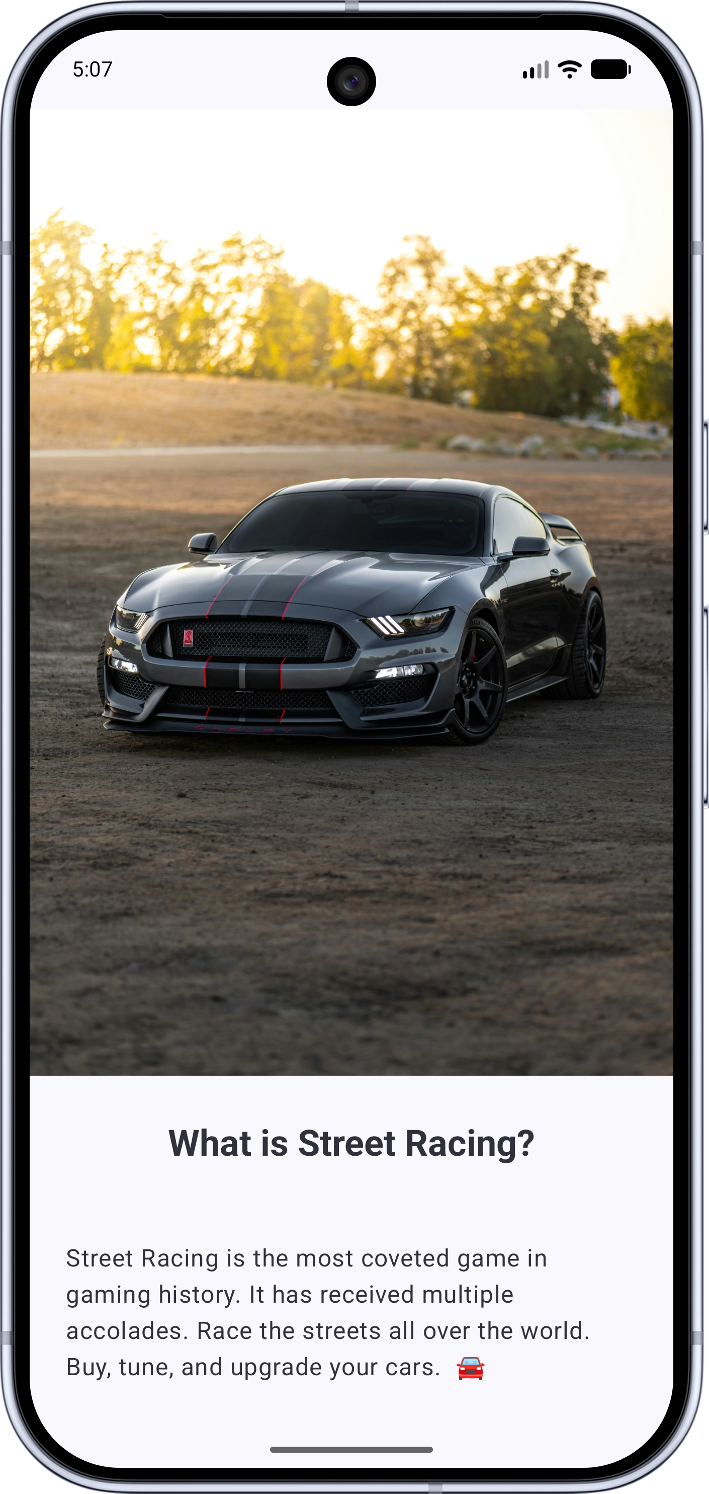
Build and run the application. The rich text content from Storyblok should now be rendered in the app.
Add support for images
Let's now enable the rendering of featured images. First add a featuredimage field of the Asset type to the Article block in Storyblok. Then, upload an image onto this field.
Asset fields do not render automatically. Render them with Coil's AsyncImage, and add Coil to the project by following the Coil setup guide.
Add the featuredimage field to the Article data model:
@Serializable
@SerialName("article")
data class Article(
    val text: RichText,
    val featuredimage: Asset,
) : Component()
The Asset type comes from com.storyblok.cdn.schema.Asset and exposes the uploaded file through its filename property and its alternative text through alt.
Update the Article component to render the image above the rich text:
package com.storyblok.androidblueprint.ui.components

import androidx.compose.foundation.layout.padding
import androidx.compose.runtime.Composable
import androidx.compose.ui.Modifier
import androidx.compose.ui.unit.dp
import com.storyblok.androidblueprint.model.Article
import com.storyblok.compose.BlockScope
import androidx.compose.foundation.layout.Column
import androidx.compose.foundation.layout.fillMaxWidth
import androidx.compose.ui.layout.ContentScale
import coil3.compose.AsyncImage

@Composable
fun BlockScope.Article(article: Article, modifier: Modifier = Modifier) {
    Column(modifier) {
        AsyncImage(
            model = article.featuredimage.filename,
            contentDescription = article.featuredimage.alt,
            contentScale = ContentScale.FillWidth,
            modifier = Modifier.fillMaxWidth(),
        )
        RichText(article.text, Modifier.padding(24.dp))
    }
}
Build and run the application. The article's featured image should now render above its rich text content.
Build the blog feed and link to each post
Now we'll build the home feed that lists our posts and lets readers tap through to each one.
We'll render that list dynamically and wire up navigation between posts using the Navigation 3 library.
In the Page block in Storyblok, add a new field called articles of type References. Restrict its source to the article content type we created earlier. The Page block will be used to display a list of articles.
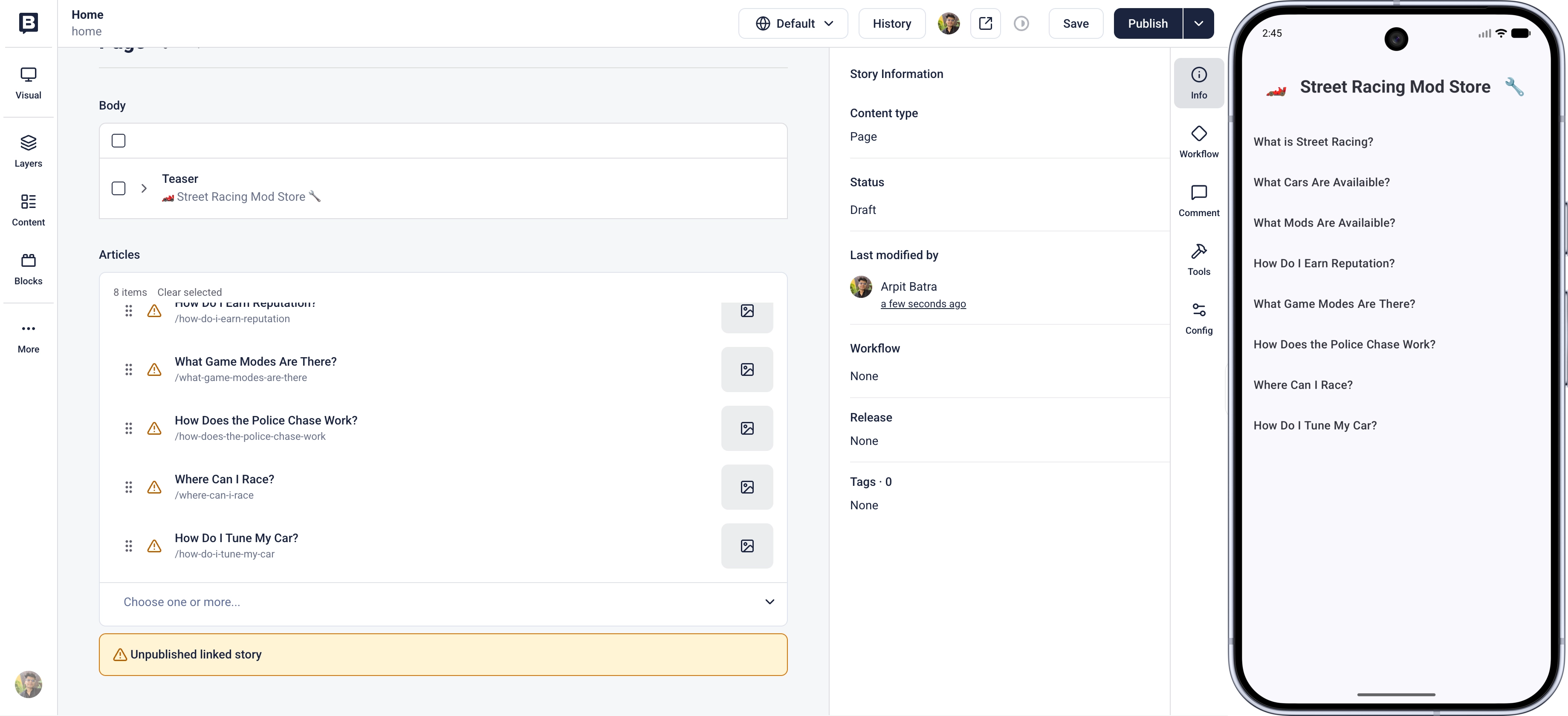
Then open the Home story and add a few articles to the new articles field. The selected references are what the application renders as the article list, so make sure at least one article is added.
Revert the fetched slug to home in the MainActivity so the application loads the Home story again.
Add the articles field to the Page data model in model/Page.kt:
@Serializable
@SerialName("page")
data class Page(
    val body: List<Component> = emptyList(),
    val articles: List<Story<Article>> = emptyList(),
) : Component()
The Story type is imported from the Android SDK:
import com.storyblok.cdn.schema.StoryEach referenced article is typed as Story<Article>. The Android SDK auto-detects this type and adds the required resolve_relations parameter to the API request which resolves the referenced articles in place. No additional configuration is needed.
To navigate between stories in the application, set up the Navigation 3 library.
In libs.versions.toml, add under [versions]:
nav3Core = "1.0.1"And under [libraries]:
androidx-navigation3-runtime = { module = "androidx.navigation3:navigation3-runtime", version.ref = "nav3Core" }
androidx-navigation3-ui = { module = "androidx.navigation3:navigation3-ui", version.ref = "nav3Core" }
In the application's build.gradle.kts dependencies, add:
implementation(libs.androidx.navigation3.runtime)
implementation(libs.androidx.navigation3.ui)
The Navigation 3 library represents each screen with a key. Create a NavKey.kt file that identifies a story by its slug or UUID, and a HomeKey for the Home story:
@file:OptIn(ExperimentalUuidApi::class)

package com.storyblok.androidblueprint

import androidx.navigation3.runtime.NavKey
import com.storyblok.cdn.schema.Component
import com.storyblok.cdn.schema.Story
import kotlinx.serialization.EncodeDefault
import kotlinx.serialization.Serializable
import kotlinx.serialization.Transient
import kotlin.uuid.ExperimentalUuidApi
import kotlin.uuid.Uuid

@Serializable
data class StoryKey(
    @Transient
    val story: Story<out Component>? = null,
    @EncodeDefault
    val uuid: Uuid? = story?.uuid,
    @EncodeDefault
    val slug: String? = story?.slug,
) : NavKey

val HomeKey = StoryKey(slug = "home")
When navigating from an already loaded list, the resolved Story is passed along to render immediately, while its slug and uuid let the detail screen refetch the latest version.
Update the Page component in ui/components/Page.kt to render a tappable row for each referenced article. The component receives an onArticleClick callback that the navigation code provides:
@Composable
fun BlockScope.Page(
    page: Page,
    onArticleClick: (Story<Article>) -> Unit,
    modifier: Modifier = Modifier,
) {
    Column(modifier.fillMaxSize()) {
        page.body.forEach { component ->
            Block(content = component)
        }
        page.articles.forEach { article ->
            Text(
                text = article.name,
                modifier = Modifier
                    .fillMaxWidth()
                    .clickable { onArticleClick(article) }
                    .padding(16.dp),
                style = MaterialTheme.typography.titleMedium,
            )
        }
    }
}
Add imports for the UI components, models, and the Story type:
import androidx.compose.foundation.clickable
import androidx.compose.foundation.layout.fillMaxWidth
import androidx.compose.material3.MaterialTheme
import androidx.compose.material3.Text
import com.storyblok.androidblueprint.model.Article
import com.storyblok.cdn.schema.Story
Each row uses the story's name as its label and calls onArticleClick with the referenced Story<Article> when tapped.
The block provider now needs to trigger navigation, so move it inside the StoryblokApp composable where it can reach the navigation back stack. Delete the top-level appBlockProvider value defined earlier and replace StoryblokApp with the following:
@OptIn(ExperimentalUuidApi::class)
@Composable
fun StoryblokApp() {
    val backStack = rememberNavBackStack(HomeKey)

    Storyblok(
        accessToken = "YOUR_ACCESS_TOKEN",
        version = if (BuildConfig.DEBUG) Draft else Published,
        blockProvider = blockProvider(
            fallback = { component, modifier ->
                Text("Unknown component: ${component.component}", modifier)
            }
        ) {
            block<Page> { page, modifier ->
                PageComponent(
                    page = page,
                    onArticleClick = { backStack.add(StoryKey(it)) },
                    modifier = modifier,
                )
            }
            block<Teaser> { teaser, modifier ->
                TeaserComponent(teaser = teaser, modifier = modifier)
            }
            block<Article> { article, modifier ->
                ArticleComponent(article = article, modifier = modifier)
            }
        }
    ) {
        Scaffold(modifier = Modifier.fillMaxSize()) { innerPadding ->
            NavDisplay(
                backStack = backStack,
                modifier = Modifier.padding(innerPadding),
                entryProvider = entryProvider {
                    entry<StoryKey> { key ->
                        val story by remember(key) {
                            when (key.uuid) {
                                null -> story(slug = key.slug!!)
                                else -> story(uuid = key.uuid)
                            }
                        }.collectAsStateWithLifecycle(key.story)

                        val content = story?.content
                        if (content != null) {
                            Block(content = content)
                        } else {
                            Box(
                                modifier = Modifier.fillMaxSize(),
                                contentAlignment = Alignment.Center,
                            ) {
                                CircularProgressIndicator()
                            }
                        }
                    }
                }
            )
        }
    }
}
Also import navigation related utilities:
import androidx.navigation3.runtime.entryProvider
import androidx.navigation3.runtime.rememberNavBackStack
import androidx.navigation3.ui.NavDisplay
import com.storyblok.compose.provider.blockProvider
A single entry<StoryKey> handles every screen. It fetches the story named by the key, then renders it with Block. The Home story resolves to the Page block, which shows the article list. Tapping a row adds a new StoryKey to the back stack, the same entry fetches that article, and the Article block renders its detail.
Build and run the application. The Home screen should now list the articles, and tapping one opens its full content. Use the system back gesture to return to the list.
Final thoughts
We've built a blog app which can list blog posts and render their rich text content. The content lives in Storyblok and can change without a new release. The blockProvider keeps our Compose UI and our Storyblok blocks cleanly mapped, and the Android SDK handles fetching and caching for us. From here we could register more block types, style the rich text to match our own design system, or expand the navigation into a full production app.
Questions or Feedback?
Join our Discord (opens in a new window)Author


