Build Accessible Experiences with Storyblok
From structured content to built-in checks, Storyblok gives developers and marketers what they need to create content everyone can use.

Make every digital experience more inclusive.
Accessibility is about more than meeting standards.
It’s about creating digital experiences that are more enjoyable for everyone, while expanding your reach and making your content more effective.

Reach a wider audience
Make your content easier to access, navigate, and engage with, regardless of how people interact with your website. When it works for more people, it reaches more people.

Stay ahead of requirements
Support compliance with evolving regulations, including the European Accessibility Act (EAA), and build accessibility into your content workflows.

Improve content discoverability
Clear content structures, descriptive headings, and meaningful alt text help search engines and AI agents understand your content, making it easier for people to find.
Accessible by architecture
A headless, component-based CMS separates content from presentation. That puts you in full control of accessible output.
-
-

You own the markup.
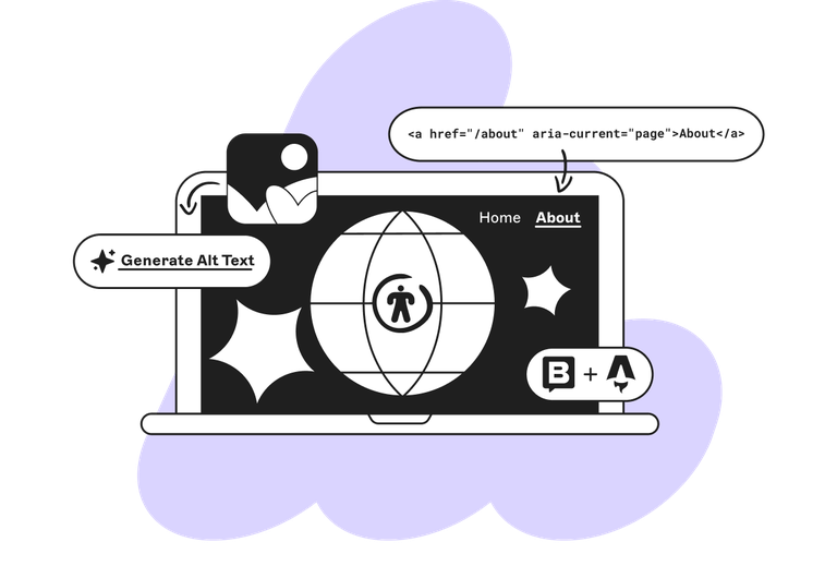
No themes or plugins injecting bloated HTML. Developers build components with semantic HTML, landmarks, and ARIA exactly as needed, in any framework.
-

Structured content.
Content is stored as clean, structured data, free of inline styles or rogue markup. Your frontend decides how it’s presented, consistently, everywhere.
-

Component-based by design.
Build accessible components once and reuse them everywhere. Fix an issue in one component and it’s fixed across every page.
-

Consistent across channels.
The same structured content powers web, apps, and more, with alt text, captions, and metadata travelling with it.
-
Build accessibility into every workflow
Give editors creative freedom while making accessible content the default.
-
Make alt text and captions mandatory.
-
Explain why a field matters, right where editors work.
-
Control which bloks can be used where, so page structure stays semantic.
-
Set heading levels through predefined options or in the frontend.
-
Lock critical components like navigation, headers, and footers.
-
Disable Markdown to keep markup consistent
The right tools for more accessible content
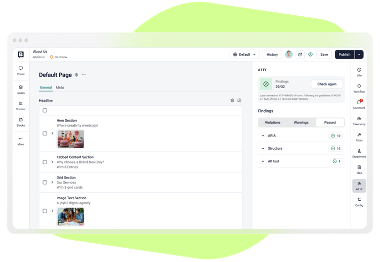
Accessibility Checker
Run accessibility checks right in the Visual Editor against WCAG 2.0–2.2 (A and AA) and best practices. No need for external tools!
Built on axe-core: Deque’s industry-standard testing engine.
Clear results: Grouped by topic and resolution area.
Pinpoints the blok: See exactly which component to fix.
Any JS framework: Developers enable it once. It never runs on your live site.
Configurable: Choose which WCAG levels to check.
And the right tools for a more accessible editing experience
Keyboard Shortcuts
The Visual Editor supports keyboard shortcuts for its most common actions. That makes editing faster for power users and more accessible for anyone who relies on a keyboard. An overview of all shortcuts is always available in the left-hand panel and adapts to your operating system.
Open Block library: ⌘ B / Ctrl B
Open Languages: ⇧ L
Show History: ⌘ ⇧ H / Ctrl ⇧ H
Save: ⌘ S / Ctrl S
Publish: ⌘ ⇧ P / Ctrl ⇧ P
Unpublish: ⌘ ⇧ U / Ctrl ⇧ U
Open Info: ⌘ I / Ctrl I
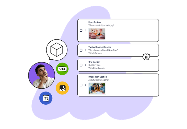
Keyboard Drag-and-Drop
You can use the keyboard to reorder items across Storyblok’s UI, including:
Blocks in the Visual Editor
Fields in the Block library
Tabs in the Block library
Multi-option items in the Block library
Multi-option and multi-asset items in the Visual Editor
Datasource entries
Languages in Settings → Internationalization
Workflows stages
Pipelines stages
A theme for every eye
Make Storyblok look the way that works best for you. Choose from four themes in your account settings:
Default: meets WCAG color contrast requirements (4.5:1)
Dark mode: easier on the eyes in low light
High contrast light
High contrast dark
The high contrast themes have stronger outlines and a contrast ratio of at least 7:1 for most elements, for better visibility.
Let’s make the web more accessible, together.
We value your feedback and are eager to hear any comments, questions, or suggestions regarding our website or product interface. If you encounter any accessibility barriers or have suggestions for improvement, please reach out to us via e-mail, our help center, or the live chat in the Storyblok App.