Design System
We created our blok.ink (opens in a new window)design system to allow our customers to build great integrated experiences while maintaining Storyblok's overall design.
Note that blok.ink loads the recent version of the design systems for field-type development.
How to use
The design system is documented and kept up to date on our blok.ink (opens in a new window) website. Each component has a preview as well as documentation on how to use it. For detailed information on the implementation, you can have a look at the Github repository (opens in a new window).
The easiest way to use the design system is to install it via npm:
# for vue 2
npm install storyblok-design-system --save

# for vue 3
npm install @storyblok/design-system --save
If you want to try out the latest development version, you can also install it directly from the development branch on Github:
npm install git+https://github.com/storyblok/storyblok-design-system#develop --saveTo use different components in Vue, we need to register the Design System and import the CSS for Vue 2:
import Vue from 'vue'
import BlokInk from 'storyblok-design-system'
import 'storyblok-design-system/dist/storyblok-design-system.css'

Vue.use(BlokInk)
For Vue 3:
import { createApp } from 'vue'
import BlokInk from '@storyblok/design-system'
import '@storyblok/design-system/dist/storyblok-design-system.css'

const app = createApp({
  ...App,
})

app.use(BlokInk)
After the Design System was registered, you can use the components and CSS classes in any page or component:
<template>
  <SbLoading type="spinner" size="x-large" color="primary" />
</template>
Nuxt
If you are using the Design System inside a Nuxt application, we have made improvements to make the process of using it easier and much more straight forward.
First, create a new plugins folder inside your project root (if you don't already have one). Then, create a new file called storyblok-design-system.client.js inside the plugins folder.
Paste the code below inside the storyblok-design-system.client.js file. This process of creating plugins is a common pattern to Nuxt projects.
// Nuxt 2
import Vue from 'vue'
import BlokInk from 'storyblok-design-system'
import 'storyblok-design-system/dist/storyblok-design-system.css'

Vue.use(BlokInk)


// Nuxt 3
import BlokInk from '@storyblok/design-system'
import '@storyblok/design-system/dist/storyblok-design-system.css'

export default defineNuxtPlugin((nuxtApp) => {
    nuxtApp.vueApp.use(BlokInk)
})
(Only Nuxt 2) Now, you just need to add the Design System to nuxt.config.js file as a plugin:
export default {
  ... // other configs
  plugins: [{
    src: '@/plugins/storyblok-design-system',
    mode: 'client'
  }],
}
Please note that you need to declare as mode: client only if your Nuxt application is SSR. SPA apps don't need to declare this variable.
How to use
Now, you can use the components from the Design System, inside your application, by just putting them inside your .vue pages, like this:
<template>
  <SbLoading type="spinner" size="x-large" color="primary" />
</template>
And you're good to go!
How to use it in custom field-types
It's also possible to use the design system in custom field-types. Read our FAQ How to use the Design System with custom field-types? (opens in a new window) if you want to know more.
Components
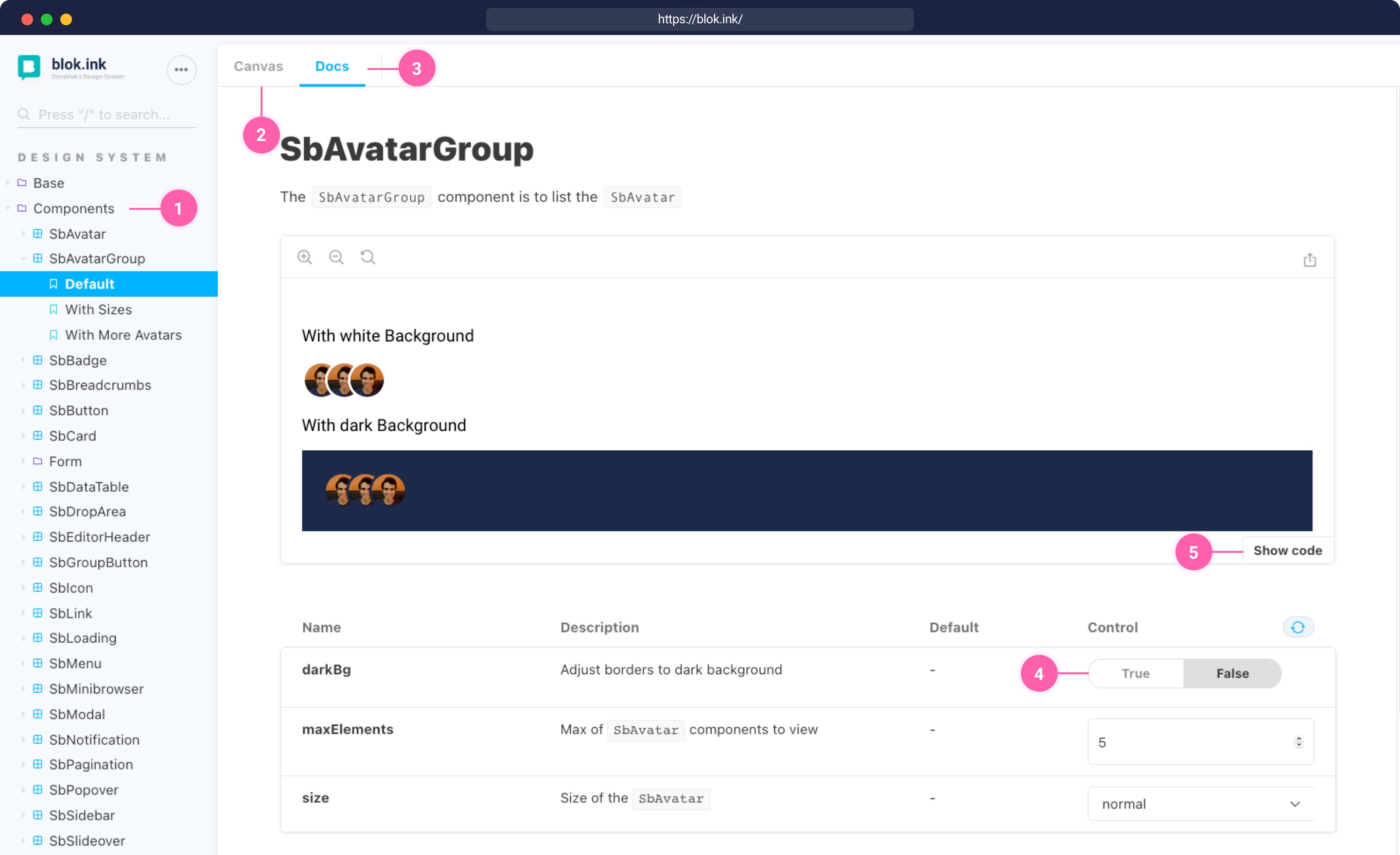
Our components are a collection of interface elements that can be reused across the Storyblok system. Once you open a component (opens in a new window) in the blok.ink website {1}. You can preview it under Canvas {2} or have a look at the documentation {3}. In the documentation, you can change the components' different settings {4} and finally show the code {5} that you will need for embedding it.
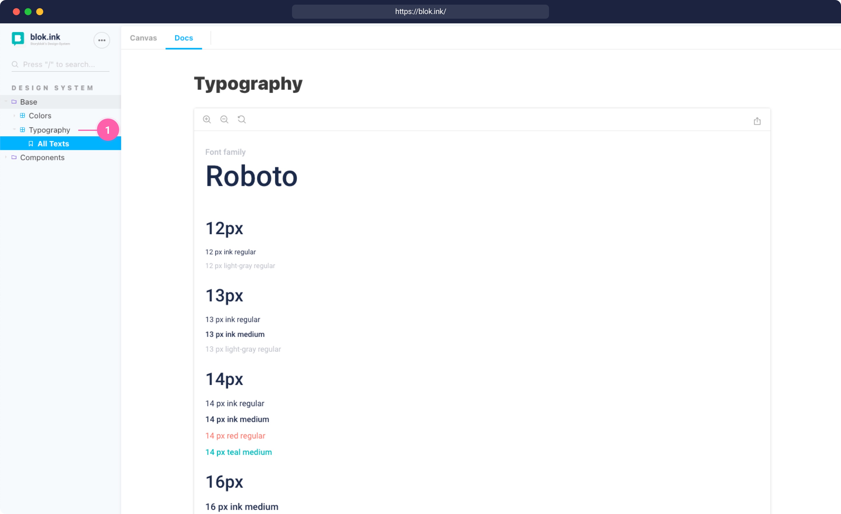
Typography
Roboto (opens in a new window) is the primary brand typeface for Storyblok. It has a mechanical skeleton and the forms are largely geometric. At the same time, the font features friendly and open curves.
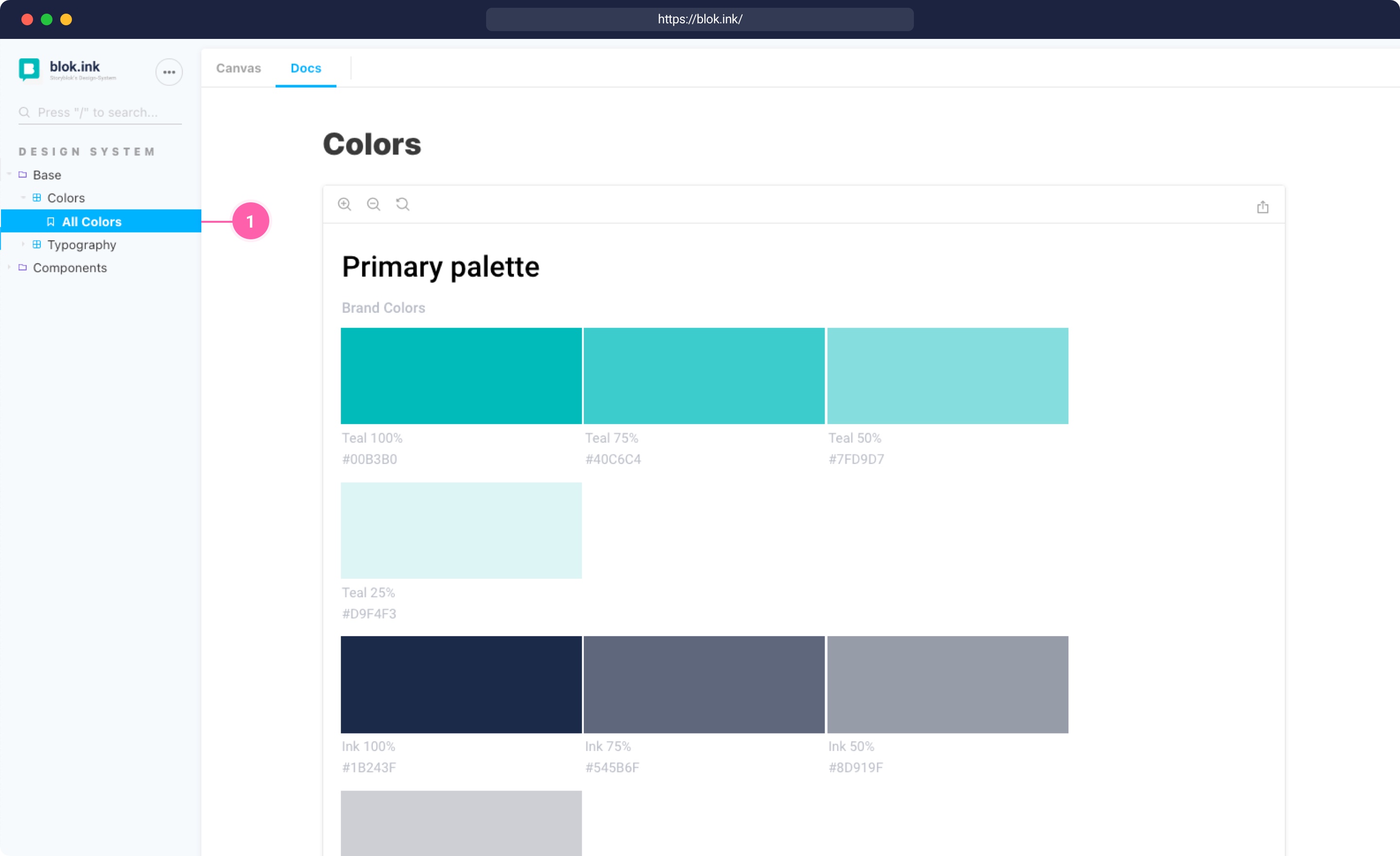
Colors
Storyblok's brand color is teal. It combines the calming properties of blue with the renewal qualities of green. The color represents open communication and clarity of thought.
To complement it, the secondary color in Storyblok is a dark blue, which is called ink.
To allow for different activity colors, there are 5 alert colors in different nuances: red, orange, yellow, blue, and green.