Building a Folder Select Field Using the Field Plugin CLI
Storyblok is the first headless CMS that works for developers & marketers alike.
In this short tutorial, we will see how to create a Field Type Plugin (opens in a new window) using the new Field Plugin CLI (opens in a new window). We will create a plugin that will allow us to select folders from the same space inside a dropdown field. We will be creating this plugin using React, and we’ll be using Material UI (opens in a new window) for the styling.
There can be many applications for this plugin. There can be scenarios where you would like to select the folders in a field (just like stories) and send the folder information with the API response. An example would be to create a menu out of all the entries inside the selected folder.
Environment Setup
Requirements
To follow this tutorial, these requirements need to be fulfilled:
- Basic understanding of JavaScript and React
- Node.js LTS version
- An account in the Storyblok App (opens in a new window)
Though we are using React for the plugin, you can create the plugins using your preferred frameworks. The CLI provides the templates for React, Vue 2 and Vue 3. The CLI uses the @storyblok/field-plugin which can be used with other frameworks as well. You can read more about it here.
Setup the project
To get started, let’s create a new project with the following CLI command:
npx @storyblok/field-plugin-cli@latest createWe will be prompted with a few questions. You can answer them according to your needs. For this one, select react as the framework after selecting the type of repo and give it a name.
After the project is created, start the application by running the project.
npm run devIn the terminal, we will find that the project is running at localhost:8080 and we will also see another link that says Sandbox. Open the sandbox link in your browser to open the plugin sandbox. The plugin sandbox emulates the Visual Editor, letting you view the field plugin while developing. It also allows us to play with the options and shows the relevant data.
This project we created has an example plugin inside it. If we go into the components, we will see a FieldPluginExample folder and a FieldPlugin.tsx file. The example folder contains the code of what we see when we run the app. It is being imported into the App.tsx file and is being rendered from there.
We will have our code for the plugin inside the FieldPlugin file. We will use jsx, but you are free to use TypeScript as well. Let’s delete the example folder and then replace the component with FieldPlugin in our App.tsx file.
Plugin Setup
Let’s install the following libraries for styling - @mui/material (Material UI) and @storyblok/mui .
@storyblok/mui is a component library for Storyblok based on Material UI. We recommend using it for your React-based extensions. You need to install the @mui/material package as well to use it. You can read more about @storyblok/mui here (opens in a new window).
Now, let’s replace the code in the files with the following:
import FieldPlugin from './components/FieldPlugin'
import { FunctionComponent } from 'react'
import { useFieldPlugin } from '@storyblok/field-plugin/react'

import { CssBaseline, GlobalStyles, ThemeProvider } from '@mui/material'
import { lightTheme } from '@storyblok/mui'

const App: FunctionComponent = () => {
  const { type, error } = useFieldPlugin()

  if (type === 'loading') {
    return <Loading />
  } else if (type === 'error') {
    return <Error error={error} />
  } else {
    return (
      <ThemeProvider theme={lightTheme}>
        <CssBaseline />
        <GlobalStyles
          styles={{
            body: { backgroundColor: 'transparent' },
          }}
        />
        <FieldPlugin />
      </ThemeProvider>
    )
  }
}

const Loading: FunctionComponent = () => <p>Loading...</p>
const Error: FunctionComponent<{ error: Error }> = (props) => {
  console.error(props.error)
  return <p>An error occured, please see the console for more details.</p>
}
export default Appimport { useEffect, useState } from 'react'
import { useFieldPlugin } from '@storyblok/field-plugin/react'
import { TextField, Autocomplete, styled, Box, Paper } from '@mui/material'
import MenuItem from '@mui/material/MenuItem'
import Checkbox from '@mui/material/Checkbox'
import ListItemText from '@mui/material/ListItemText'
const StyledAutocomplete = styled(Autocomplete)(({ theme }) => ({
backgroundColor: theme.palette.background.paper,
}))
const StyledPopper = styled(Box)(({ theme }) => ({
position: 'relative !important',
display: 'flex',
flexDirection: 'column',
alignItems: 'stretch',
// maxHeight: 'unset !important',
marginTop: theme.spacing(2),
width: 'unset !important',
maxHeight: 300,
border: `1px solid ${theme.palette.divider}`,
borderRadius: theme.shape.borderRadius,
}))
const StyledPaper = styled(Paper)(() => ({
display: 'flex',
flexDirection: 'column',
alignItems: 'stretch',
}))
const StyledListBox = styled(Box)(() => ({
maxHeight: 'unset !important',
}))
const FieldPlugin = () => {
const {
type,
data,
actions
} = useFieldPlugin()
const [folders, setFolders] = useState([])
const [selectOpen, setSelectOpen] = useState(false)
// Intial content of the plugin
const isArrayOfObjects = (value) =>
Array.isArray(value) && value.every((it) => typeof it === 'object')
const content = isArrayOfObjects(data?.content) ? data?.content : []
// Extracting starts_with from options
const startsWith = data?.options.starts_with ?? ''
// Using space token
const token = data?.token
const maximum = Number(data?.options.maximum)
useEffect(() => {
getFolders(token, startsWith).then(setFolders)
}, [token, startsWith])
const foldersInContent = folders.filter((folder) =>
content.some((c) => c.id === folder.id),
)
if (type !== 'loaded') {
return null
}
return (
<StyledAutocomplete
multiple
value={foldersInContent}
options={folders}
getOptionLabel={(folder) => folder.name}
disableCloseOnSelect
renderInput={(params) => (
<TextField
{...params}
variant="outlined"
placeholder="Select Folders"
/>
)}
componentsProps={{
popper: {
sx: {
display: selectOpen ? undefined : 'none',
},
},
}}
PopperComponent={StyledPopper}
PaperComponent={StyledPaper}
ListboxComponent={StyledListBox}
noOptionsText="No folders matches the filter"
open={selectOpen}
onOpen={() => setSelectOpen(true)}
onClose={() => setSelectOpen(false)}
onChange={(event, value) => actions.setContent(value)}
renderOption={(props, option, { selected }) => (
<MenuItem
{...props}
divider
key={option.id}
value={option}
sx={{ justifyContent: 'space-between' }}
disabled={!!maximum && content.length >= maximum && !selected}
>
<Checkbox checked={selected} />
<ListItemText
primary={option.name}
secondary={option.slug}
/>
</MenuItem>
)}
/>
)
}
const getFolders = async (token, startsWith) => {
// Get folders and filter according to starts_with
// Fetch all links
let response = await fetch(
`https://api.storyblok.com/v2/cdn/links/?token=${token}&starts_with=${startsWith}`,
{
headers: {
'Content-Type': 'application/json',
Accept: 'application/json',
},
},
)
const allLinks = await response.json()
// Map Folders
return Object.values(allLinks.links)
.filter((l) => l.is_folder)
.map((f) =>
// Storing id, name, slug, uuid
({
id: f.id,
name: f.name,
slug: f.slug,
uuid: f.uuid,
}),
)
}
export default FieldPluginThese are the only two files that we need to modify. The code looks long because of the styling, but it isn’t very complicated. Let’s go through it now.
In the App.tsx, we are just adding the MUI theme and some styles along with the changing of our import. In the FieldPlugin.jsx file, we have the main code for our plugin. One important thing to note is the useFieldPlugin function, which is being imported from the library @storyblok/field-plugin/react. It gives you access to the plugin and its properties like data and action.
You can read more about Field Plugin's response here.
The first few lines in the FieldPlugin.jsx are for styling our plugin better, and the main logic starts from line 30, where we are using the useFieldPlugin to access the data, and then for accessing setContent action that will allow us to set the content of the plugin.
We have two states: One to store the folders and the other to store the state of the dropdown. Since we will have two options in our field plugin, we are extracting those as well from the data. These two option will be:
startsWith: to only show the folders whose path starts from the given value.maximum: to have a maximum number of folders that can be selected.
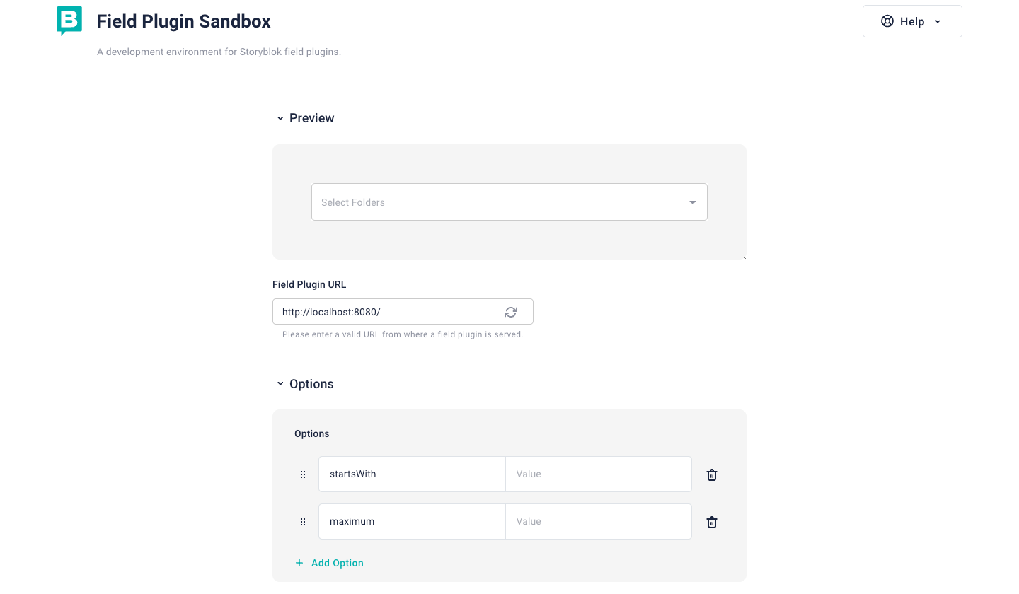
Both of the options are optional and can be tested in the Sandbox. In the Sandbox, you can add the Options {1} as well as see the content and data. For the main plugin, the addition of the options will be done during the deployment.
We are also retrieving the token from the data, which helps us fetch the folders’ links from the space. The function getFolders is defined after the template and is called as soon as the plugin renders in the useEffect hook with two dependencies, token and startsWith. So that we fetch the folders again if the option startsWith changes.
To make the plugin work in the sandbox, replace the token variable with the actual token instead of data.token. Make sure to remove this by the time of deployment so that it can work with the actual token of the space it is installed in.
In the function getFolders, we are fetching all the links using the links endpoint and filtering out the folders from them.
Storyblok's Content Devlivery API has a links endpoint, that just returns links with a couple of important properties. Read more about it here.
In the end, we are returning the array of objects that are folders and have some of the important folder information needed like id, uuid, name and slug. This information will be there when we select the folders and store those in the field.
Then we have the template, which is basically a StyledAutocomplete component, that displays all the options of folders, and the value there is already selected folders (if any). This component mostly has the styles defined at the top of the file so that it can work fine in the iframe (as the plugin is loaded inside an iframe) along with the logic to display the folders as options and select those. It displays the folder name along with the folder slug as the options. It also contains the logic where it uses the maximum from the options to limit the selection. Now we can move towards the deployment.
Deployment
The deployment can be done with the help of the CLI itself. We need to build the plugin first before we deploy it. To build it, run the following:
npm run buildTo deploy it, simply run:
npx @storyblok/field-plugin-cli@latest deployThis deployment works with the help of the personal access token of the user, and prompts for the same if you don’t have it stored in the .env file under the name STORYBLOK_PERSONAL_ACCESS_TOKEN. You can generate a new one following the link in the terminal, or put in an existing token if you already have one.
The deploy command gives a couple of options to choose from. For example, the place to deploy. We can choose that depending on the requirements. Let’s choose My Plugins for this one. We will need to then enter the name of the plugin as well.
You can read more about the deployment here.
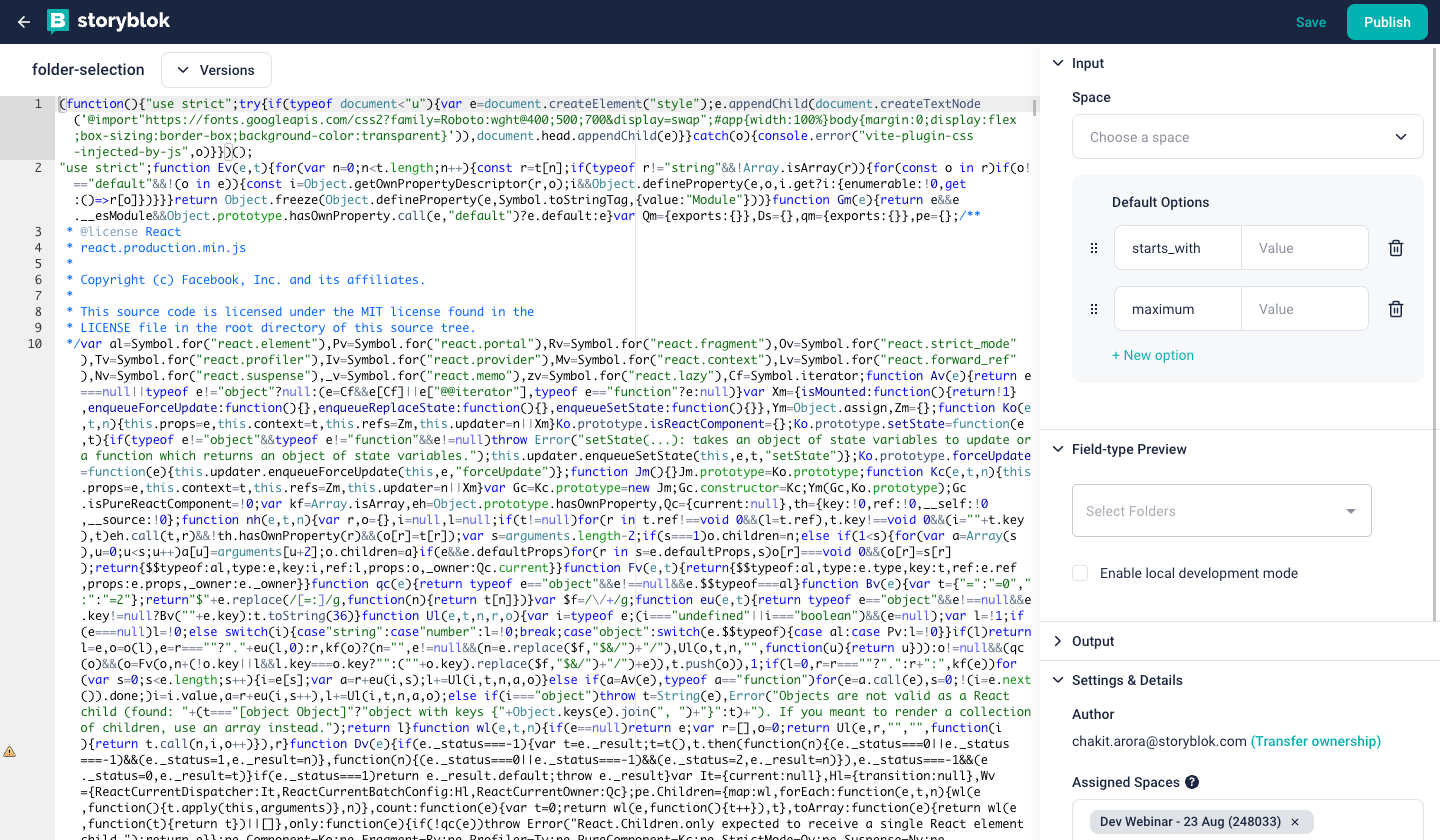
The CLI also helps to update the plugins by giving the option to update or create a new one while deploying. Once the plugin is deployed, we can move toward the Storyblok App and modify the settings of the plugin. Click on My account {1} on the left bottom corner and select My Plugins {2}. Select the deployed plugin.
Once we open the plugin, we will see the build code at the center of the screen {1} and a few tabs on the right-hand side {2}. This is the place where we can add the default input options {3}, see the preview {4} as well as the output {5} of the app along with a few settings.
Add the options startsWith and maximum in the input tab. We can also assign the plugin to some spaces so that other people with access to the block library of those spaces can use the plugin. Once everything is configured, hit Publish {6}.
Amazing! Now you can use the plugin in all your spaces. Go to any of your spaces and add a field of type Plugin {1} to any component. Select your plugin in Custom Type {2}.
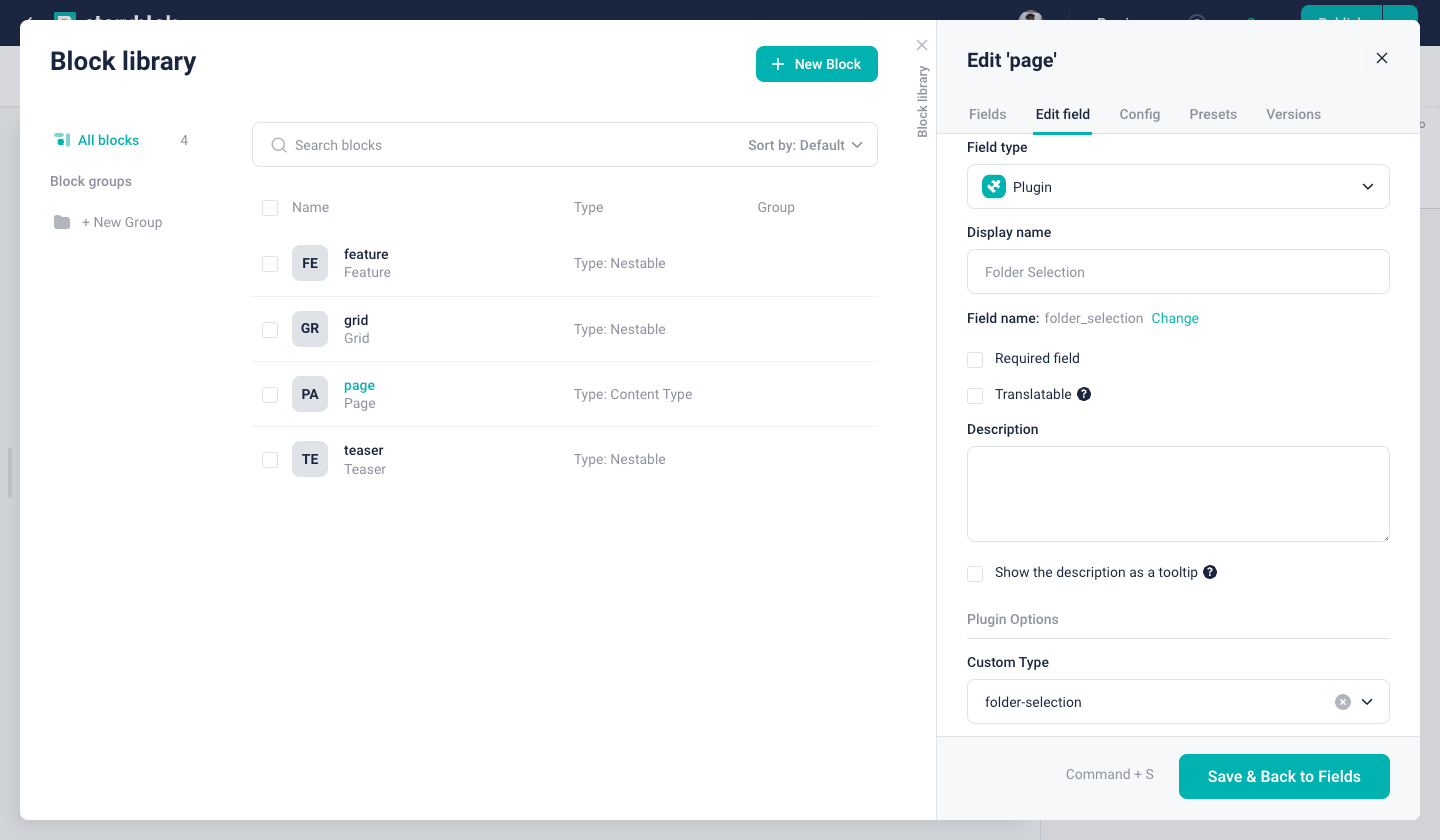
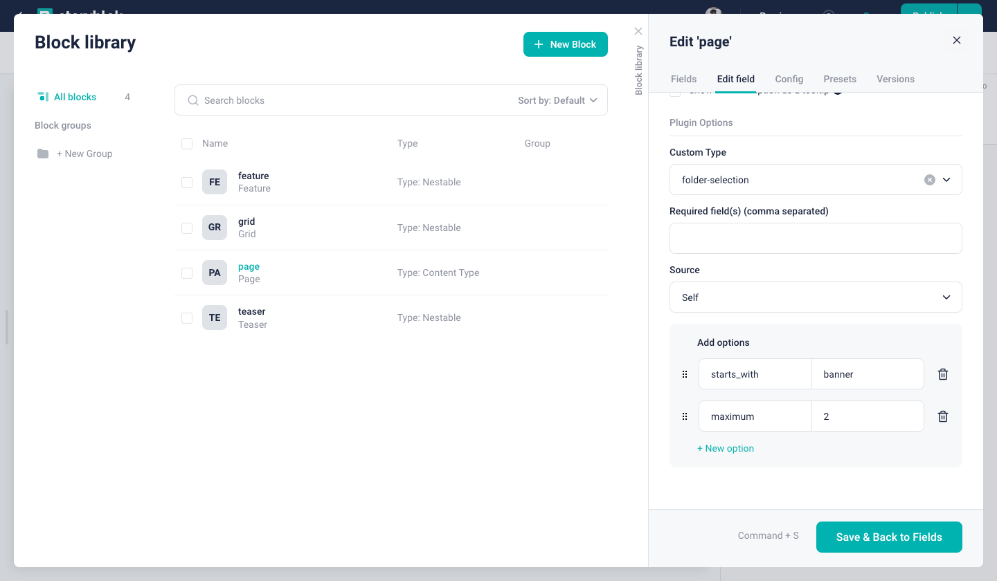
Once we select our plugin in the custom type, we will also see the options we added (starts_with and maximum) {1}. You can add the required values here. Hit Save {2}
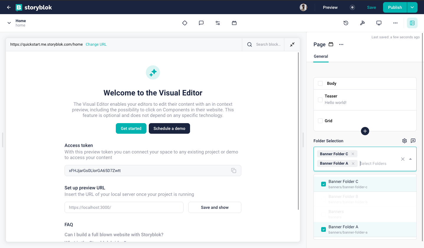
Once we go back to the Story, we will see our plugin there. This plugin now shows the folder names that start with banner. And, a maximum of 2 can be selected from those.
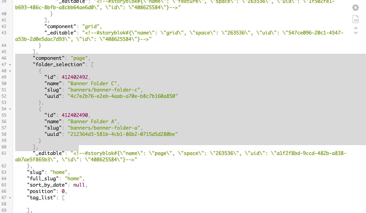
At this point, the response of the API can be checked to see that we get all the relevant information about the selected folders in the field. In the following image, we are able to see the folder_selection key with 2 entries inside the array. These 2 entries show the id, name, slug and uuid of the folders selected in the field.
Wrapping Up
Congratulations, we just made a Field Type Plugin, deployed it, and installed it to use in one of our spaces.
| Resource | Link |
|---|---|
| Code Repository | https://github.com/storyblok/field-type-examples/tree/main/folder-selection |
| Extensions | https://www.storyblok.com/docs/plugins/introduction |
| Field Pugins | https://www.storyblok.com/docs/plugins/field-plugins |
| Distribution | https://www.storyblok.com/docs/plugins/field-plugins/distribution |
| Continuous Delivery | https://www.storyblok.com/docs/plugins/field-plugins/continuous-delivery |
