Getting Started with Next.js Commerce and Storyblok
Storyblok is the first headless CMS that works for developers & marketers alike.
In this tutorial, we will implement Storyblok into a Next.js commerce site. Next.js Commerce is a front-end starter kit for your e-commerce site. For this tutorial, we will use BigCommerce as our eCommerce platform.
Starting point
We are going to follow this guide from BigCommerce. It takes you to the step-by-step guild on creating and deploying the site to Vercel. This will be our starting point and we will have a fully working e-commerce site with dummy data.
If you already have an existing Next.js commerce site you can still follow this guide and learn how you can implement Storyblok in your site.
Now we can just clone the project from our own GitHub repo to our local machine to work on it.
You can quickly get all the env variables from Vercel to your local machine by using the Vercel CLI: vercel env pull
Once the project is cloned locally do the following to run the project.
pnpm install & pnpm build # run these commands in the root folder of the mono repo
pnpm dev # run this command in the site folder
Create a Storyblok project
Sign up for a free Storyblok account. Once you're signed up you can create a new space.
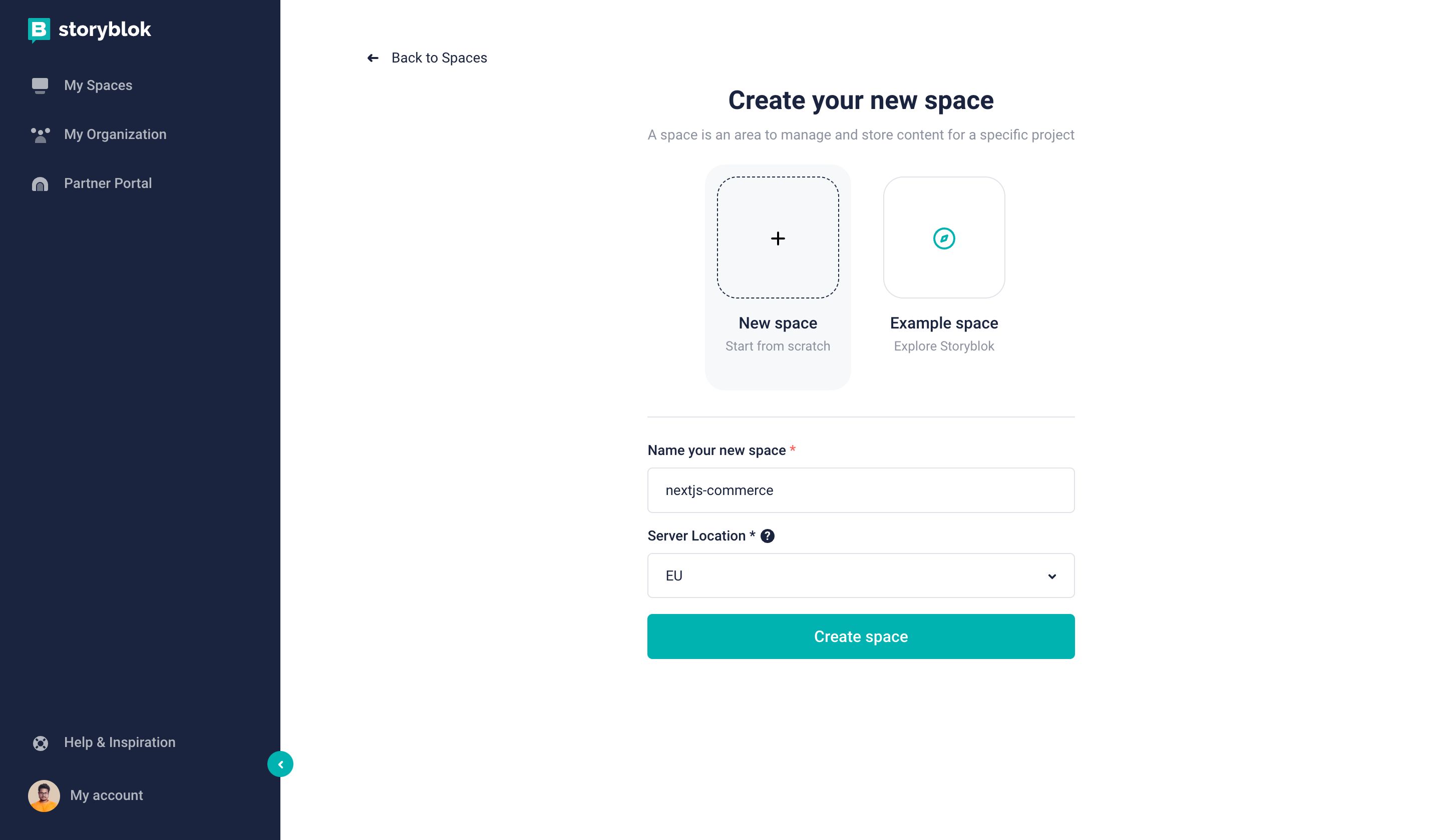
Storyblok create new space
Once the project is created, we can connect our Storyblok space to our project. You can also follow our Next.js starter guide to connect this Storyblok space with our project.
npm install @storyblok/react # run this command in the site folder
npm install local-ssl-proxy -D # run this command in the site folder
After installing the following packages, add this script to your package.json file in the site folder.
"proxy": "mkcert -install && mkcert localhost && local-ssl-proxy --source 3010 --target 3000 --cert localhost.pem --key localhost-key.pem"The above script will proxy our dev site to run on https this is required to load Storyblok data.
Furthermore, we have to add the Storyblok access token to the env.local file.
NEXT_PUBLIC_STORYBLOK_ACESSTOKEN=YOUR_ACESS_KEYNow you can open two terminals and run two commands npm run dev and npm run proxy. Now if you go to https://localhost:3010/ you will see the site is working as if nothing changed.
Now let's add the following code in _app.tsx file in your pages folder.
import { storyblokInit, apiPlugin } from '@storyblok/react'

storyblokInit({
  accessToken: process.env.NEXT_PUBLIC_STORYBLOK_ACESSTOKEN,
  use: [apiPlugin],
  apiOptions: { https: true },
  components: {}
})
We will return to this file shortly and add all of our components but for now, the empty object{} is fine.
Breakdown of the Next.js Commerce Home Page
Before we design our components in Storyblok let's first quickly take a look at how our current Home page is structured.
export default function Home({
  products
}: InferGetStaticPropsType<typeof getStaticProps>) {
  return (
    <>
      <Grid variant="filled">
        {products.slice(0, 3).map((product: any, i: number) => (
          <ProductCard
            key={product.id}
            product={product}
            imgProps={{
              alt: product.name,
              width: i === 0 ? 1080 : 540,
              height: i === 0 ? 1080 : 540,
              priority: true,
            }}
          />
        ))}
      </Grid>
      <Marquee variant="secondary">
        {products.slice(0, 3).map((product: any, i: number) => (
          <ProductCard key={product.id} product={product} variant="slim" />
        ))}
      </Marquee>
      <Hero
        headline="Dessert dragée halvah croissant."
        description="Cupcake ipsum dolor sit amet lemon drops pastry cotton candy. Sweet carrot cake macaroon bonbon croissant fruitcake jujubes macaroon oat cake. Soufflé bonbon caramels jelly beans. Tiramisu sweet roll cheesecake pie carrot cake. "
      />
      <Grid layout="B" variant="filled">
        {products.slice(0, 3).map((product: any, i: number) => (
          <ProductCard
            key={product.id}
            product={product}
            imgProps={{
              alt: product.name,
              width: i === 1 ? 1080 : 540,
              height: i === 1 ? 1080 : 540,
            }}
          />
        ))}
      </Grid>
      <Marquee>
        {products.slice(3).map((product: any, i: number) => (
          <ProductCard key={product.id} product={product} variant="slim" />
        ))}
      </Marquee>
    </>
  )
}
If we breakdown the above code we can see we have
Gridcomponent and this component take two optional propslayoutandvariantand within this, we have threeProductCardcomponents.- Next, we have a
Marqueecomponent and this component takes an optional propvariantand within this, similar to the aboveGridit also has threeProductCardcomponents. - Lastly, we have a
Herocomponent that just takes two propsheadlineanddescription.
Based on this now let's design our components in Storyblok.
Create components in Storyblok
To create new components let’s go to the Block library section in the Storyblok dashboard.
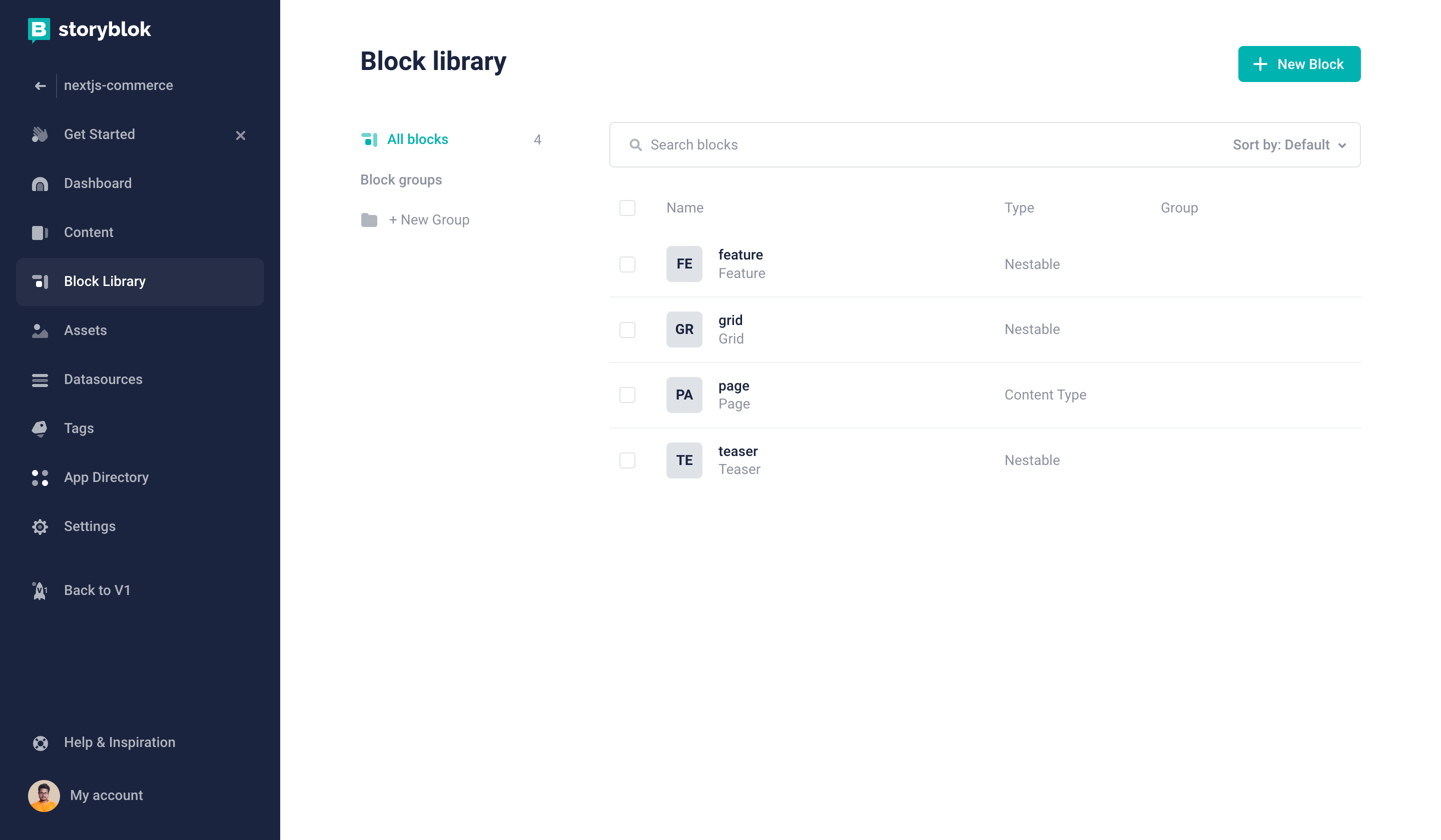
Storyblok Block Library
By default, four blocks come with an empty Storyblok project. We will delete all except the page block and then create new blocks to match our eCommerce homepage layout.
Create our first component "HeroSection"
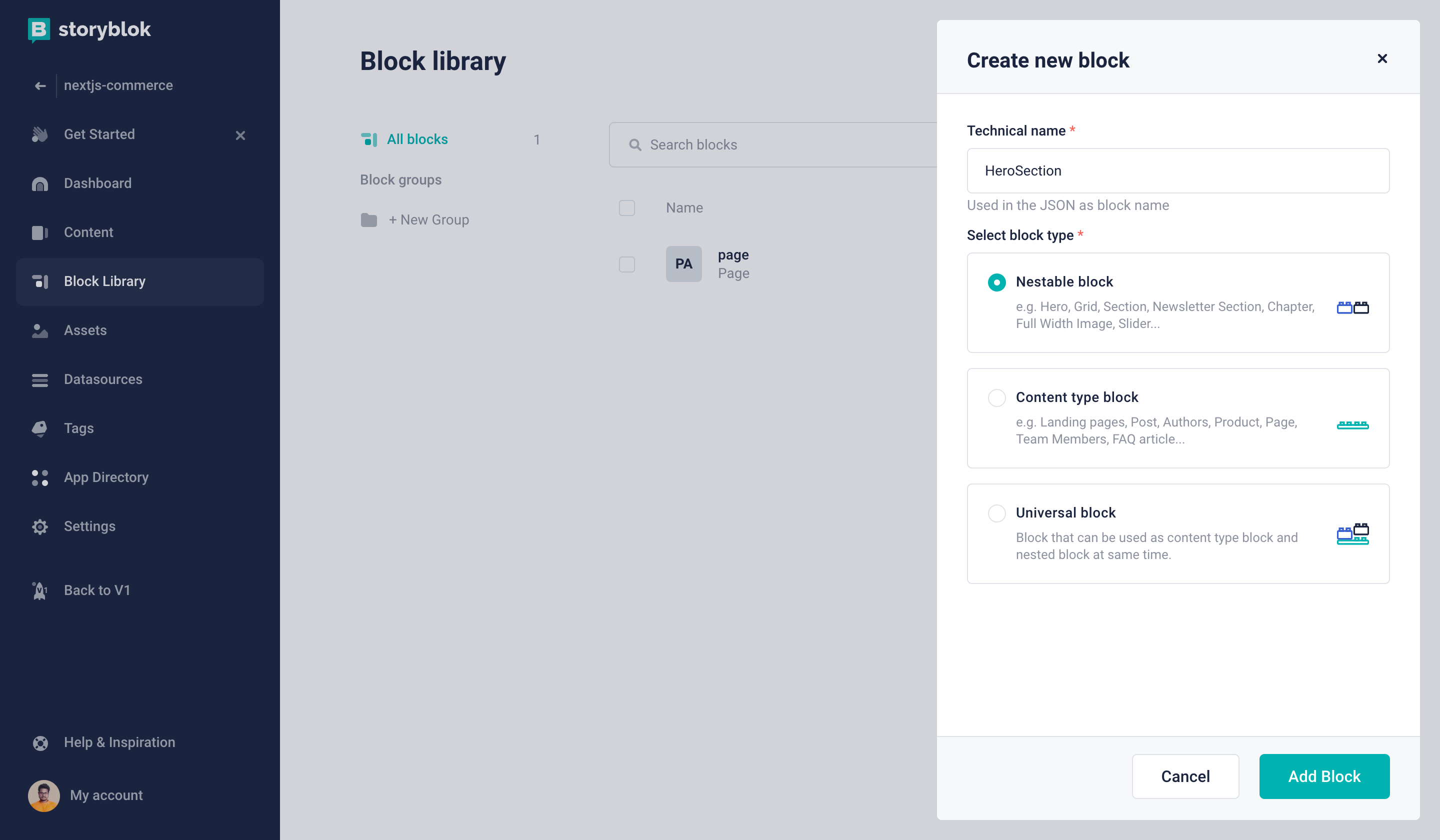
Storyblok create new block
This will represent the existing Hero component of our project. Based on this we will have two Text field headline and description. You can match the below screenshot.
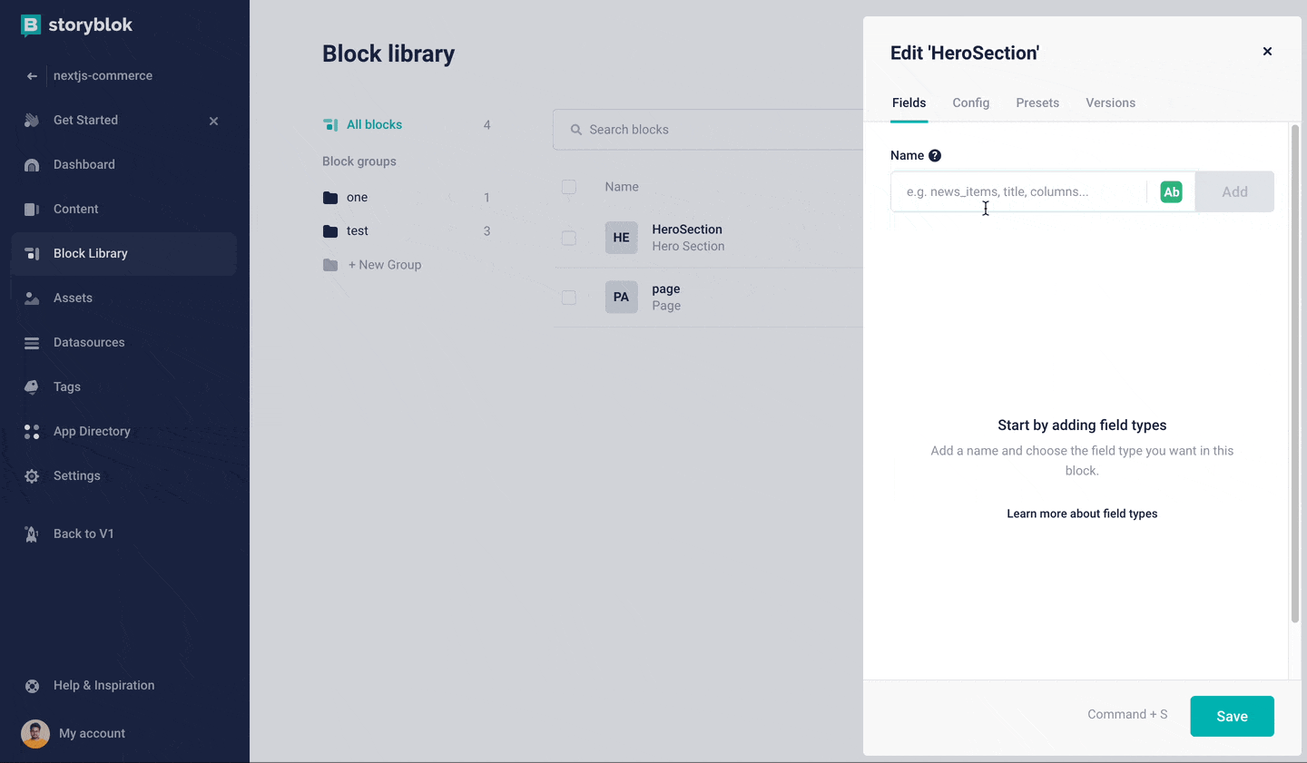
Create HeroSection block
Second component "ProductGrid"
Next, we are going to create a ProductGrid component. This will represent the Grid component and looped ProductCard within this. Let's create a new Nestable Block like the one above and name it ProductGrid.
After the block is created we are going to add a new field to this Block named variant and this will be a Single-Option field
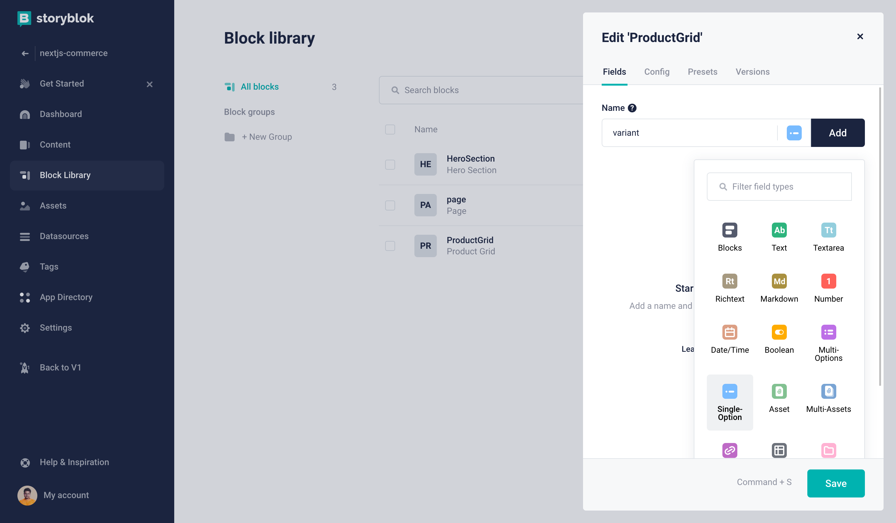
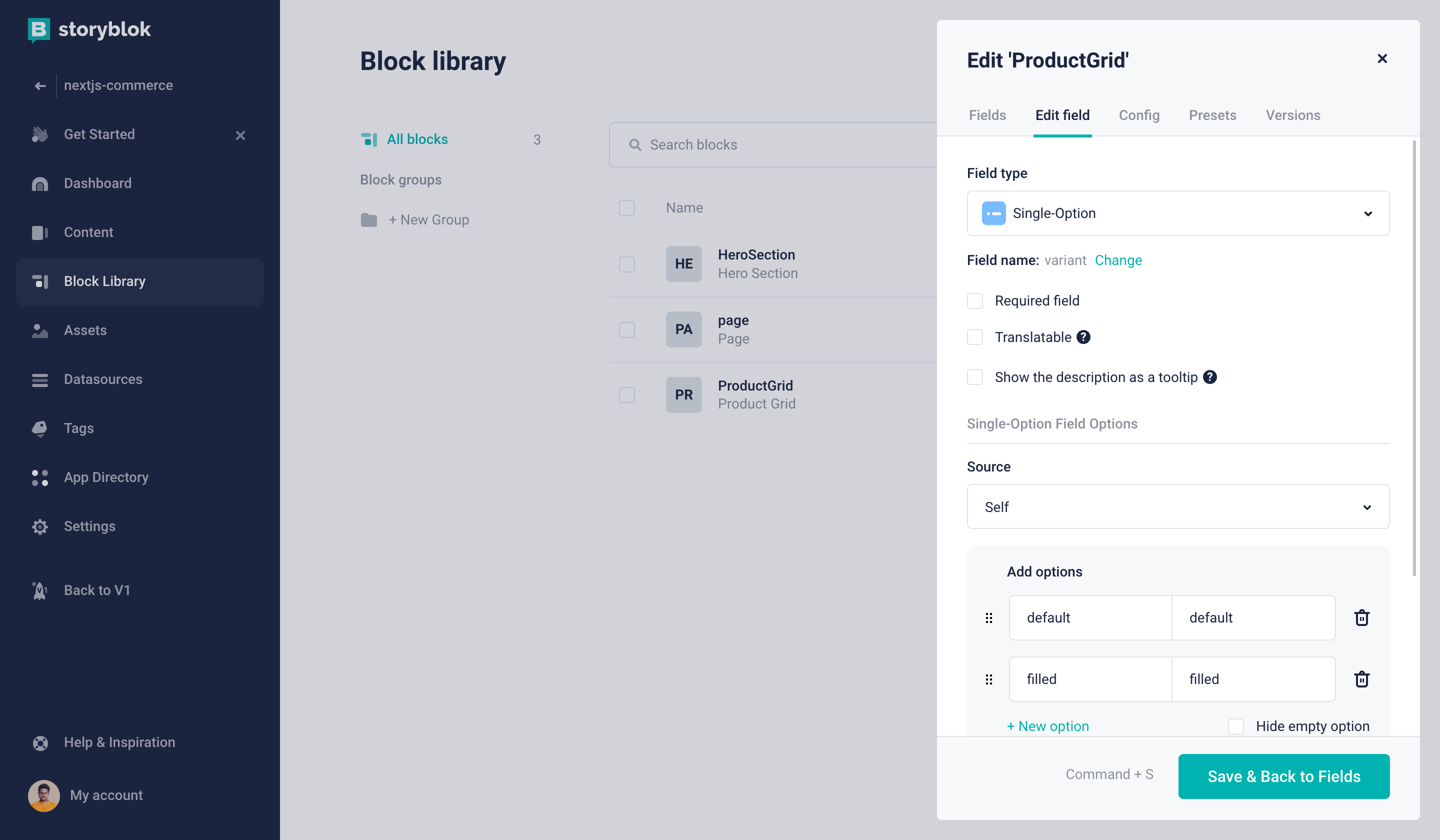
Now we can edit this field and add two options. This will let us select between these two values.
We can learn about all the props our Grid component takes in the following path site/components/ui/Grid.
interface GridProps {
  className?: string
  children?: ReactNode
  layout?: 'A' | 'B' | 'C' | 'D' | 'normal'
  variant?: 'default' | 'filled'
}
Seeing that we can add the above two values as options in our variant Single-Option Field.
Next, we will repeat the above step and create a new field named layout with the following options. layout?: 'A' | 'B' | 'C' | 'D' | 'normal'
These options and field names are not limited to what we are writing. This is just to match our current code base. You are free to add new fields and more options as you like.
The last field for this component will be products and for this, we are going to select a new field called Plugin.
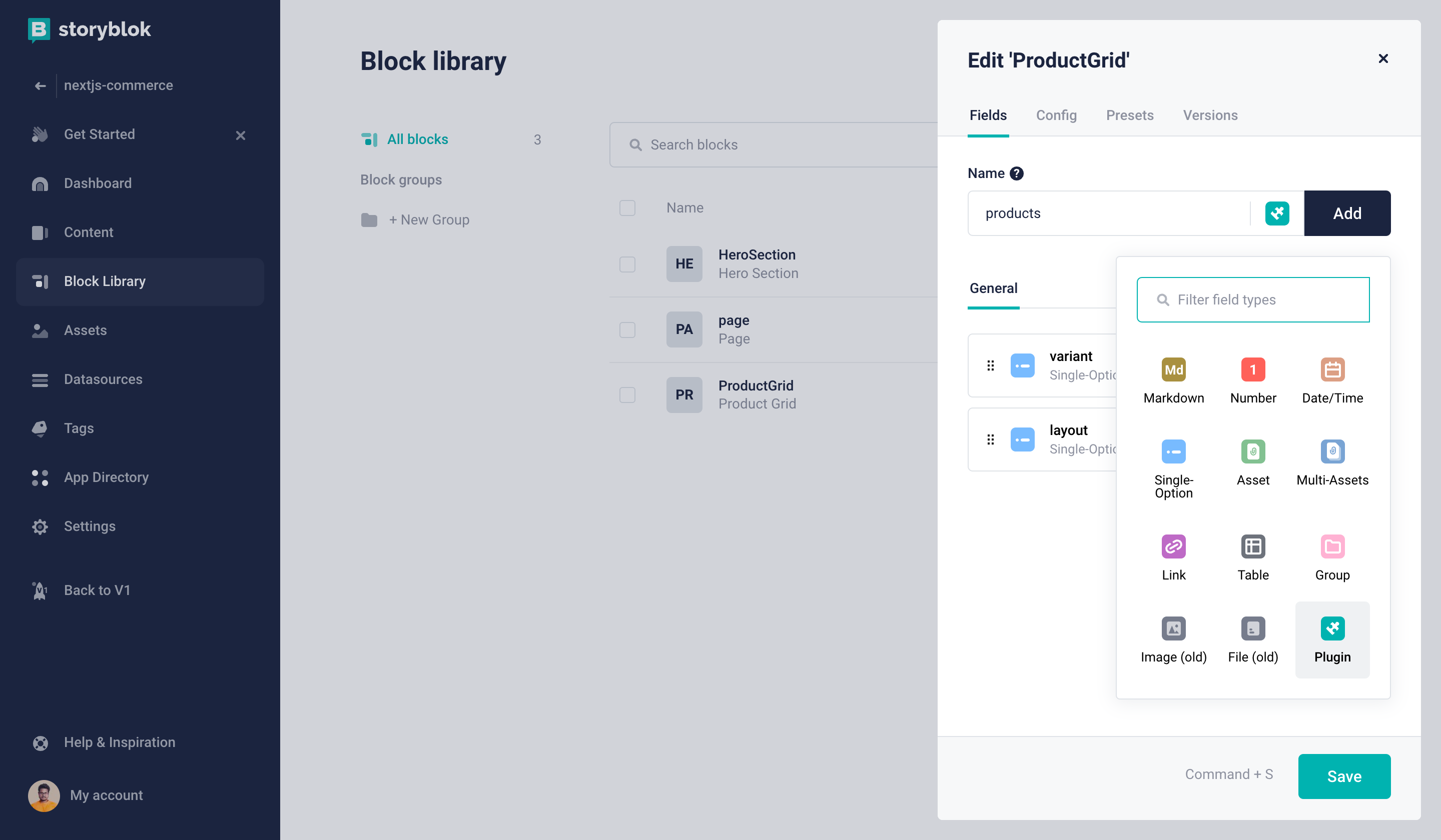
Now we need to edit this field and configure it as seen in the following screenshot:
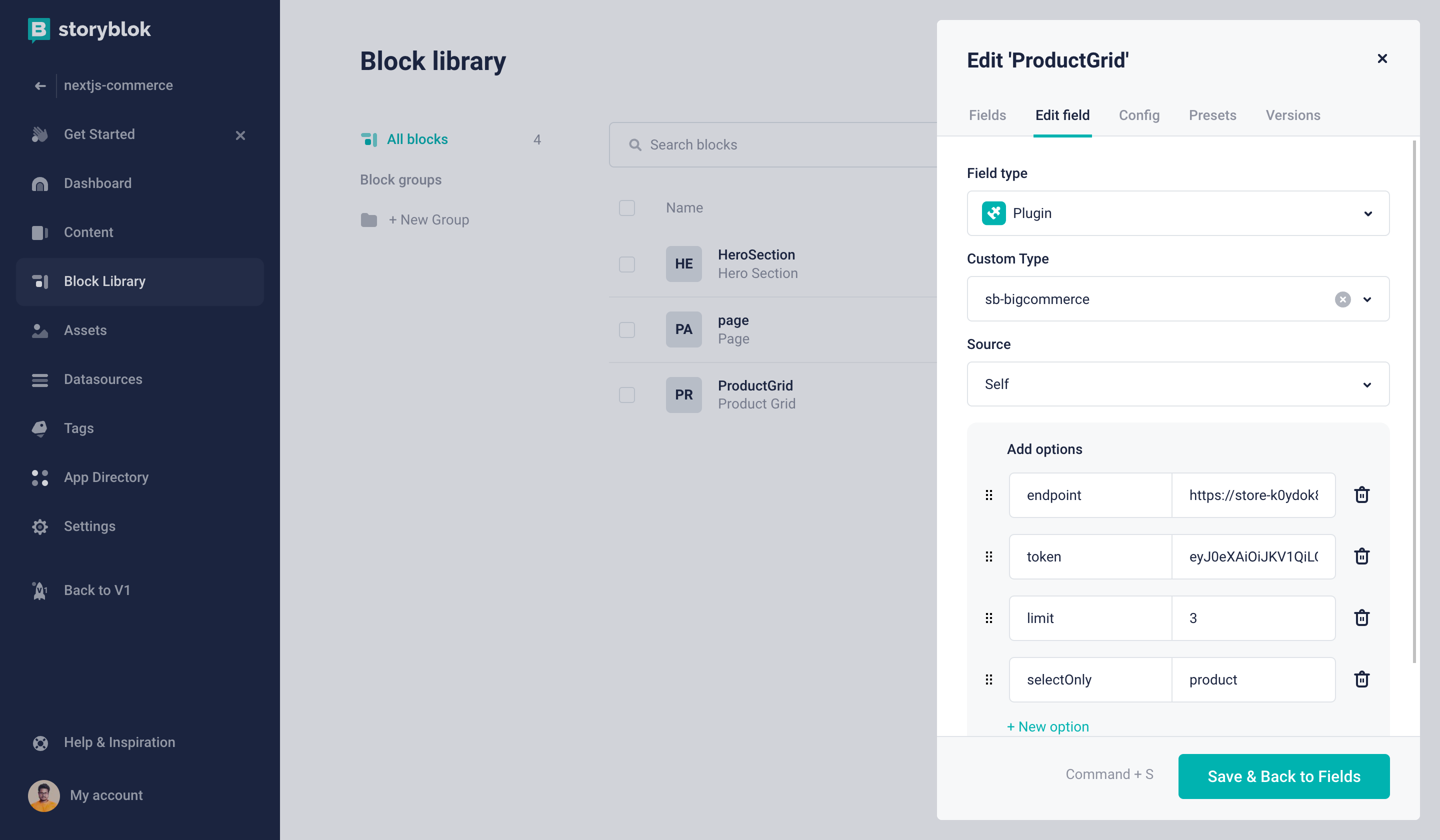
You can find the endpoint and access_token in your BigCommerce dashboard. If you are not sure you can follow this guide on how you can generate the token.
Final component "MarqueeSlider"
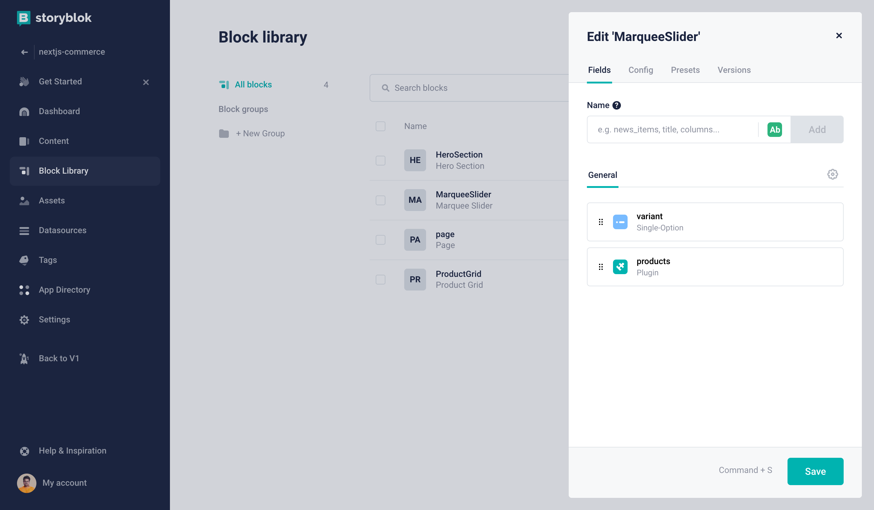
This one will be pretty similar to the above ProductGrid component. It will have two fields
variantthis will be a Single-Option Field with the following optionvariant: 'primary' | 'secondary'productsthis will be a Plugin Field, with the same option as the aboveProductGrid
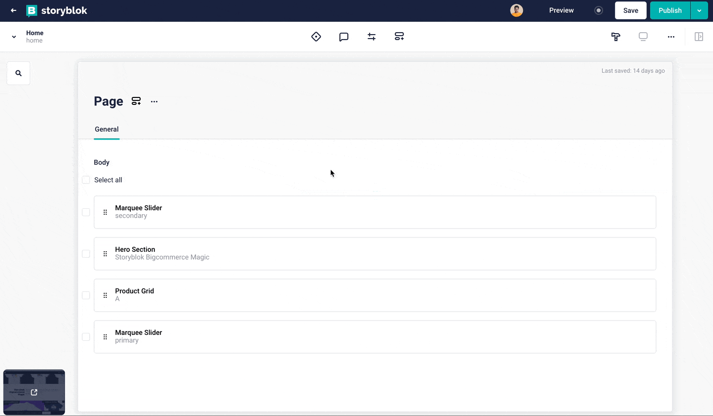
Add the following components to our Home story
Lastly, we must add our newly created components to our Home story. For this tutorial, we are going to match the components to match our code base but with Stoyblok we are free to add new components if needed.
Create Storyblok components in our project
Next, we must create the following components in our Next.js project and reference these components in the _app.txs file. Let's create a new folder named storyblok inside the site folder and create the following files.
import { storyblokEditable, StoryblokComponent, SbBlokData } from '@storyblok/react'
interface PageProps {
  blok: SbBlokData
}
export default function Page({ blok }: PageProps) {
  return (
    <div {...storyblokEditable(blok)} key={blok._uid} data-test="page">
      {blok.body
        ? (blok.body as SbBlokData[]).map((nestedBlok) => (
            <div key={nestedBlok._uid}>
              <StoryblokComponent blok={nestedBlok} />
            </div>
          ))
        : null}
    </div>
  )
}import { Hero } from '@components/ui'
import { storyblokEditable } from '@storyblok/react'
interface Props {
blok: {
_uid: string
headline: string
description: string
}
}
export default function HeroSection({ blok }: Props) {
return (
<div
{...storyblokEditable(blok)}
key={blok._uid}
data-test="storyblok-hero-section"
className="storyblok-hero-section"
>
<Hero headline={blok.headline} description={blok.description} />
</div>
)
}import { storyblokEditable } from '@storyblok/react'
import SingleProduct from './SingleProduct'
import { Grid } from '@components/ui'
interface Props {
blok: {
_uid: string
products: {
items: PItem[]
}
variant: 'default' | 'filled'
layout: 'A' | 'B' | 'C' | 'D' | 'normal'
}
}
interface PItem {
id: number
}
export default function ProductGrid({ blok }: Props) {
let { variant, layout, products } = blok
return (
<div
{...storyblokEditable(blok)}
key={blok._uid}
data-test="storyblok-product-grid"
className="storyblok-product-grid"
>
<Grid variant={variant} layout={layout}>
{products?.items?.map((item, index) => (
<SingleProduct key={item.id} index={index} productID={item.id} />
))}
</Grid>
</div>
)
}In the above component, you can see that we are looping through the products. Instead of passing the ProductCard we are passing a component called SingleProduct and this component takes only productID.
The reason for doing this is following
- Incoming product details are very limited, and there is no way to get more info for each product from Storyblok (this is by design).
- The data coming from Storyblok is static/cached in Storyblok CDN but for an eCommerce site always updated information is more desirable.
This is why we are going to only take the productID from Storyblok and then we will validate the data on our end and also get all the required info for ProductCard component.
First, create an API endpoint that gets the product info by ID
import { normalizeProduct } from '@framework/lib/normalize'
import type { NextApiRequest, NextApiResponse } from 'next'
export default async function handler(
  req: NextApiRequest,
  res: NextApiResponse
) {
  const { pid } = req.query
  if (!pid || typeof parseInt(pid as string) !== 'number') {
    res.status(400).json({
      error: true,
      message: 'Not a valid product ID',
    })
  }
  const product = await fetchClient({
    query,
    variables: {
      productId: parseInt(pid as string),
    },
  })
  let haveProduct = product?.site?.product
  if (!haveProduct) {
    res.status(500).json({ error: true, message: 'No product found' })
  }
  let parsedProduct = normalizeProduct(haveProduct)
  res.status(200).json({ product: parsedProduct })
}
let fetchClient = async ({ query = '', variables = {} }) => {
  let url = process.env.BIGCOMMERCE_STOREFRONT_API_URL!
  try {
    const response = await fetch(url, {
      method: 'POST',
      headers: {
        'Content-Type': 'application/json',
        Authorization: `Bearer ${process.env
          .BIGCOMMERCE_STOREFRONT_API_TOKEN!}`,
      },
      body: JSON.stringify({
        query,
        variables,
      }),
    })
    const { data } = await response.json()
    return data
  } catch (error) {
    throw new Error('Failed to fetch API')
  }
}
let query = `
query productById($productId: Int!) {
  site {
    product(entityId: $productId) {
      entityId
      name
      path
      description
      prices {
        price {
          value
          currencyCode
        }
      }
      images {
        edges {
          node {
            urlOriginal
            altText
            isDefault
          }
        }
      }
      variants(first: 250) {
        edges {
          node {
            entityId
            defaultImage {
              urlOriginal
              altText
              isDefault
            }
          }
        }
      }
      productOptions {
        edges {
          node {
            __typename
            entityId
            displayName
            ...multipleChoiceOption
          }
        }
      }
    }
  }
}
fragment multipleChoiceOption on MultipleChoiceOption {
  values {
    edges {
      node {
        label
        ...swatchOption
      }
    }
  }
}
fragment swatchOption on SwatchOptionValue {
  isDefault
  hexColors
}`
This will give us the formatted product information that will match what we need to pass as props in ProductCard component. Next, we can create our SingleProduct component as follows.
import useSWR from 'swr'
import { ProductCard } from '@components/product'
export default function SingleProduct({
  index,
  productID,
}: {
  index: number
  productID: number
}) {
  const { data }: any = useSWR(
    `/api/get-product/${productID}`,
    (apiURL: string) => fetch(apiURL).then((res) => res.json())
  )
  if (!data || data?.error)
    return <p style={{ backgroundColor: 'black' }}>Loading...</p>
  let product = data.product
  return (
    <ProductCard
      key={product.id}
      product={product}
      imgProps={{
        alt: product.name,
        width: index === 0 ? 1080 : 540,
        height: index === 0 ? 1080 : 540,
        priority: true,
      }}
    />
  )
}
Lastly, we have one component left MarqueeSlider. let’s create it.
import { storyblokEditable } from '@storyblok/react'
import SingleProduct from './SingleProduct'
import { Marquee } from '@components/ui'
interface Props {
  blok: {
    _uid: string
    products: {
      items: PItem[]
    }
    variant: 'primary' | 'secondary'
  }
}
interface PItem {
  id: number
}
export default function MarqueeSlider({ blok }: Props) {
  let { variant, products } = blok
  return (
    <div
      {...storyblokEditable(blok)}
      key={blok._uid}
      data-test="storyblok-marquee-slider"
      className="storyblok-marquee-slider"
    >
      <Marquee variant={variant}>
        {products?.items?.map((item, index) => (
          <SingleProduct key={item.id} index={index} productID={item.id} />
        ))}
      </Marquee>
    </div>
  )
}
Now, we have created all the components that we defined in Storyblok let's pass these into _app.tsx file.
import { storyblokInit, apiPlugin } from '@storyblok/react'
import Page from '../storyblok/Page'
import ProductGrid from '../storyblok/ProductGrid'
import HeroSection from '../storyblok/HeroSection'
import MarqueeSlider from '../storyblok/MarqueeSlider'
storyblokInit({
  accessToken: process.env.NEXT_PUBLIC_STORYBLOK_ACESSTOKEN,
  use: [apiPlugin],
  apiOptions: { https: true },
  components: {
    page:Page,
    ProductGrid,
    HeroSection,
    MarqueeSlider
  },
})
Next, go to our index.tsx page and replace this file with the following code.
import { Layout } from '@components/common'
import type { GetStaticPropsContext, InferGetStaticPropsType } from 'next'
import {
useStoryblokState,
getStoryblokApi,
StoryblokComponent,
} from '@storyblok/react'
export async function getStaticProps({
preview,
locale,
locales,
}: GetStaticPropsContext) {
let slug = 'home'
const storyblokApi = getStoryblokApi()
let { data } = await storyblokApi.get(`cdn/stories/${slug}`, {
version: 'draft',
})
return {
props: {
story: data ? data.story : false,
},
revalidate: 60,
}
}
export default function Home({
story: initialStory,
}: InferGetStaticPropsType<typeof getStaticProps>) {
const story = useStoryblokState(initialStory)
if (story?.content === (undefined || null)) {
return <div>Loading...</div>
}
return <StoryblokComponent blok={story.content} />
}
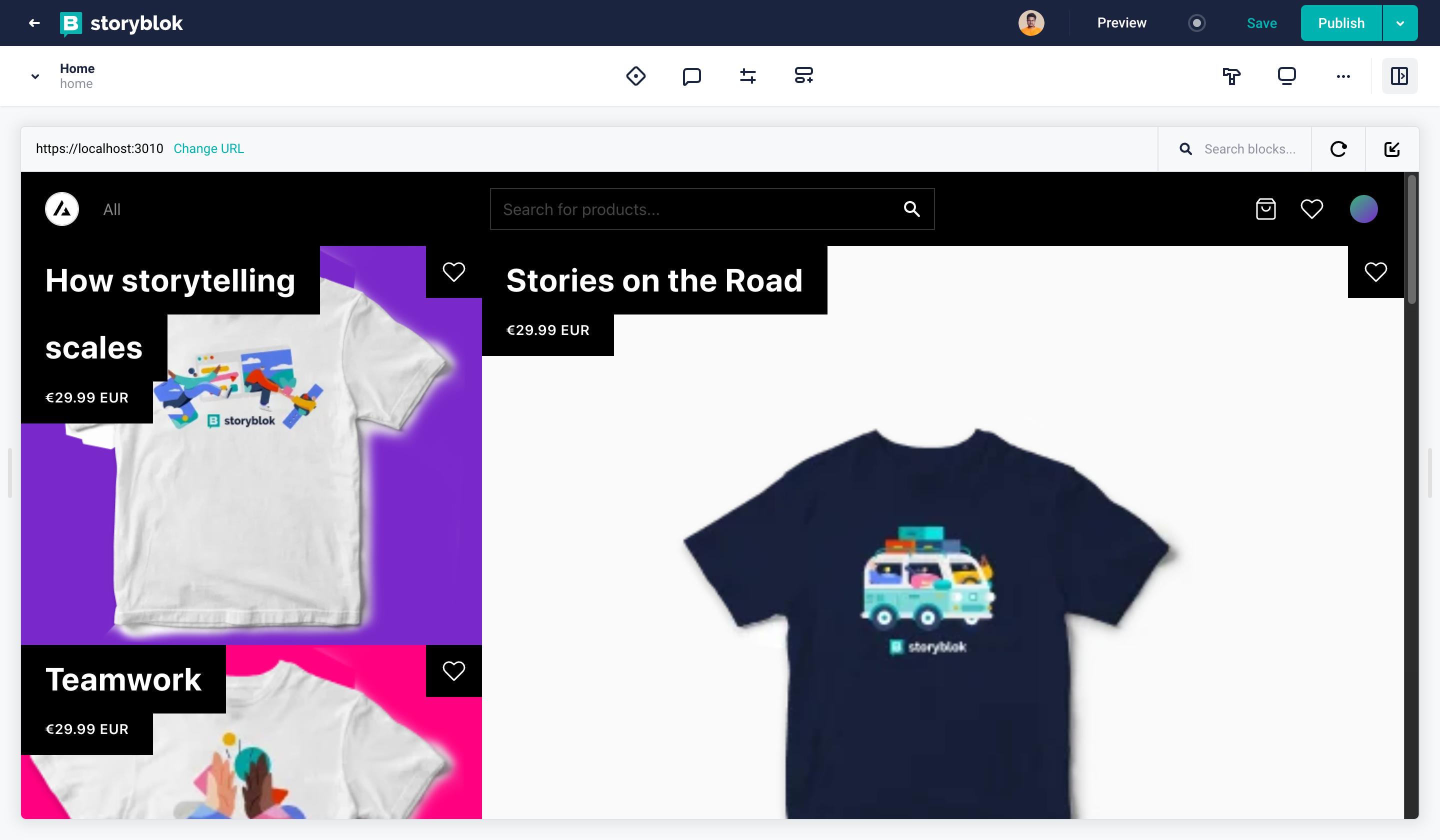
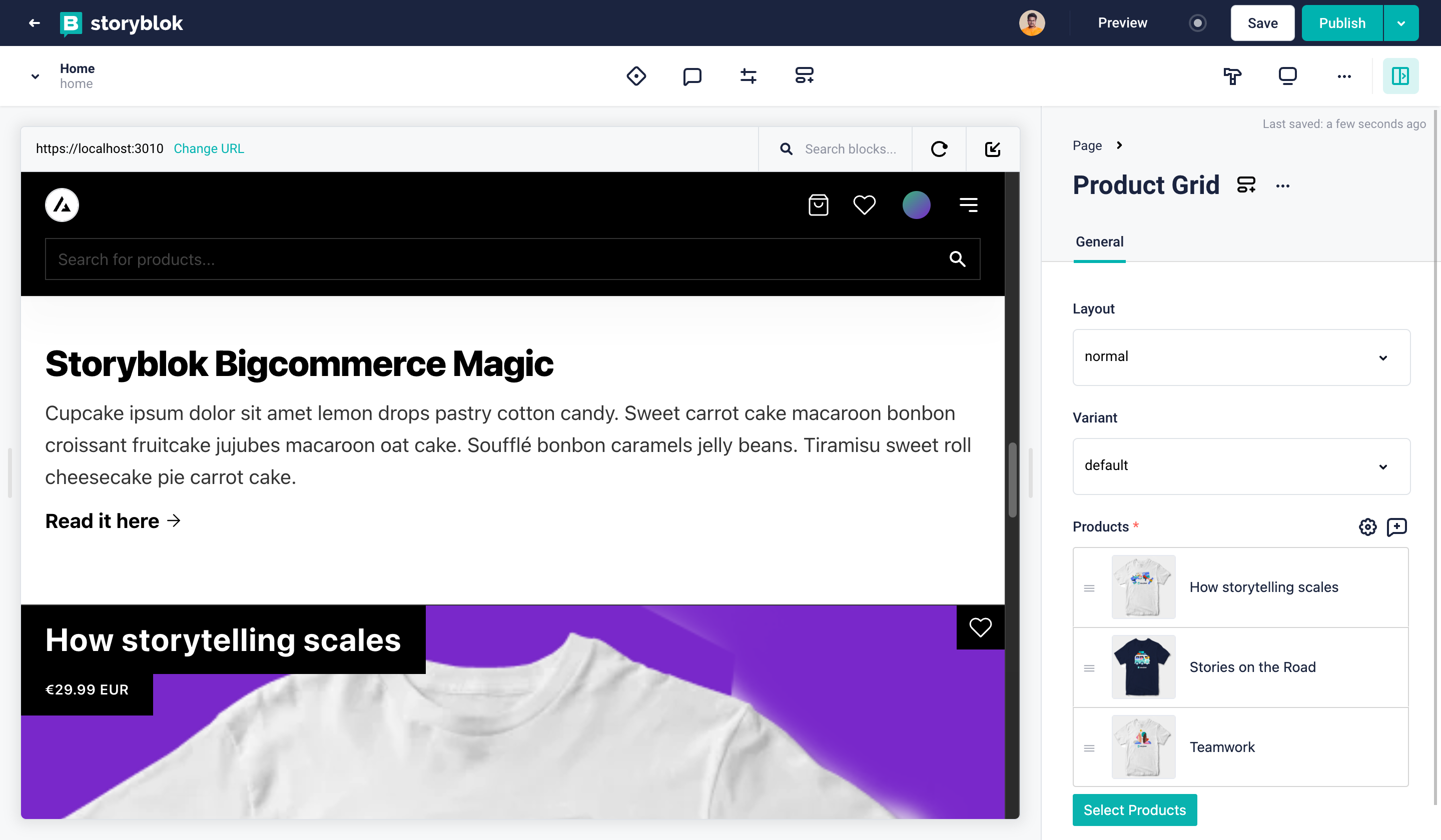
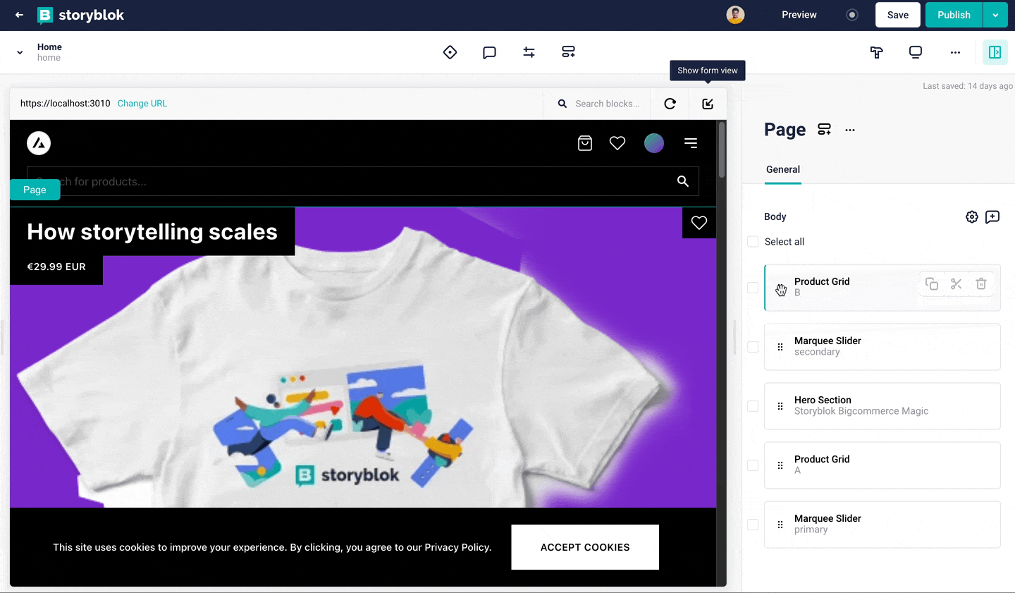
Home.Layout = LayoutWe can already see how minimal our homepage code looks compared to before. Now let's visit https://localhost:3010/ and make sure our site works as expected.
We now don't have hard-coded products on our home page. We can easily change the products for each section and reorder components directly from the Storyblok Visual Editor and see the live preview. Once we publish it will reflect automatically on our site without touching the code.
Finally, by implementing Storyblok with our existing codebase we not only reduced the number of codes in our project but also added a lot of new possibilities. Now we can create new components and make all the parts of our site fully dynamic. We can reuse these components throughout our site to reduce development time and give the content creators much more flexibility.
| Name | Link |
|---|---|
| Next.js Commerce Quick Start | https://developer.bigcommerce.com/api-docs/storefronts/nextjs-commerce |
| Next.js Commerce | https://nextjs.org/commerce |
| Bigcommerce API Accounts & OAuth Scopes | https://developer.bigcommerce.com/api-docs/getting-started/api-accounts |
| Storyblok eCommerce Integrations | https://www.storyblok.com/docs/guide/integrations/ecommerce |
