How to use Nuxt components inside Storyblok Rich-Text editor
Storyblok is the first headless CMS that works for developers & marketers alike.
I will talk about a feature of Storyblok that is not highlighted enough, yet is extremely powerful. The rich-text field, and more specifically, the possibility of inserting components.
To provide some context, the rich-text at Storyblok is based on prosemirror.
Why use Richtext with Storyblok?
I am going to provide an example of how to use it and small tips that will bring you the added value for its use.
Storyblok configuration
You have a Nuxt project with storyblok-nuxt installed. From there you can start using the rich-text feature of Storyblok.
Define components
For the Storyblok part we will create a home page like in the image below.
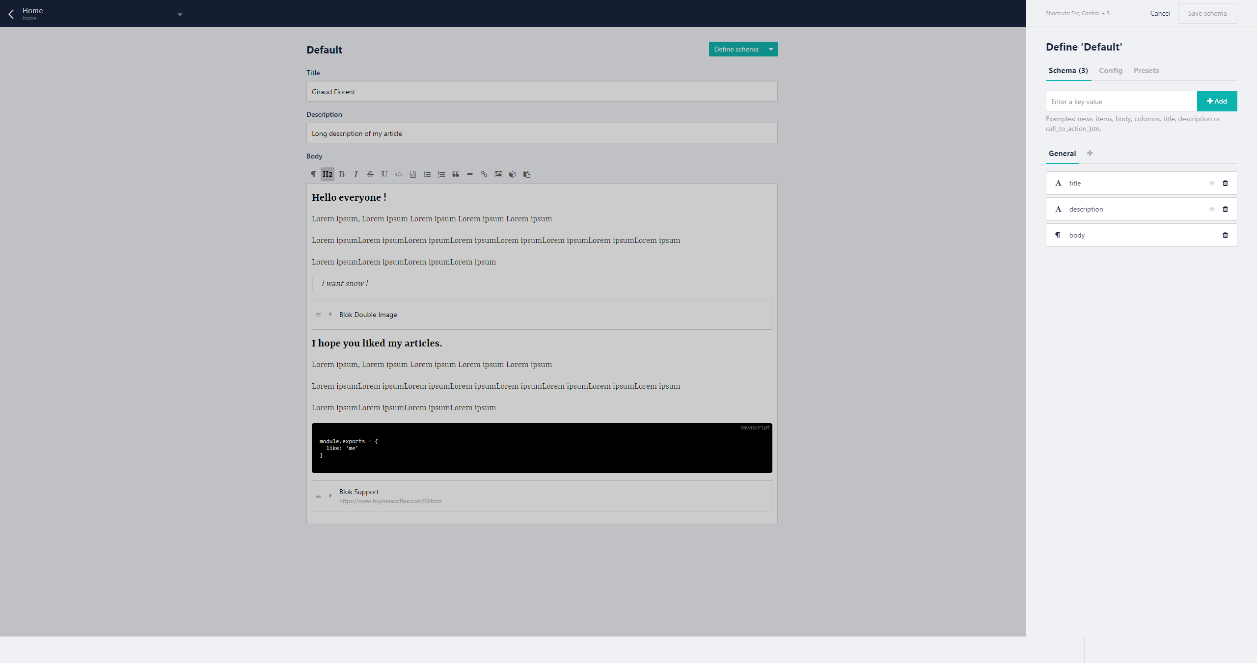
The body part here is our focus-it will be our rich-text. The small configuration that I like to use when I write my articles is to disable the preview.
Before going into detail, we will first create the two components to use in our rich-text.
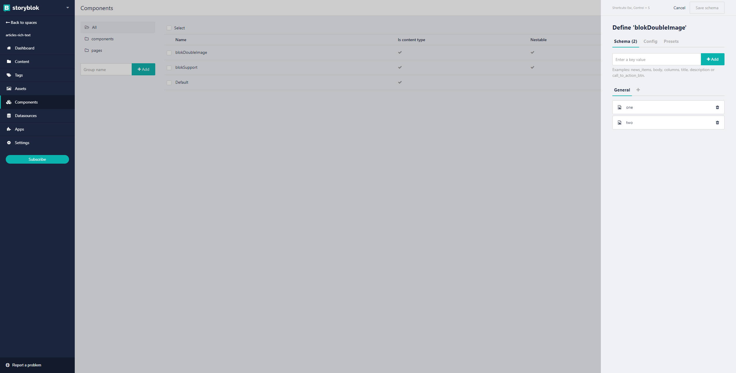
Our blokDoubleImage Component
The blokDoubleImage represents a block with 2 images taking 50% of the space.
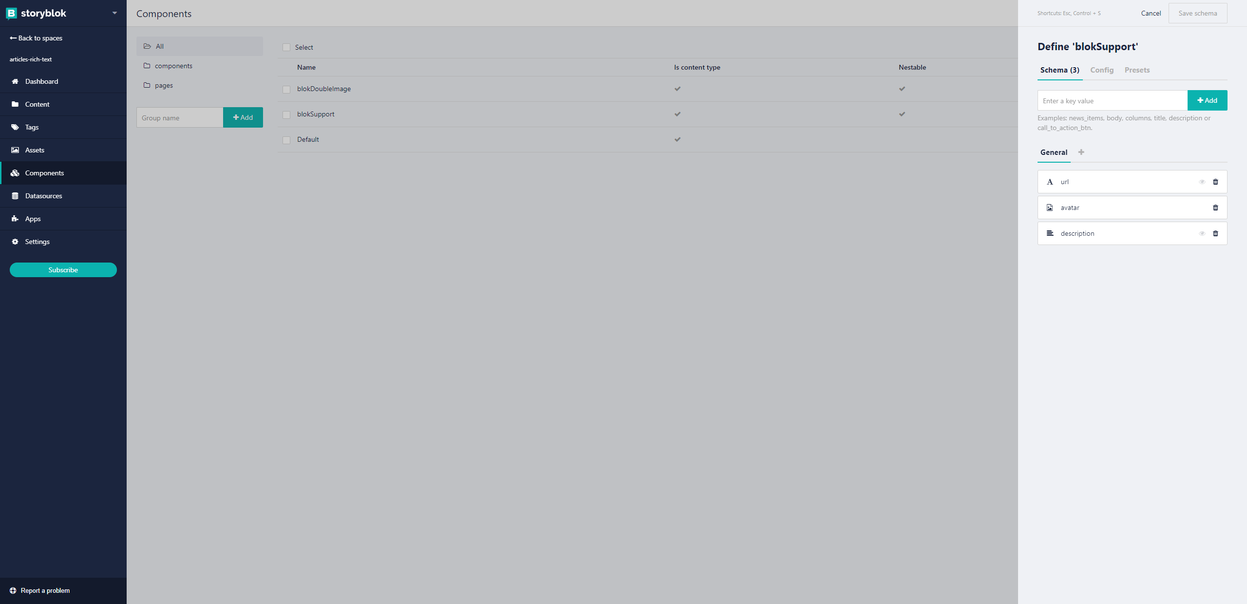
Our blokSupport Component
The blokSupport represents a banner in the flow of the page, composed of an URL, an image of the person and a description text .
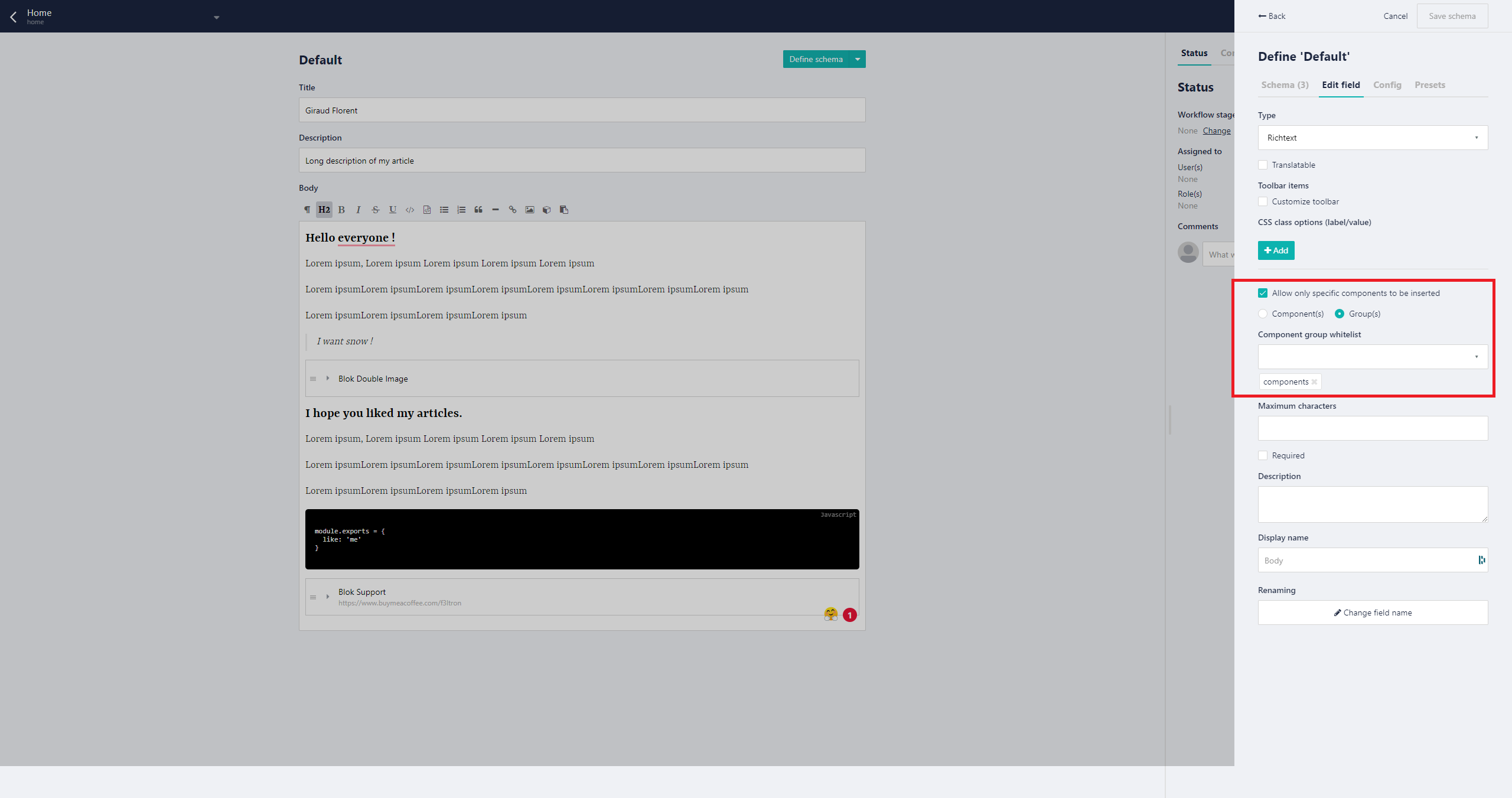
For each component I suggest you use the preview functionality.
This option lets you define a screenshot that gets shown when the user inserts a new component in the blocks field. This helps the user to better identify the component type.
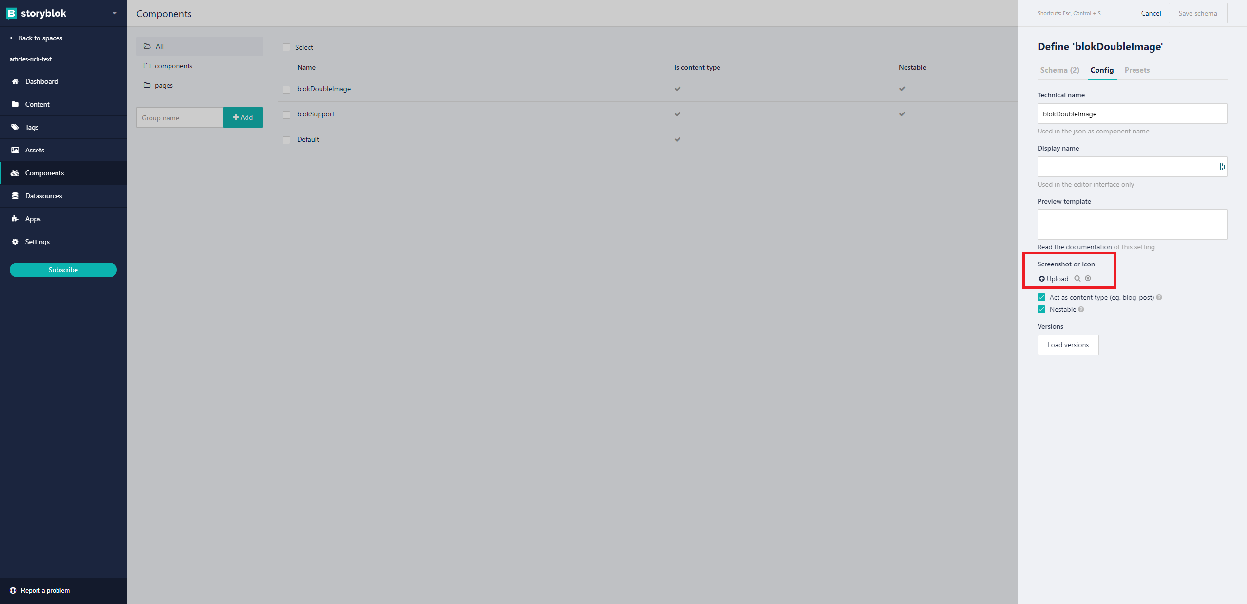
This gives you a mini-preview of your components which helps your users see what they are going to use.
Example:
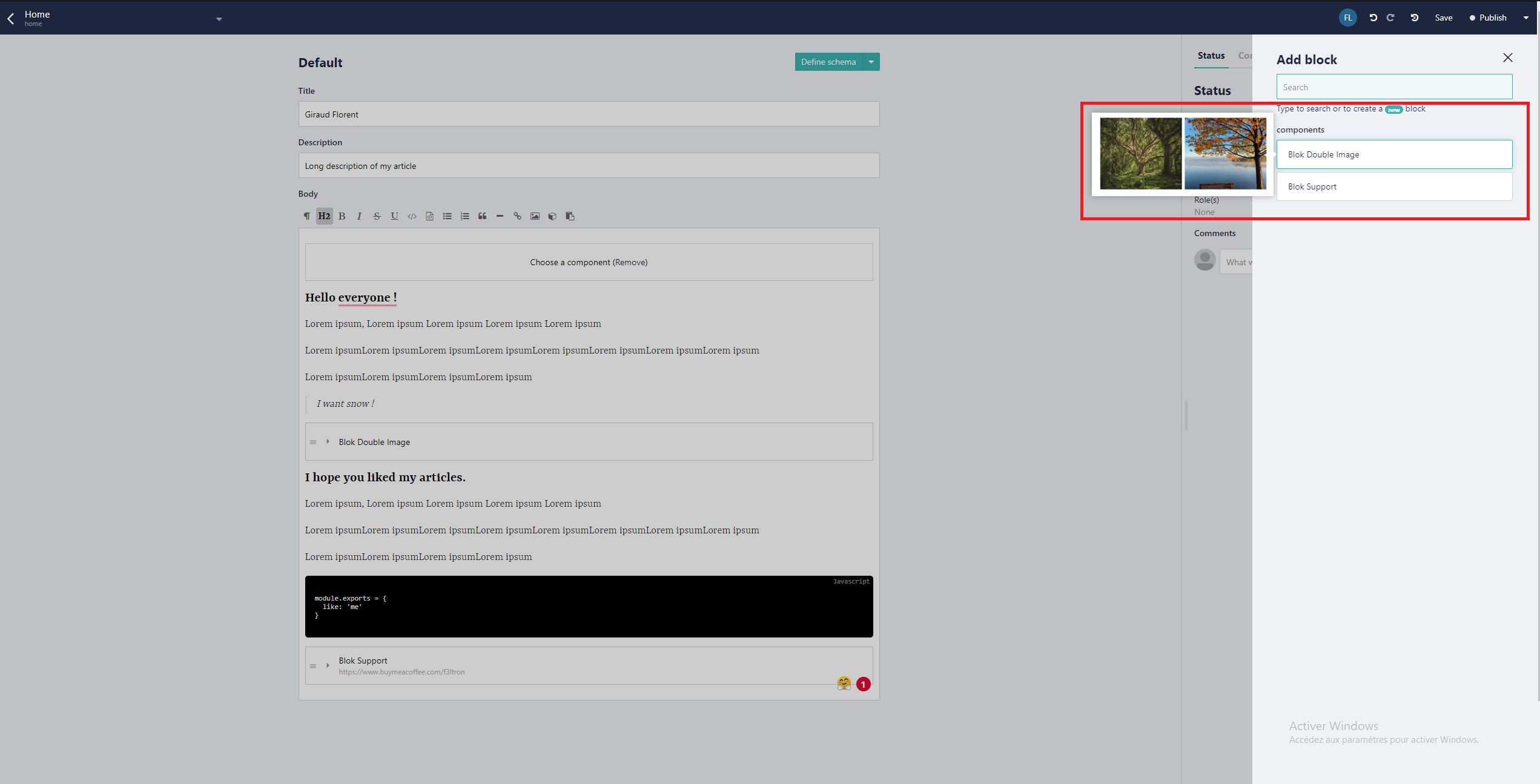
We will now configure and insert our two components in the rich-text.
Et voila ! Now we can move on to Nuxt!
Nuxt Configuration
So now we want to do the following:
- Prepare our components
- Call the content of our home page
- Render our rich text with the components.
Prepare our components
You must make sure that the name of the components will be the same as that on Storyblok.
Example: BlokInfo should be BlockInfo too or blok-info.
BlokDoubleImage.vue
<template>
  <div class="flex -mx-2 my-4">
    <div class="px-2 w-1/2">
      <div
        class="bg-image"
        :style="{ backgroundImage: `url('${body.one.filename}')` }"
      ></div>
    </div>
    <div class="px-2 w-1/2">
      <div
        class="bg-image"
        :style="{ backgroundImage: `url('${body.two.filename}')` }"
      ></div>
    </div>
  </div>
</template>

<script>
export default {
  props: {
    body: {
      type: Object,
      required: true,
    },
  },
}
</script>

<style lang="postcss">
...
</style>
BlokSupport.vue
<template>
  <div class="support w-full lg:w-1/2">
    <div class="rounded-lg shadow-xl p-4 flex">
      <div class="flex items-center w-1/3">
        <img
          :src="body.avatar.filename"
          :alt="body.avatar.alt"
          class="rounded-full object-cover"
        />
      </div>
      <div class="p-2 w-2/3">
        <p class="mb-4">{{ body.description }}</p>
        <a
          target="_blank"
          :href="body.url"
          class="bg-yellow-400 text-black px-4 py-2 rounded-lg flex items-center w-40"
        >
          <Coffee class="w-6 h-6 mr-2" />
          <span>Buy coffee</span>
        </a>
      </div>
    </div>
  </div>
</template>

<script>
export default {
  props: {
    body: {
      type: Object,
      required: true,
    },
  },
}
</script>

<style lang="postcss">
...
</style>
Call the content of our home page
In your index.vue use the following code.
index.vue
<template>
  <div class="m-auto w-full md:w-2/3 px-4">
    <h1 class="text-6xl font-bold mb-4">{{ title }}</h1>
    <p class="text-lg mb-8">{{ description }}</p>
    <div class="mb-8">
      <SbRichText :text="body" />
    </div>
  </div>
</template>

<script>
export default {
  async asyncData({ app }) {
    try {
      const { data } = await app.$storyapi.get(`cdn/stories/home`, {
        version: process.env.STORYBLOK_VERSION || 'draft',
      })
      return {
        ...data.story.content,
      }
    } catch (e) {
      console.error(e)
    }
  },
}
</script>
Render our rich text with the components.
First create the rich text component.
SbRichText.vue
<template>
  <div>
    <RichTextRenderer :document="text" />
  </div>
</template>

<script>
export default {
  props: {
    text: {
      type: [String, Object],
      default: '',
    },
  },
  computed: {
    richtext() {
      return typeof this.text === 'string'
        ? this.text
        : this.$storyapi.richTextResolver.render(this.text)
    },
  },
}
</script>

<style lang="postcss" scoped>
... your css for your rich text
</style>
By default, Storyblok's rich-text component is not able to render inline components. To do this you need a compiler. In our case, I suggest you use storyblok-rich-text-renderer.
You will have to install it.
yarn add --dev @marvr/storyblok-rich-text-vue-renderer

yarn add --dev @vue/composition-api // It needs vue composition api to make it work.
Create two plugins:
plugins/composition-api.js
import Vue from 'vue'
import VueCompositionApi from '@vue/composition-api'

Vue.use(VueCompositionApi)
plugins/rich-text-renderer.js
import Vue from 'vue'
import VueRichTextRenderer from '@marvr/storyblok-rich-text-vue-renderer'
import blokDoubleImage from '@/components/bloks/blok-double-image'
import blokSupport from '@/components/bloks/blok-support'

Vue.use(VueRichTextRenderer, {
  resolvers: {
    components: {
      blokDoubleImage,
      blokSupport,
    },
  },
})
Don't forget to update the config of the Nuxt.
./nuxt.config.js
export default {
	...
	plugins: ['~/plugins/composition-api.js', '~/plugins/rich-text-renderer.js'],
}You must follow the order exactly or it will not work.
Conclusion
Voila! Now your components should be rendered. You can create a full component library and give freedom to your content creator. The only limit is your imagination!
| Resource | URL |
|---|---|
| Github repository for this article | https://github.com/f3ltron/storyblok-nuxt-rich-text-components |
| Storyblok Rich Text Documentation | https://www.storyblok.com/docs/richtext-field |
| Storyblok Rich Text Renderer | https://github.com/MarvinRudolph/storyblok-rich-text-renderer |
| Nuxt | https://nuxtjs.org |
Question or Feedback?
Author
