Add a headless CMS with Live Preview to Qwik in 5 Minutes
Storyblok is the first headless CMS that works for developers & marketers alike.
This short tutorial will show you how to integrate the data from the Storyblok API into a Qwik (opens in a new window) app to create a site. We will also enable the real-time editing experience in the Visual Editor with the Storyblok JS Bridge - so that you can see your changes right away. At the end of this article, you will have a Qwik website that renders components filled with data from Storyblok (opens in a new window).
If you don't know what a Headless CMS is or what Storyblok does, please read first the Storyblok Guide (opens in a new window).
If you’re in a hurry, check out the Qwik Storyblok boilerplate repository on Github!
Environment Setup
Requirements
To follow this tutorial, make sure to meet these requirements:
- Basic understanding of Qwik (opens in a new window) and Javascript
- Node.js (opens in a new window)LTS version
- An account in the Storyblok App (opens in a new window)
The project in this tutorial and its subsequent parts was developed using the following versions:
- @builder.io/qwik@1.5.1
- @storyblok/js@3.0.7
Please remember that these versions may be slightly behind the latest ones.
Create a Qwik project
What’s Qwik offering us
Qwik is designed from the ground up to address the size problem. Small bundle size is its initial goal, and all other design decisions are subservient to that goal.
Qwik is not about creating less JavaScript. Qwik is about not having to ship all that JavaScript to the client at once on application startup. Qwik is what you end up with when you take the idea of "delay loading of JavaScript" to the extreme.
Yes, Qwik requires a different way of thinking and designing your application, but the result is near zero initial JavaScript with progressive JavaScript download based on user interactions.
Let’s create our Qwik app
Let's follow the official Qwik documentation (opens in a new window) to create an app with the latest version of Qwik. Run this command:
pnpm create qwik@latestHere, you will be presented with a few options - for the sake of this tutorial:
- Where would you like to create your new project?
./qwik-ultimate-tutorial-series - Select a starter
Empty App - Would you like to install pnpm dependencies?
Yes - Initialize a new git repository? (Up to you)
- Finishing the install. Wanna hear a joke?
Yes(Who doesn’t want to laugh sometimes)
Once you have created the project, go to the directory by running cd qwik-ultimate-tutorial-series and launch the project by running pnpm start. Now you’ll see this screen when you open http://localhost:5173/ in your browser:
Welcome screen of your Qwik project
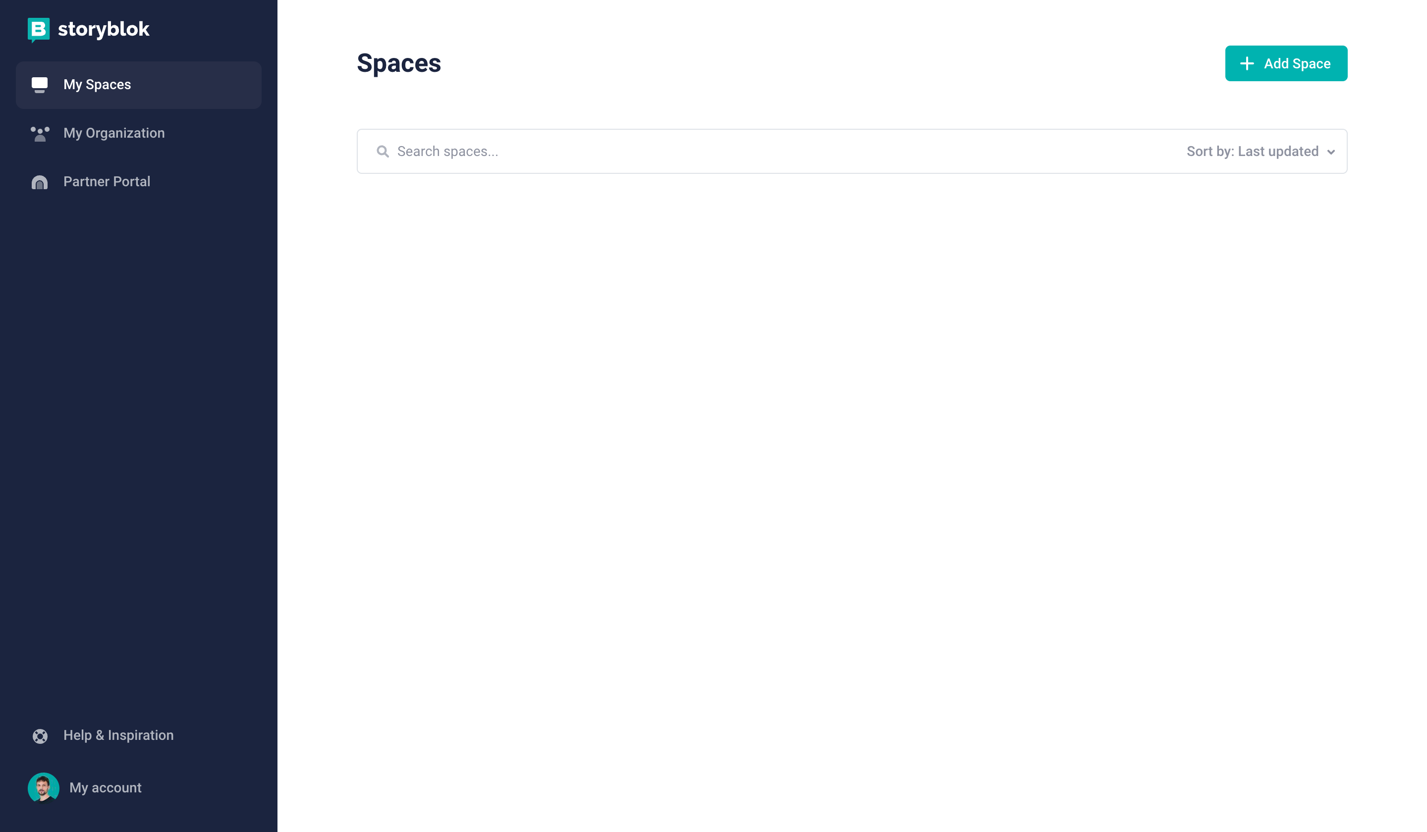
Configuration of the space
You can easily configure a new space by clicking Add Space {1} after having logged in to Storyblok.
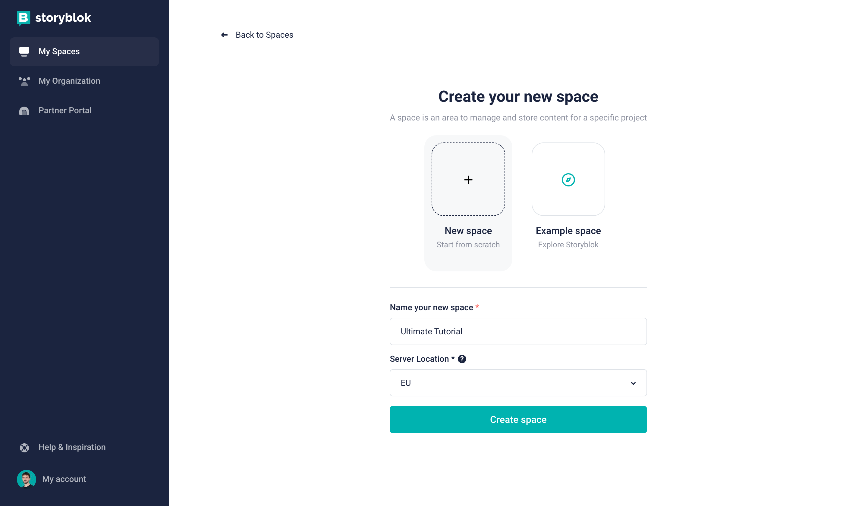
Creating a new space in Storyblok
Create a new space in the Storyblok app by choosing the Create space {1} option. Pick a name for it {2}. Optionally, you can choose between different server locations for your space {3} (if you choose the United States or China, please be mindful of the required API parameter explained hereinafter).
Creating a new space in Storyblok
Shortly afterward, a Storyblok space with sample content has been created for you. Let’s open the Home story by first clicking on Content {1} and then on Home {2}:
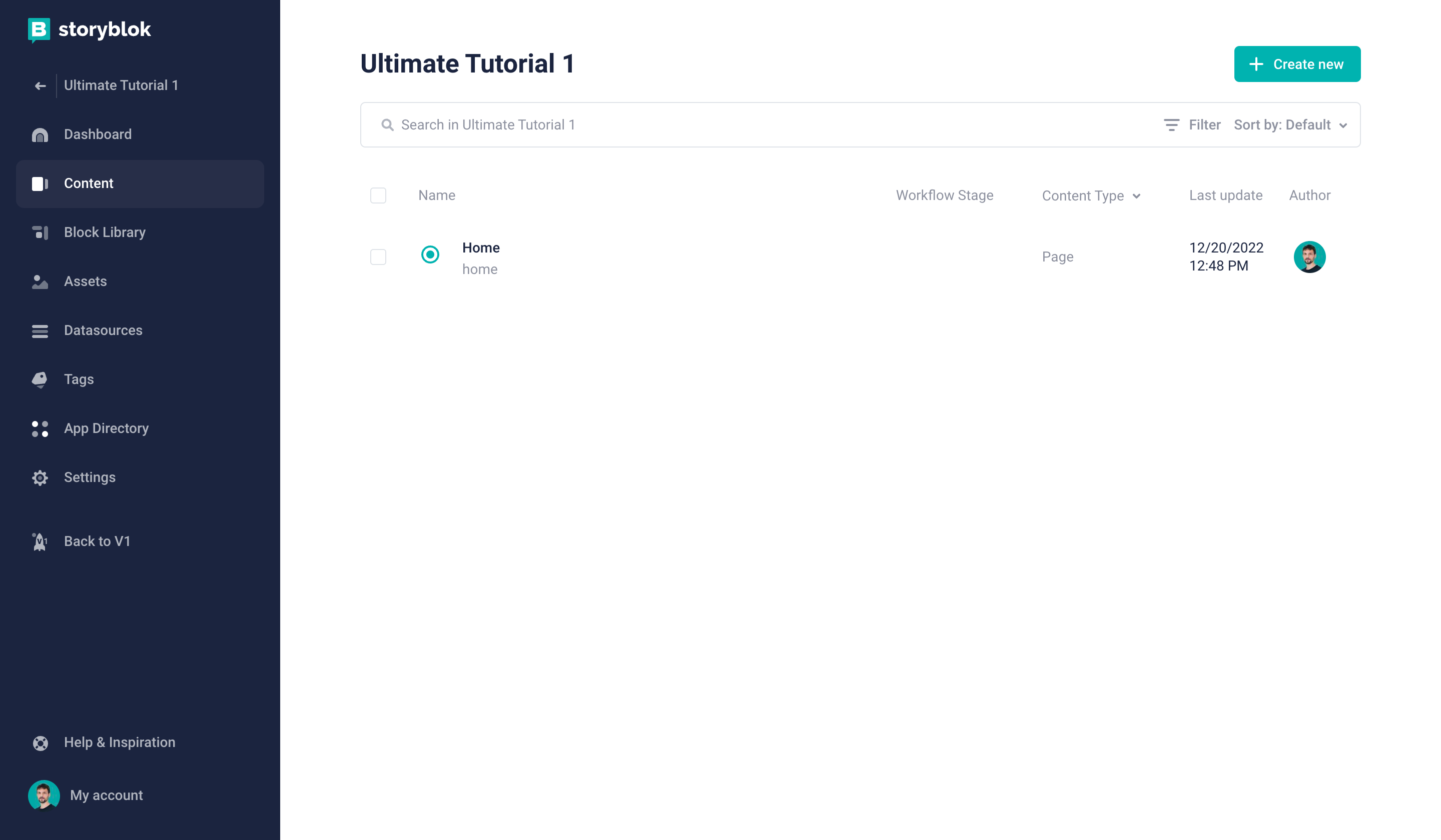
Opening the Home story
Now you’ll see the default screen and the Visual Editor:
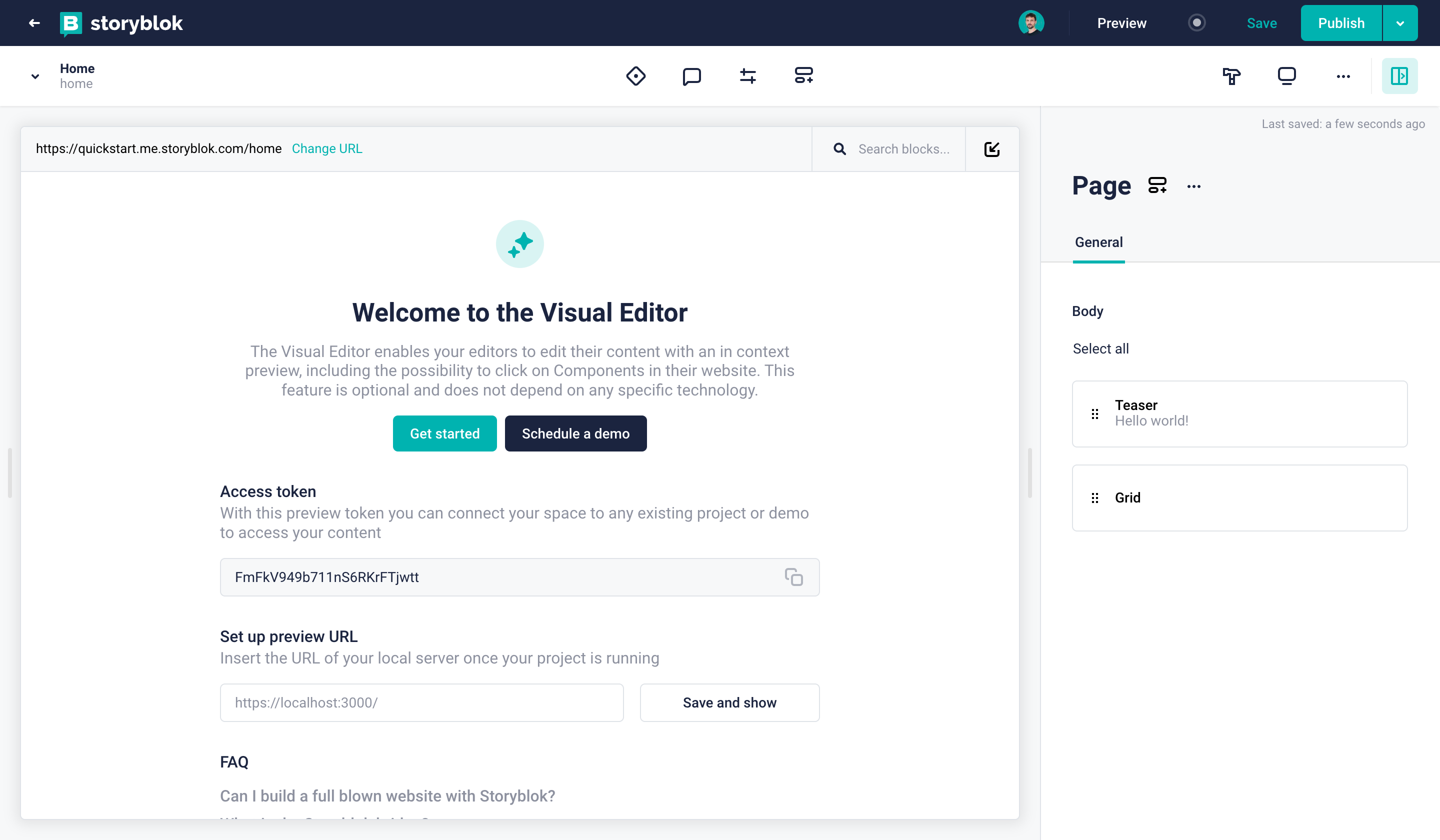
Visual Editor representing your Home story
Enabling the Visual Editor
In order to actually see your Qwik project in the Visual Editor, we’ll have to define the default environment URL. Let’s do that by going to Settings > Visual Editor {1} and setting the Location field to https://localhost:5173/ {2}:
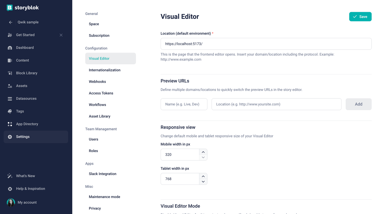
Defining the default environment URL
As Storyblok v2 requires that your website is served via HTTPS. You will need to follow the steps below to enable this in your Qwik project:
- Install
vite-plugin-mkcerton your project. The installation instructions can be found in the package README vite-plugin-mkcert.
pnpm add vite-plugin-mkcert -D- In the project’s
vite.config.tsinclude:
// other imports
import mkcert from'vite-plugin-mkcert';

export default defineConfig((): UserConfig => {
    return {
        plugins: [/* other plugins */, mkcert()],
        // ... (preview)
    };
});- Finally, run the
pnpm startcommand again to see the localhost in https.
Now, if you go back to the Home story, you won’t see your Qwik app there just yet. Just one more quick step to take: Open the Entry configuration {1} and set the Real path to / {2}. After having saved, you should now be seeing your Qwik app in the Visual Editor:
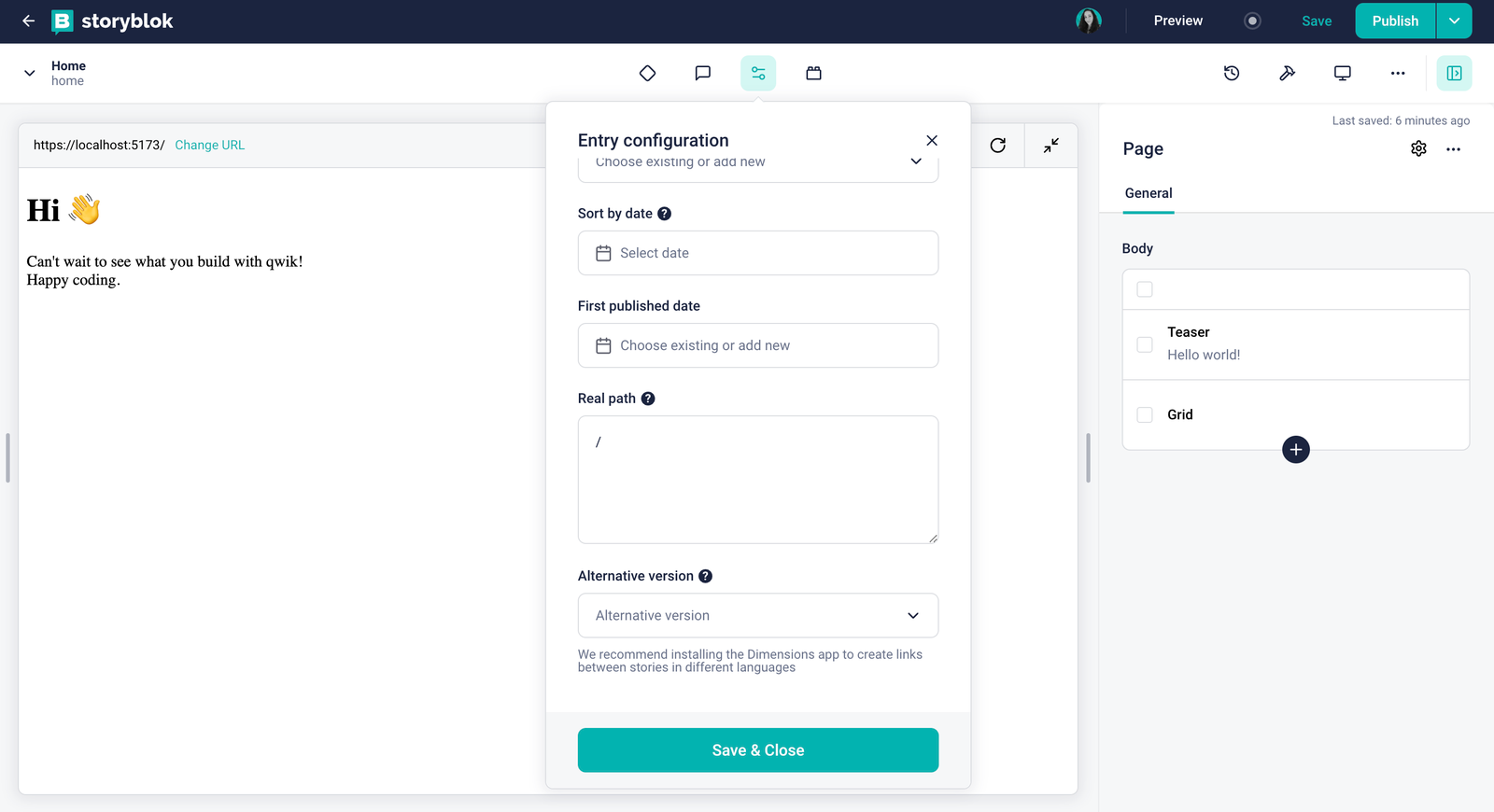
Overriding the real path of the Home story
Connecting Qwik to Storyblok
First of all, let’s install the official Storyblok JS SDK (opens in a new window):
pnpm install @storyblok/jsThis SDK allows you to interact with the Storyblok API. On top of that, it also provides a bridge to enable real-time editing! Let’s start configuring it.
Before we jump into the code, we quickly need to grab our API token from our space. Let’s do that by going to Settings > Access Tokens {1} and copying the Preview Token {2}.
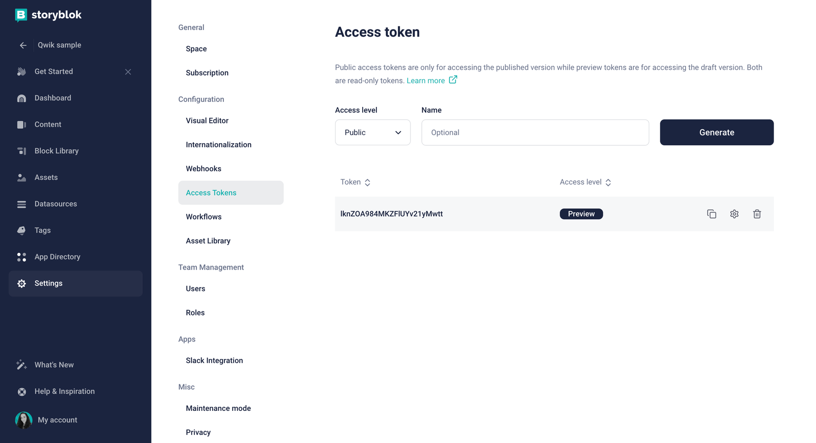
Where to get the preview access token of your Storyblok space
We can use this token to initialize the JS SDK in our Qwik app, so for that, let’s add a .env file in the root of your project and create the variable PUBLIC_STORYBLOK_TOKEN=<YOUR_COPIED_PREVIEW_TOKEN>.
Check how to access PUBLIC environment variables in Qwik.
Now, let’s create a plugin in the src/routes folder of our application:
import { storyblokInit, apiPlugin } from "@storyblok/js";

export const { storyblokApi } = storyblokInit({
  accessToken: import.meta.env.PUBLIC_STORYBLOK_TOKEN,
  use: [apiPlugin],
  bridge: true,
});
This will help us reuse the same instance of the JS SDK across our application.
Setting the correct region
Depending on whether your space was created in the EU, the US, Australia, Canada, or China, you may need to set the region parameter of the API accordingly:
eu(default): For spaces created in the EUus: For spaces created in the USap: For spaces created in Australiaca: For spaces created in Canadacn: For spaces created in China
Here's an example for a space created in the US:
apiOptions: {
  region: "us",
},Note: For spaces created in any region other than the EU, the region parameter must be specified.
Rendering Dynamic Components in the Qwik App
The core idea of using Storyblok for this particular use case is the following:
- Content managers (even if it’s only yourself) can create pages (or stories) composed of different components (or blocks)
- Developers receive the page in the JSON format by using the Storyblok API and can render components accordingly (this is what we want to accomplish in our Qwik app)
When you create a new space from scratch, Storyblok automatically creates four default components for you:
page: Content type blockgrid: Nested blockfeature: Nested blockteaser: Nested block
You can find all of these in the Components section of your space.
Understand the difference between the nestable components and content type in our Structures of Content tutorial.
Creating the Qwik Components
Let’s create the counterparts of the four components discussed above in our Qwik app. To do that, generate the following files in a storyblok folder inside src/components folder:
import { component$ } from '@builder.io/qwik';
import { storyblokEditable } from "@storyblok/js";

import StoryblokComponent from "~/components/storyblok/component";
import type { SbBlokData } from "@storyblok/js";

interface PageProps {
  blok: {
    body: [];
  };
}

export default component$<PageProps>((props) => {
  return (
    <main {...storyblokEditable(props.blok)} class="px-4">
    {props.blok.body.map((block: SbBlokData) => {
      return (
        <StoryblokComponent key={block._uid} blok={block} />
      )
    })}
    </main>
  );
});import { component$ } from '@builder.io/qwik';
import { storyblokEditable } from "@storyblok/js";
import StoryblokComponent from "~/components/storyblok/component";
import type { SbBlokData } from "@storyblok/js";
interface GridProps {
blok: {
columns: []
};
}
export default component$<GridProps>((props) => {
return (
<div {...storyblokEditable(props.blok)} class="container mx-auto grid md:grid-cols-3 gap-12 my-12 place-items-center">
{props.blok.columns.map((block: SbBlokData) => {
return (
<StoryblokComponent key={block._uid} blok={block} />
)
})}
</div>
);
});import { component$ } from '@builder.io/qwik';
import { storyblokEditable } from "@storyblok/js";
interface FeatureProps {
blok: {
name: string;
};
}
export default component$<FeatureProps>((props) => {
return <div {...storyblokEditable(props.blok)} class="w-full p-12 bg-[#f7f6fd] rounded-[5px] text-center">
<h3 class="text-2xl text-[#1d243d] font-bold">
{props.blok.name}
</h3>
</div>;
});import { component$ } from '@builder.io/qwik';
import { storyblokEditable } from "@storyblok/js";
interface TeaserProps {
blok: {
headline: string;
};
}
export default component$<TeaserProps>((props) => {
return <h2 {...storyblokEditable(props.blok)} class="py-32 text-6xl text-[#50b0ae] font-bold text-center">{props.blok.headline}</h2>;
});You may be wondering why we added those components to a storyblok subfolder. By doing that, we can separate components that load dynamically from the Headless CMS from the ones that are basic to our application, like the router-head.tsx that comes from the initial setup.
Dynamic components with TSX
To register and render the components coming from the Storyblok API JSON response, we need to define a dynamic component that will be able to render the components we have defined in the storyblok folder by just providing the technical name:
import { component$ } from '@builder.io/qwik';
import type { StoryblokComponentType } from "@storyblok/js";

// Components
import grid from "~/components/storyblok/grid";
import teaser from "~/components/storyblok/teaser";
import feature from "~/components/storyblok/feature";
import page from "~/components/storyblok/page";

interface Props {
  blok: StoryblokComponentType<string>;
}

const Components: any = {
  'sb-grid': grid,
  'sb-teaser': teaser,
  'sb-feature': feature,
  'sb-page': page
};

export default component$<Props>((props) => {
  const Component = Components[`sb-${props.blok.component}`];
  return (
    <Component blok={props.blok} />
  );
});
Optional: Use TailwindCSS to style your components
You may have noticed that we’ve been using Tailwind classes in our components. To make these work, let’s quickly add Tailwind to our Qwik project by running:
pnpm qwik add tailwindCheck how to integrate Qwik with Tailwind in their official docs.
Load content using the API
Now that our components are ready, we can fetch the Home story data. You can view the JSON structure of any story by clicking the Draft JSON {1} button:
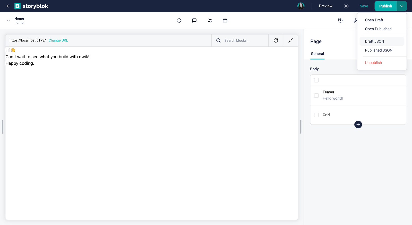
Getting the Draft JSON from the Visual Editor
All we have to do is replace src/routes/index.tsx with the following code:
import { component$, useSignal } from "@builder.io/qwik";
import type { DocumentHead } from "@builder.io/qwik-city";
import { routeLoader$ } from "@builder.io/qwik-city";

import StoryblokComponent from "~/components/storyblok/component";
import type { ISbStoryData } from "@storyblok/js";
import { storyblokApi } from "~/routes/plugin@storyblok";

export const useStory = routeLoader$(async () => {
  if (!storyblokApi)
    throw new Error("Not Storyblok plugin found to make the API calls");

  const { data } = await storyblokApi.get("cdn/stories/home", {
    version: "draft",
  });

  return data.story as ISbStoryData;
});

export default component$(() => {
  const story = useSignal(useStory().value);

  return (
    <>
      <StoryblokComponent key={story.value.id} blok={story.value.content} />
    </>
  );
});

export const head: DocumentHead = {
  title: "Welcome to Qwik with Storyblok",
  meta: [
    {
      name: "description",
      content: "Qwik & Storyblok site description",
    },
  ],
};
As you see, we are using Route Loaders (opens in a new window), to load the data from Storyblok API into the server and render it in the component; they can only be declared inside the src/routes folder, in a layout.tsx or index.tsx file, and they MUST be exported.
Route Loaders are perfect for fetching data from a database or an API. For example, you can use them to fetch data from a CMS, a weather API, or a list of users from your database.
At this point, the components should be rendered successfully when viewing the Home story in the Visual Editor.
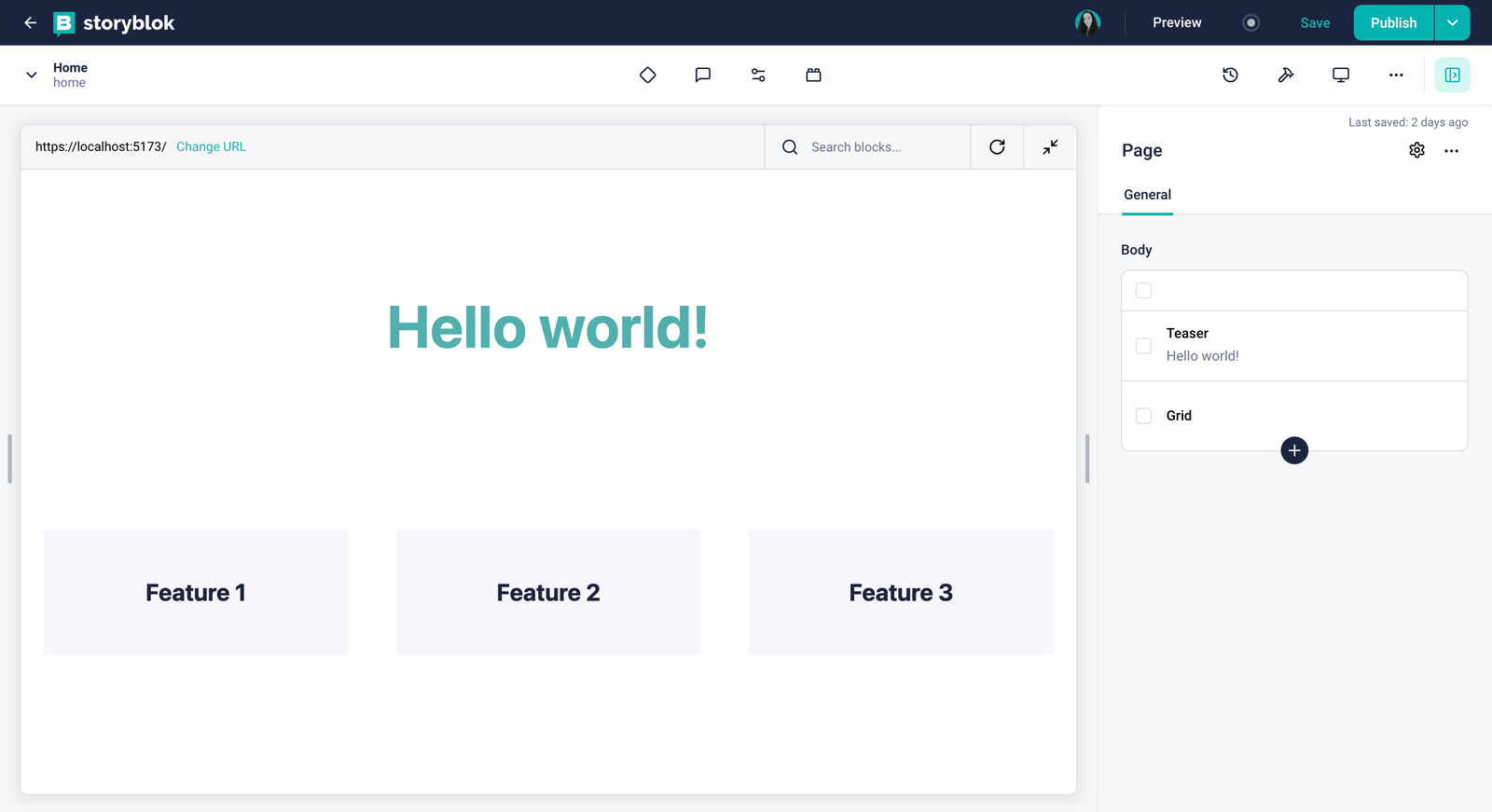
Qwik app integrated into the Storyblok Visual Editor
Real-time editing with Storyblok Bridge
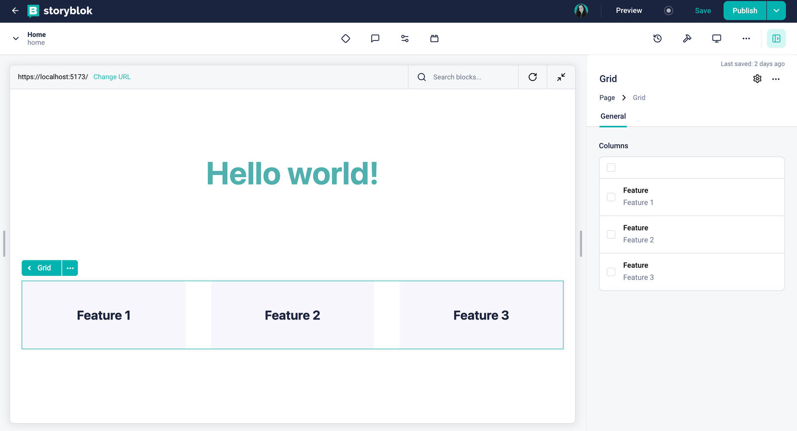
The power of Storyblok relies on its fantastic real-time editing experience. Play with changing the teaser headline or re-arranging the features and see the magic happen!
Fortunately, @storyblok/js makes a bridge available for you. Your components have to be connected with Storyblok and listen to changes by its Visual Editor. Let's take a closer look at how this is achieved:
First, to link your Qwik and Storyblok components together, @storyblok/js provides a storyblokEditable function. If you take a look at the components in your src/components/storyblok folder, you'll already find it there.
Second, we need to load the Storyblok Bridge (opens in a new window) in our routes. Let’s create a reusable hook in the plugin@storyblok.ts with the following code:
import { $, useOnWindow, useSignal } from "@builder.io/qwik";
import {
 storyblokInit,
  apiPlugin,
  type ISbStoryData,
  type StoryblokBridgeConfigV2,
  loadStoryblokBridge,
} from "@storyblok/js";

export const { storyblokApi } = storyblokInit({
  accessToken: import.meta.env.PUBLIC_STORYBLOK_TOKEN,
  use: [apiPlugin],
  bridge: true,
});

export const useStoryblok = (
  initialStory: ISbStoryData,
  bridgeOptions: StoryblokBridgeConfigV2 = {}
) => {
  const story = useSignal(initialStory);
  useOnWindow(
    "load",
    $(async () => {
      await loadStoryblokBridge();
      const { StoryblokBridge, location } = window;
      const storyblokInstance = new StoryblokBridge(bridgeOptions);
      storyblokInstance.on(["published", "change"], () => {
       location.reload();
      });
      storyblokInstance.on("input", (event) => {
       story.value = event?.story as ISbStoryData;
      });
    })
  );
  return story;
};Check how you can Register DOM events in Qwik with useOn(), useOnWindow(), or useOnDocument().
Now Let’s use this hook in index.tsx file and see it in action.
import { component$ } from "@builder.io/qwik";
import type { DocumentHead } from "@builder.io/qwik-city";
import { routeLoader$ } from "@builder.io/qwik-city";
import type { ISbStoryData } from "@storyblok/js";
import StoryblokComponent from "~/components/storyblok/component";
import { storyblokApi, useStoryblok } from "~/routes/plugin@storyblok";

export const useStory = routeLoader$(async () => {
  if (!storyblokApi)
    throw new Error("Not Storyblok plugin found to make the API calls");

  const { data } = await storyblokApi.get("cdn/stories/home", {
    version: "draft",
  });
  return data.story as ISbStoryData;
});

export default component$(() => {
  const story = useStoryblok(useStory().value);

  return <StoryblokComponent key={story.value.id} blok={story.value.content} />;
});

export const head: DocumentHead = {
  title: "Welcome to Qwik with Storyblok",
  meta: [
    {
      name: "description",
      content: "Qwik & Storyblok site description",
    },
  ],
};
Real-time editing experience enabled
Wrapping Up
Congratulations! You now have a Qwik app with dynamic components, a landing page, and a complete integration with Storyblok, providing a unique real-time editing experience.
As you plan to deploy and use Storyblok and Qwik in production, here are a few important considerations:
- Preview Mode: When running
npm run preview, remember that Qwik sites have caching enabled by default. You can checkvite.config.tsandroutes/layout.tsxto see the cache logic. To ensure a real-time editing experience during preview, make sure to remove the cache settings. - Separate Environments: We recommend setting up two environments: one for Storyblok preview without caching (showing draft content) and one for production with appropriate caching (showing published content). You can manage both environments from the same codebase by controlling the settings using
.envvariables.
By following these best practices, you’ll ensure a smooth and efficient workflow, maximizing the benefits of both Storyblok and Qwik.
| Resource | Link |
|---|---|
| Storyblok Qwik Starter repo | https://github.com/storyblok/qwik-5-min-tutorial |
| Storyblok JS Module | https://github.com/storyblok/storyblok-js |
| Storyblok APIs | https://www.storyblok.com/docs/api |
| Qwik | https://qwik.dev/ |
