Next.js with styled-components and Snipcart
Storyblok is the first headless CMS that works for developers & marketers alike.
Introduction
This tutorial will show you how to use styled components with Next.js and Storyblok. Styled components and other libraries will bring more flexibility in customizing Blok. You will see how to create a component and give the flexibility of managing responsive design or more power for your user from Storyblok.
It's essential to find the balance between what a User from Storyblok can do and your code.
As for the bonus, I will show you how to implement Snipcart, a shopping cart that you can easily integrate into any website in minutes.
Prerequisites
We will start with the tutorial from Add a headless CMS to Next.js in 5 minutes (opens in a new window). It shows how to create components in Storyblok and Next.js. We recommend that tutorial before starting this one. You can find the tutorial GitHub repository (opens in a new window).
Next, we will install styled-components (opens in a new window) with the code block below:
npm install --save styled-componentsThen, create a next.config.js file at the root with this code :
/**
* @type {import('next').NextConfig}
*/

const nextConfig = {
   reactStrictMode: true,
   compiler: {
       styledComponents: true
   }
}

module.exports = nextConfig
If you are missing something you can always check this repository (opens in a new window), each step of the tutorial has its own branch.
Create a card component with styled-components
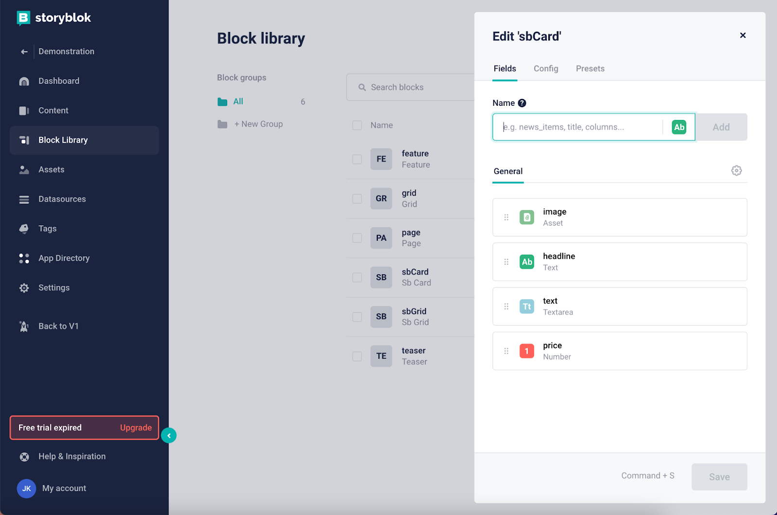
Let's now add a block named sbCard which will be a Nested type block. It should have the following fields :
- image of type asset {1}: similar to the way we added in this tutorial (opens in a new window).
- title of type text {2}
- text of type textarea {3}
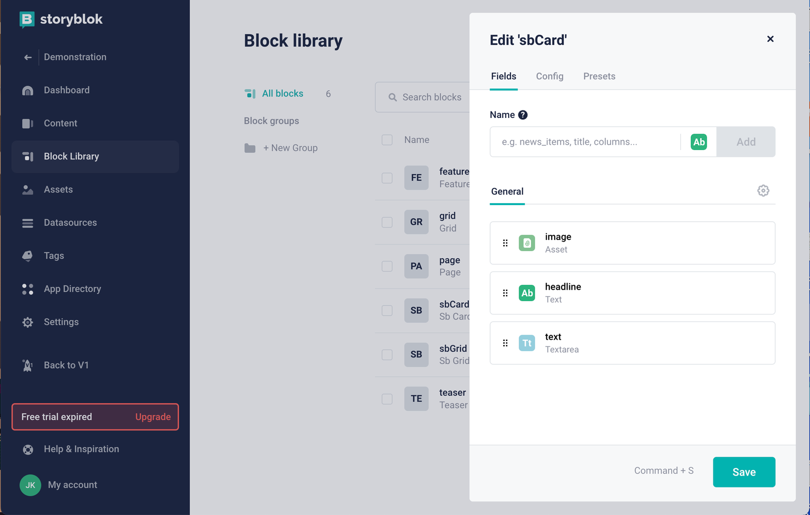
Storyblok block library
You can get the asset I used in my storyblok-next-demo repository (opens in a new window).
Let’s start creating a new file called SbCard.js in the components folder and add the following code to it.
import { storyblokEditable } from "@storyblok/react";
import styled from "styled-components";

const SbCardContainer = styled.li`
   width: 300px;
   border-radius: 12px;
   overflow: hidden;
   border: 1px solid black;
   list-style: none;
`

const ImgContainer = styled.div`
   height: 180px;
   > img {
       width: 100%;
       height: 100%;
       object-fit: cover;
   }
`

const SbCardContent = styled.div`
   padding: 16px;
   > h2 {
       margin-top: 0px;
   }
`

const SbCard = ({ blok }) => {
   return <SbCardContainer {...storyblokEditable(blok)}>
       <ImgContainer>
           <img
               alt={blok.image.alt}
               src={blok.image.filename}
           />
       </ImgContainer>
       <SbCardContent>
           <h2>{blok.headline}</h2>
           <p>{blok.text}</p>
       </SbCardContent>
   </SbCardContainer>;
};

export default SbCard;
The container component will be an <li> element because we will use it as an item on the list. It will be wrapped in a grid in the next step. Here you can see a simple use of styled-components, on the next step we will see how to create a styled-components based on props.
Now we can create a sbCard, it should display like this:
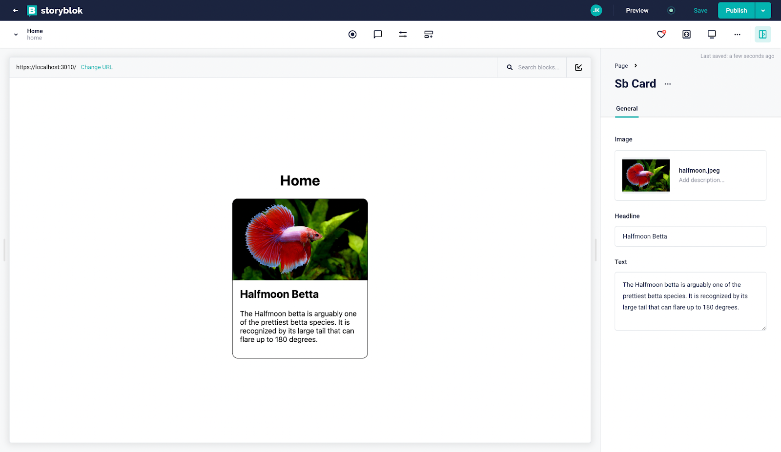
Sb Card component on visual editor
Wrap sbCard in a Grid layout
In this part, we will create a Grid Layout to wrap our sbCard. We will pass some parameters from Storyblok to the component in order to choose how many columns we want to display in a different formats (mobile, tablet, desktop) and optionally add a padding-top.
Let's create a block named sbGrid which will be a Nested type block. It should have the following fields :
- content of type Blocks
- nbColumnMobile of type number and 1 as default value.
- nbColumnTablet of type number and 2 as default value.
- nbColumnDesktop of type number and 4 as default value.
- paddingTop of type number and 0 as default value.
You should have something like this :
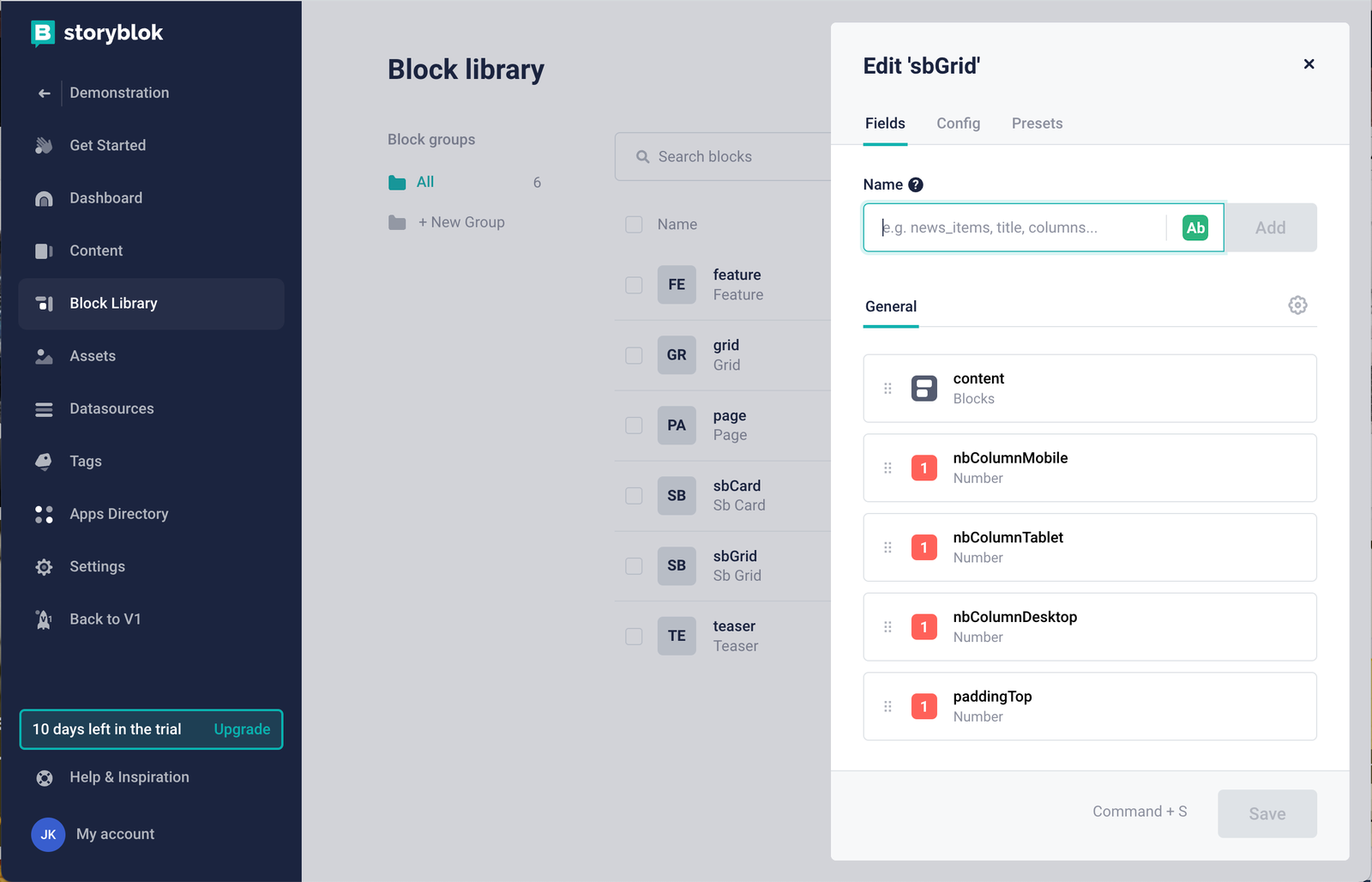
editing fields in sbGrid component
Let’s create a new file called SbGrid.js in the components folder and add the following code to it :
import { storyblokEditable, StoryblokComponent } from "@storyblok/react";
import styled from "styled-components";
const GridLayout = styled.ul`
display: grid;
grid-gap: 32px;
padding: 0;
padding-top: ${(props) => props.blok.paddingTop}px;
grid-template-columns: repeat(${(props) => props.blok.nbColumnDesktop},1fr);
@media (max-width: 599px) {
grid-template-columns: repeat(${(props) => props.blok.nbColumnMobile},1fr);
}
@media (min-width: 600px) and (max-width: 960px) {
grid-template-columns: repeat(${(props) => props.blok.nbColumnTablet},1fr);
}
`
const SbGrid = ({ blok }) => {
return (
<GridLayout {...storyblokEditable(blok)} blok={blok}>
{blok.content.map((nestedBlok) => (
<StoryblokComponent blok={nestedBlok} key={nestedBlok._uid} />
))}
</GridLayout>
);
};
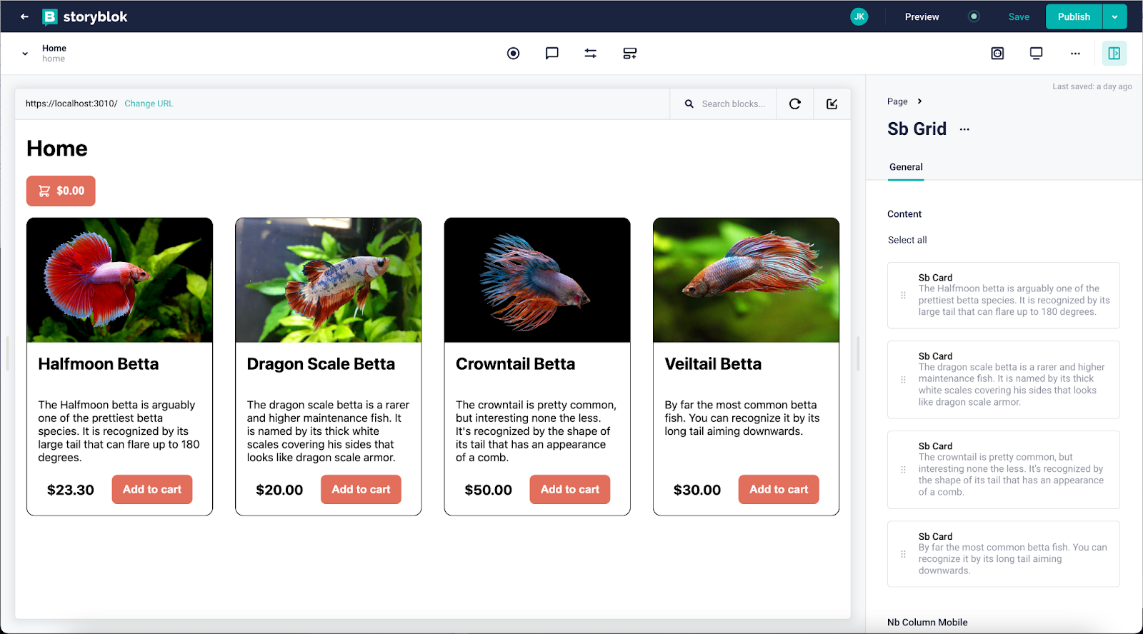
export default SbGrid;Now let’s modify our content in Storyblok. Create a sbGrid and move the created sbCard inside and add 3 new sbCard components.
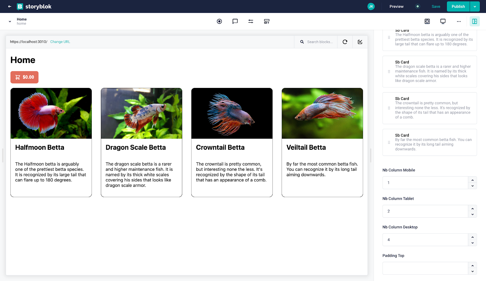
You should have something like this :
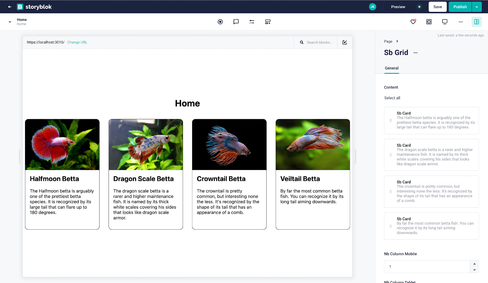
sbGrid component for desktop
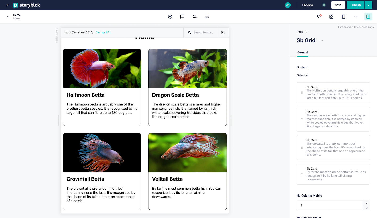
sbGrid component for desktop
sbGrid component for desktop
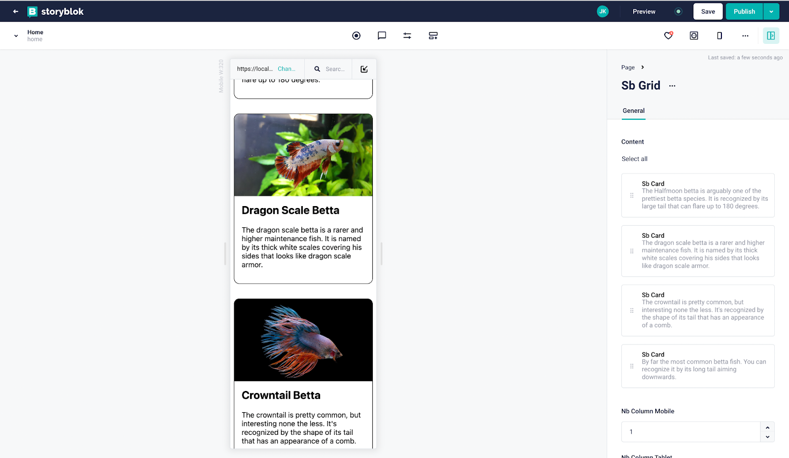
So what we have just done ? We use the Grid CSS property and media queries to define the display. Storyblok give the number of columns in each format and with styled-components we passed props in order to have a dynamic grid.
For example, you can reuse sbGrid and have different column in the same format.
Here is an example, I create two sbGrid with 48px of padding-top, the first one with 3 columns and the second with 2 columns.
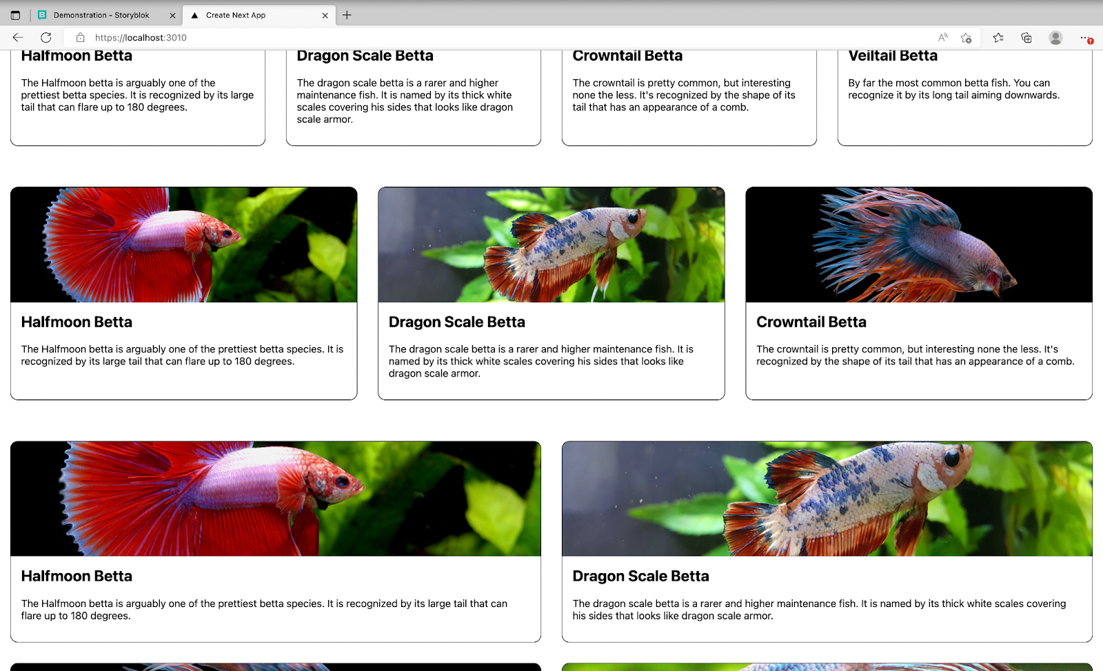
sbGrid components on desktop
And that's it! Now you can use sbGrid and sbCard as you want, or create more flexible and customizable components with styled-components (opens in a new window) from Storyblok.
You can find the final result of this part on the branch feat/final-result (opens in a new window).
Now, let’s start with Snipcart!
How it works
Unlike many e-commerce solutions, Snipcart lives on your site, in its HTML client-side code.
Add the shopping cart to your site with a simple JavaScript snippet inclusion. It's similar to adding a third-party script like Google Analytics.
You create products by adding simple HTML attributes—product name, price, description, etc.—to elements on your site. Usually, developers add these attributes to a “buy” button.
You manage orders within a user-friendly merchant dashboard. Unlike the cart, this dashboard doesn't live on your site, it's hosted on our own servers. You can access it at any time at this URL:
https://app.snipcart.com/dashboard
Source: https://docs.snipcart.com/v3/#how-it-works
Requirements
We follow the tutorial we have just finished.
You can find the final result in this branch GitHub repository. (opens in a new window)
First, create an account on Snipcart (opens in a new window).
Add Snipcart script
Check your Snipcart account and go to the credentials page (opens in a new window). You should see this image below :
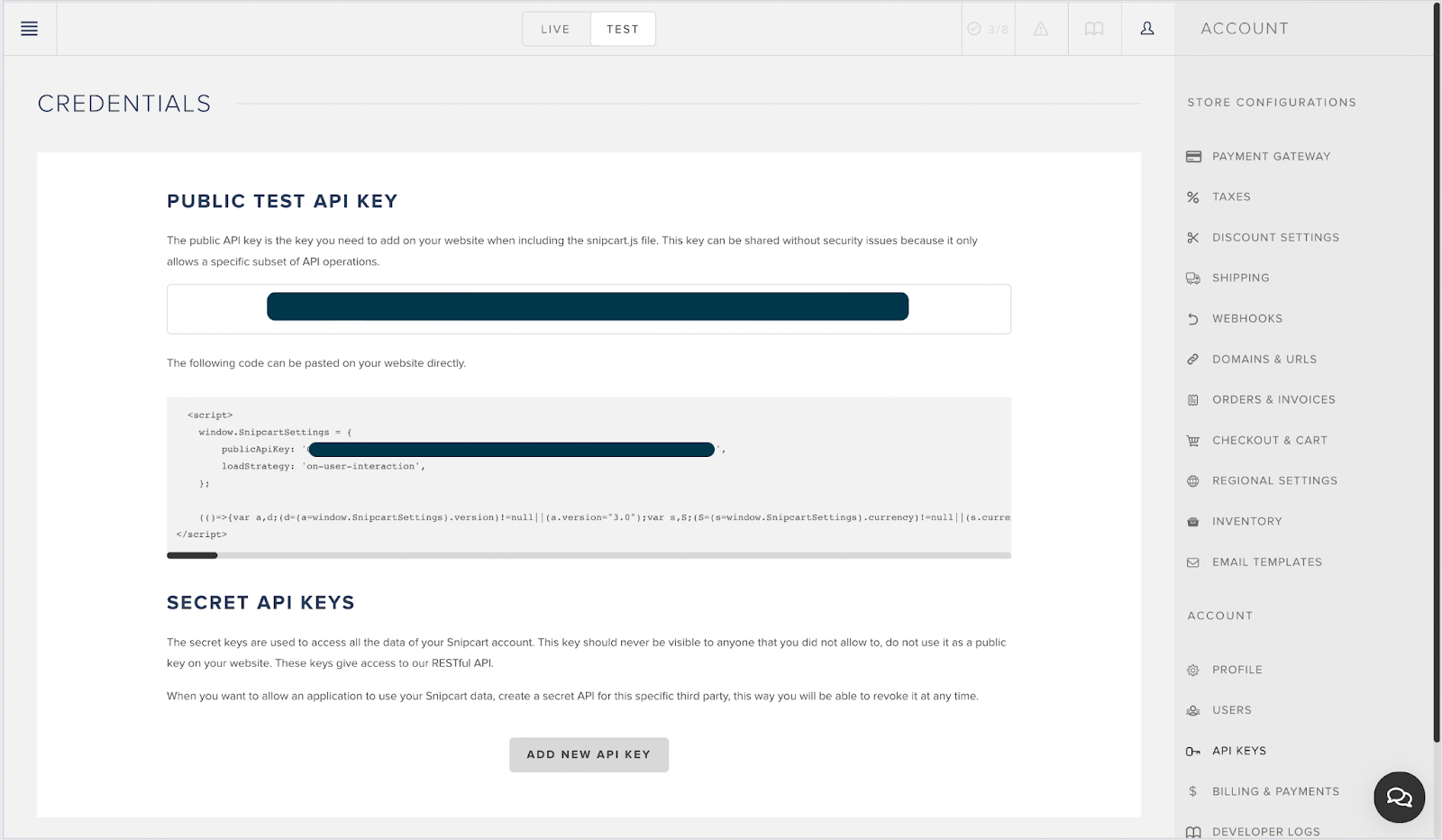
Snipcart Credentials Page
In your Next.js project, create a _document.js and replace <your-public-api-token> by your API key from Snipcart.
import { Html, Head, Main, NextScript } from 'next/document'

export default function Document() {
   return (
       <Html>
           <Head>
               <link rel="preconnect" href="https://app.snipcart.com"/>
               <link rel="preconnect" href="https://cdn.snipcart.com"/>
               <link rel="stylesheet" href="https://cdn.snipcart.com/themes/v3.4.0/default/snipcart.css"/>
               <script async defer src="https://cdn.snipcart.com/themes/v3.4.0/default/snipcart.js"></script>
               <div hidden id="snipcart" data-api-key="<your-public-api-token>"></div>
           </Head>
           <body>
           <Main />
           <NextScript />
           </body>
       </Html>
   )
}
It's important to note that if you have an attribute lang in your tag <Html>, the script will use the language you have in your Html. So if you have <Html lang="fr">, you will have the cart in French :
snipcart checkout page
Create a ShoppingCartButton
Let’s make the ShoppingCartButton first. The button will show the current state of your cart. And on click, it will open the Cart.
Create a SbShoppingCartButton.js, you don’t need to create a component from Storyblok.
Here is the code below:
import styled from "styled-components";

const CartButton = styled.button`
   display: flex;
   align-items: center;
   padding: 12px 16px;
   background-color: #E26D5C;
   border-radius: 8px;
   font-size: 16px;
   font-weight: bold;
   border: none;
   color: white;

   > svg {
       width: 20px;
       height: 20px;
       margin-right: 8px;
   }
`
const ShoppingCartLogo = () => {
   return <svg xmlns="http://www.w3.org/2000/svg" className="h-6 w-6" fill="none" viewBox="0 0 24 24" stroke="currentColor" strokeWidth={2}>
       <path strokeLinecap="round" strokeLinejoin="round" d="M3 3h2l.4 2M7 13h10l4-8H5.4M7 13L5.4 5M7 13l-2.293 2.293c-.63.63-.184 1.707.707 1.707H17m0 0a2 2 0 100 4 2 2 0 000-4zm-8 2a2 2 0 11-4 0 2 2 0 014 0z" />
   </svg>
}

export const SbShoppingCartButton = () => {
   return <CartButton className="snipcart-checkout">
       <ShoppingCartLogo/> <span className="snipcart-total-price"></span>
   </CartButton>
}
Then, add in index.js the button :
export default function Home({ story }) {
 story = useStoryblokState(story);

 return (
   <div className={styles.container}>
     <Head>
       <title>Create Next App</title>
       <link rel="icon" href="/favicon.ico" />
     </Head>

     <header>
       <h1>{story ? story.name : "My Site"}</h1>
       <SbShoppingCartButton/>
     </header>

     <StoryblokComponent blok={story.content} />
   </div>
 );
}
You should have:
Snipcart Product Homepage
On clicking the button, a cart should be opened :
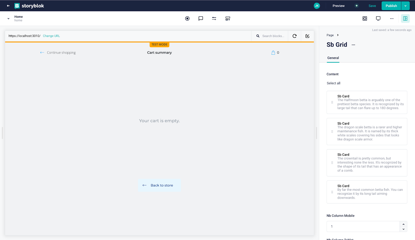
Snipcart Product Cart page
Add Snipcart Buy Button
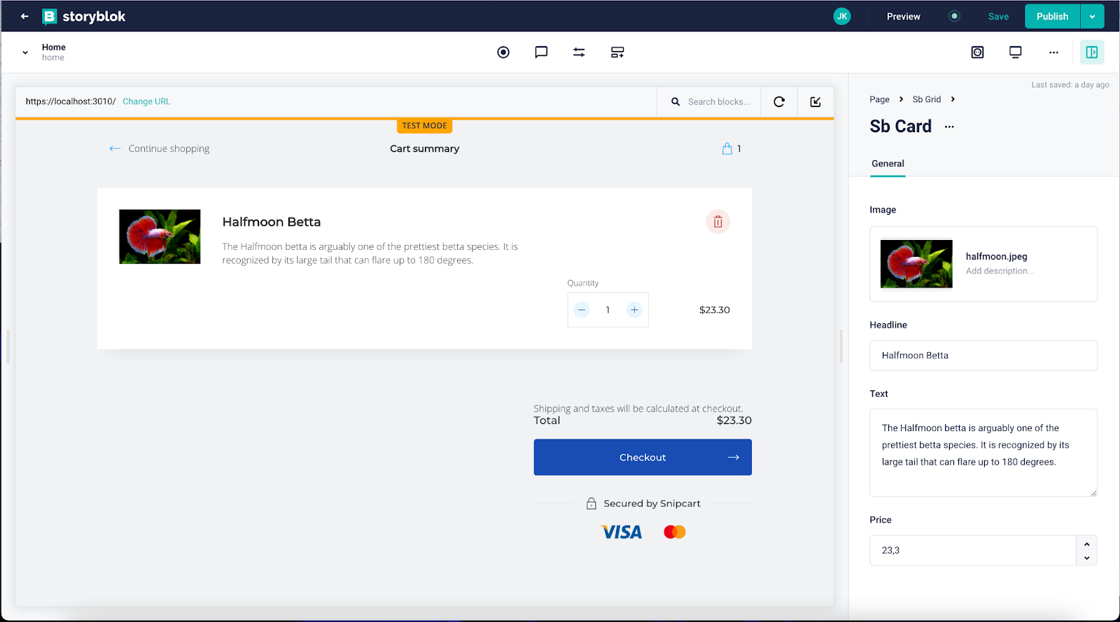
Add parameters price to the sbCard from :
editing fields in sbCard component
Let’s add the buy button. It will help us to add your product in the cart. Below the code, we add a button and change the layout card in order to make the card more consistent.
import { storyblokEditable } from "@storyblok/react";
import styled from "styled-components";

const SbCardContainer = styled.li`
   border-radius: 12px;
   overflow: hidden;
   border: 1px solid black;
   list-style: none;
   display: flex;
   flex-direction: column;
`

const ImgContainer = styled.div`
   height: 180px;
   > img {
       width: 100%;
       height: 100%;
       object-fit: cover;
   }
`

const SbCardContent = styled.div`
   padding: 16px;
   display: flex;
   flex-direction: column;
   flex: 1 1 auto;
   > h2 {
       margin-top: 0px;
   }
   > p {
       flex : 1 1 auto;
   }
`

const BuyButton = styled.button`
   padding: 12px 16px;
   background-color: #E26D5C;
   border-radius: 8px;
   font-size: 1rem;
   font-weight: bold;
   border: none;
   color: white;
`

const PriceContainer = styled.div`
   display: flex;
   align-items: center;
   justify-content: space-around;

   > span {
       font-weight: bold;
       font-size: 1.25rem;
   }
   `
const SbCard = ({ blok }) => {
   return <SbCardContainer {...storyblokEditable(blok)}>
       <ImgContainer>
           <img
               alt={blok.image.alt}
               src={blok.image.filename}
           />
       </ImgContainer>
       <SbCardContent>
           <h2>{blok.headline}</h2>
           <p>{blok.text}</p>
           <PriceContainer>
               <span>${Number(blok.price).toFixed(2)}</span>
               <BuyButton
                   className="snipcart-add-item"
                   data-item-id={blok._uid}
                   data-item-name={blok.headline}
                   data-item-description={blok.text}
                   data-item-price={(blok.price)}
                   data-item-image={blok.image.filename}
               >
               Add to cart</BuyButton>
           </PriceContainer>
       </SbCardContent>
   </SbCardContainer>;
};

export default SbCard;
Let explained a bit the code of the button, here what you got in the DOM :
<button class="snipcart-add-item" data-item-id="0eb113ad-1ce4-403f-9518-6d5eeaa32606" data-item-name="Veiltail Betta"
data-item-description="By far the most common betta fish. You can recognize it by its long tail aiming downwards."
data-item-price="30" data-item-image="https://a.storyblok.com/f/167732/1280x852/d6ea39c51f/veiltail.jpeg">
Add to cart
</button>
The important thing is to add the class snipcart-add-item, if you don’t, the script won’t recognize the button, and you won’t add anything to your cart. After the other attributes help to describe your product. More information here (opens in a new window).
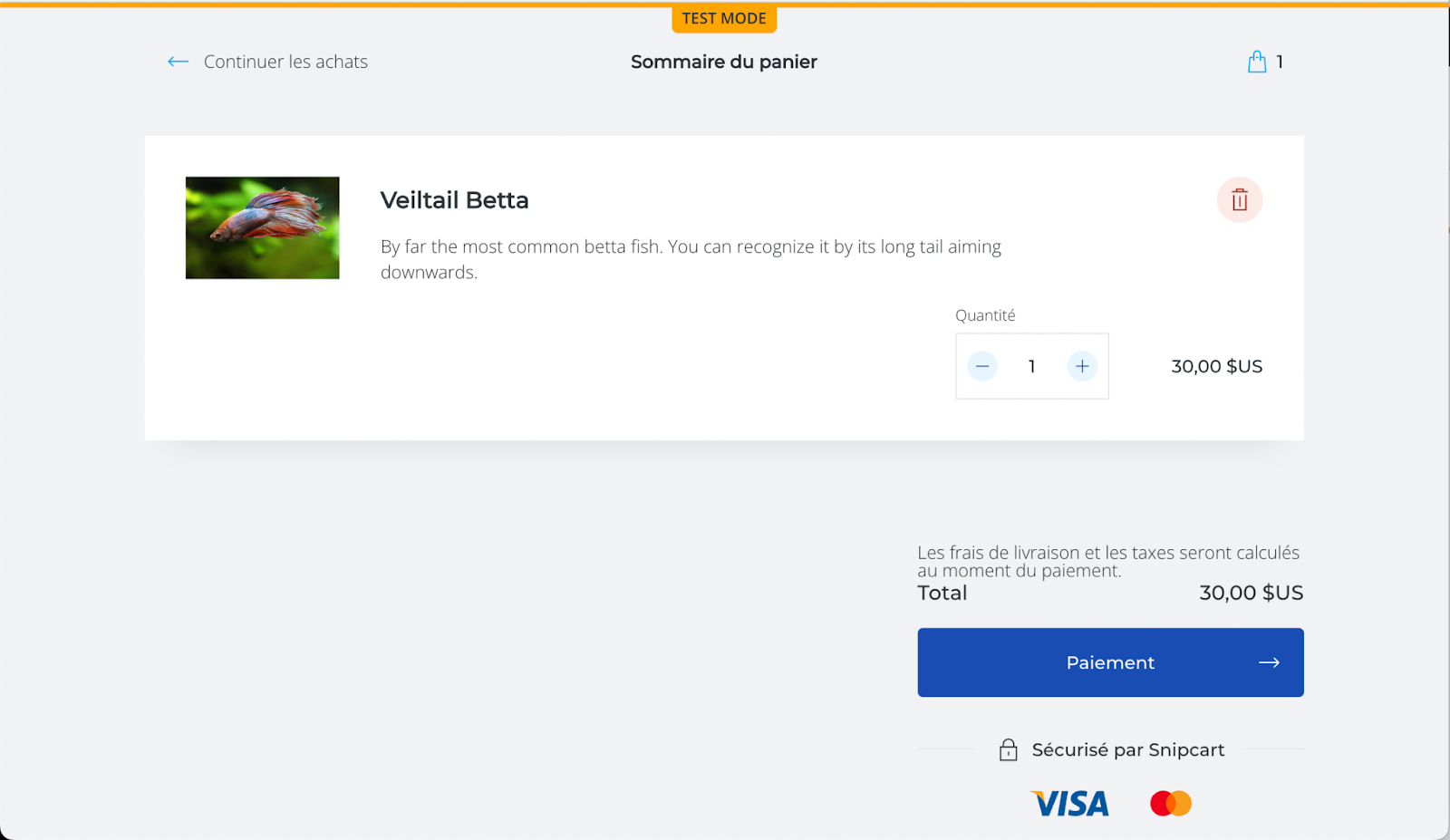
In the cart, it shows like this :
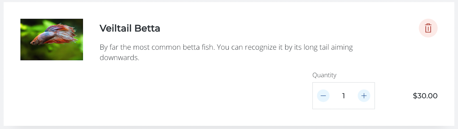
Example of a product in the cart
To conclude you should have now :
Snipcart shopping cart
And when you click on the Add to cart button, the cart should open and get your product.
Snipcart checkout page
Then you can click on Checkout, but to put it in production you need to put a payment gateway in your Snipcart account and everything should work without doing anything.
Wrapping Up
In this tutorial, you see how to use styled-components in Next.js and how to create flexible components in different format and bring more power and customization to your user.
With Snipcart, you see how is easy to set up and can be plugged to any frontend you have. If you leave the website and come again, Snipcart keeps your last cart state. And also on the payment of the product, it will browse your e-commerce website and check the products on your cart to get the same information (price, id etc…) as your website for the security.
Resources
Inspired by:
https://snipcart.com/blog/next-js-ecommerce-tutorial-example
To customize the cart part:
https://snipcart.com/blog/customizing-snipcart-to-reflect-the-style-of-your-websi
