Create Custom Components in Storyblok and Laravel
Storyblok is the first headless CMS that works for developers & marketers alike.
Let’s take it one step further in this part by exploring component schemas in Storyblok. We’ll learn how to modify existing components, create entirely new ones from scratch, and integrate all of these changes into our Laravel web application.
If you’re in a hurry, you can explore or fork the code from the Laravel Ultimate Tutorial GitHub Repository.
Requirements
This tutorial is part 4 of the Ultimate Tutorial Series for Laravel. We recommend that you follow the previous tutorials before starting this one.
Changing Existing Components
Adding an Image Field to the Feature Component
First, let’s extend one of the existing components that Storyblok created for us: the Feature component. Right now, the Feature components look slightly bland, don’t they? Adding an image to them would certainly spice things up a little bit.
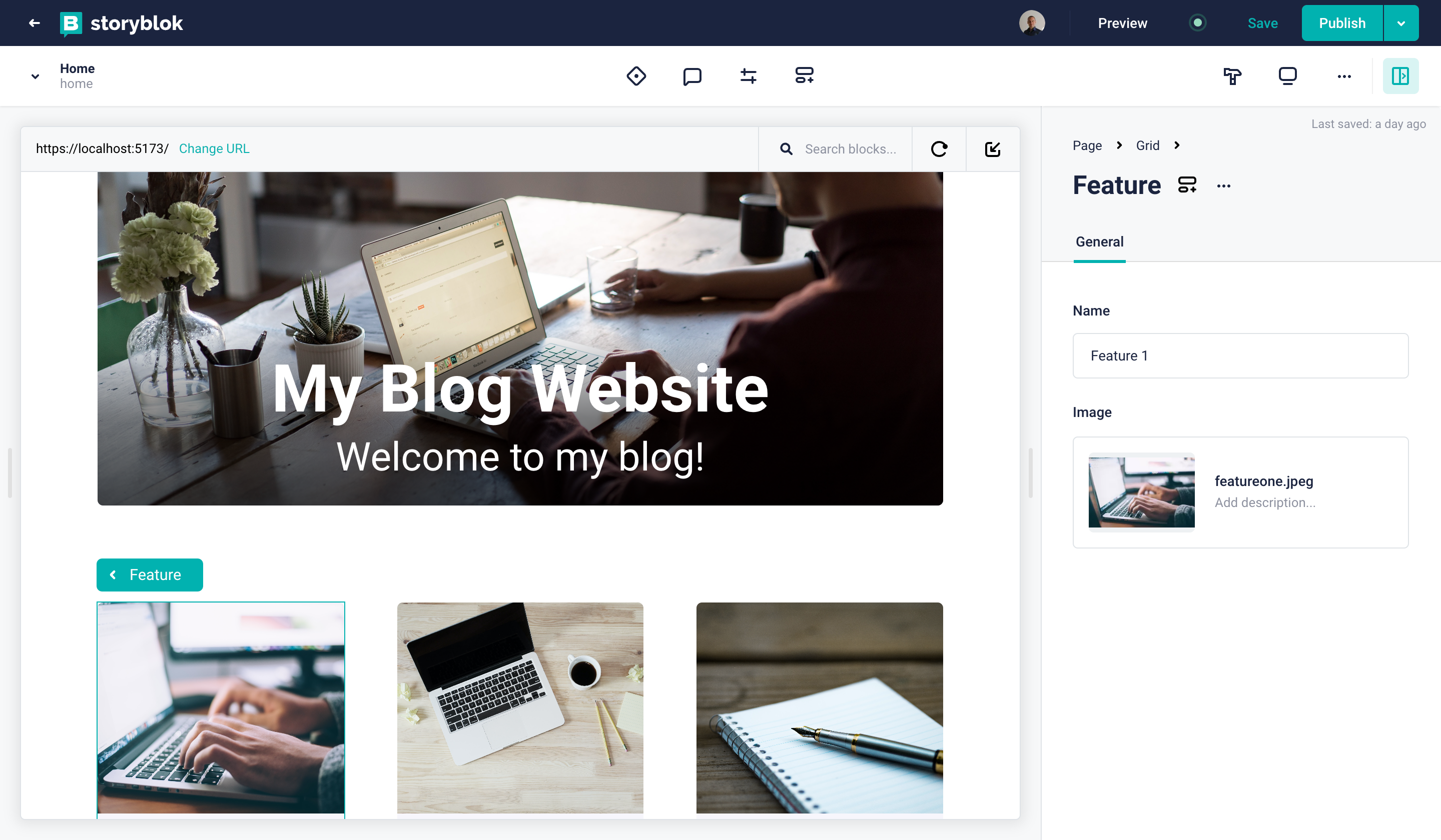
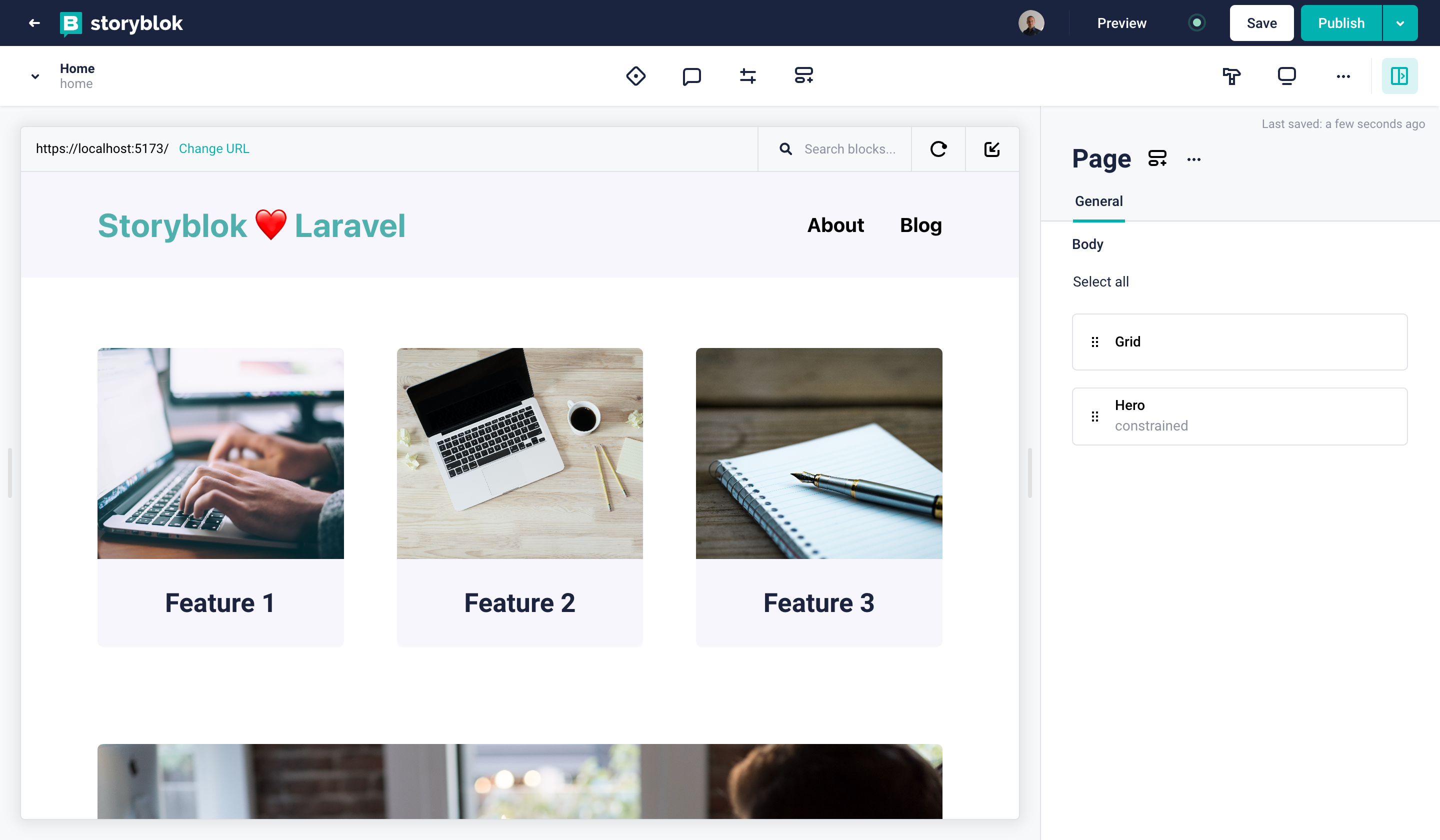
To modify it right from the Visual Editor, go to the Home story and click on one of the Feature components, which exist as nested blocks in the Grid component. To edit the schema, click on the component icon next to the name {1}.
Accessing the block schema from the Visual Editor
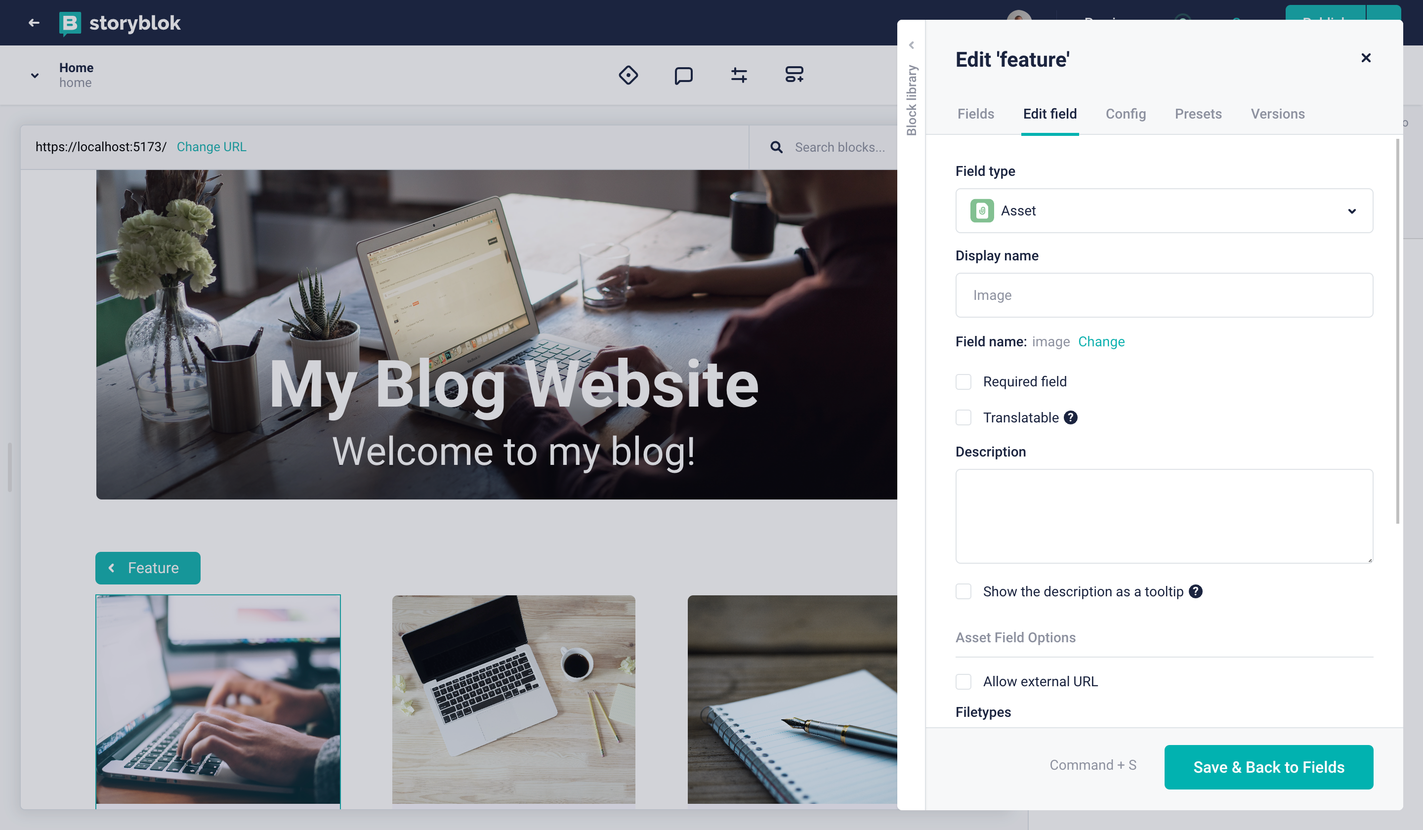
Let’s enter the image as our field name. Afterward, you can click on the newly created field. In the Field type option (in the Edit field tab), you can select Asset {1} to create a field to store an asset.
Creating a field for storing an asset
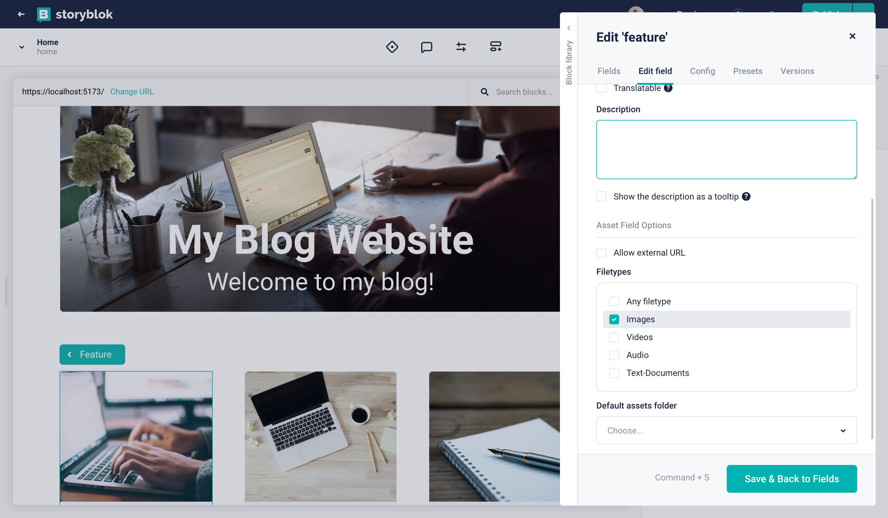
Now you have selected the Asset file type. You can restrict it to the image file type Images {1}.
Creating a field for storing an image asset
And that’s that! After closing the Block Library, you’ll see the image field, allowing you to upload an asset. Go ahead and upload some images for the three instances of the Feature component. Of course, they won’t show up in your Laravel front end just yet, so let’s take care of that next.
Showing the Image Field in Laravel
To render the images correctly in Laravel, we have to figure out what is provided by Content Delivery API after the changes to our component schema. To do that, open the Draft JSON as described in the first part of the Laravel Ultimate Tutorial.
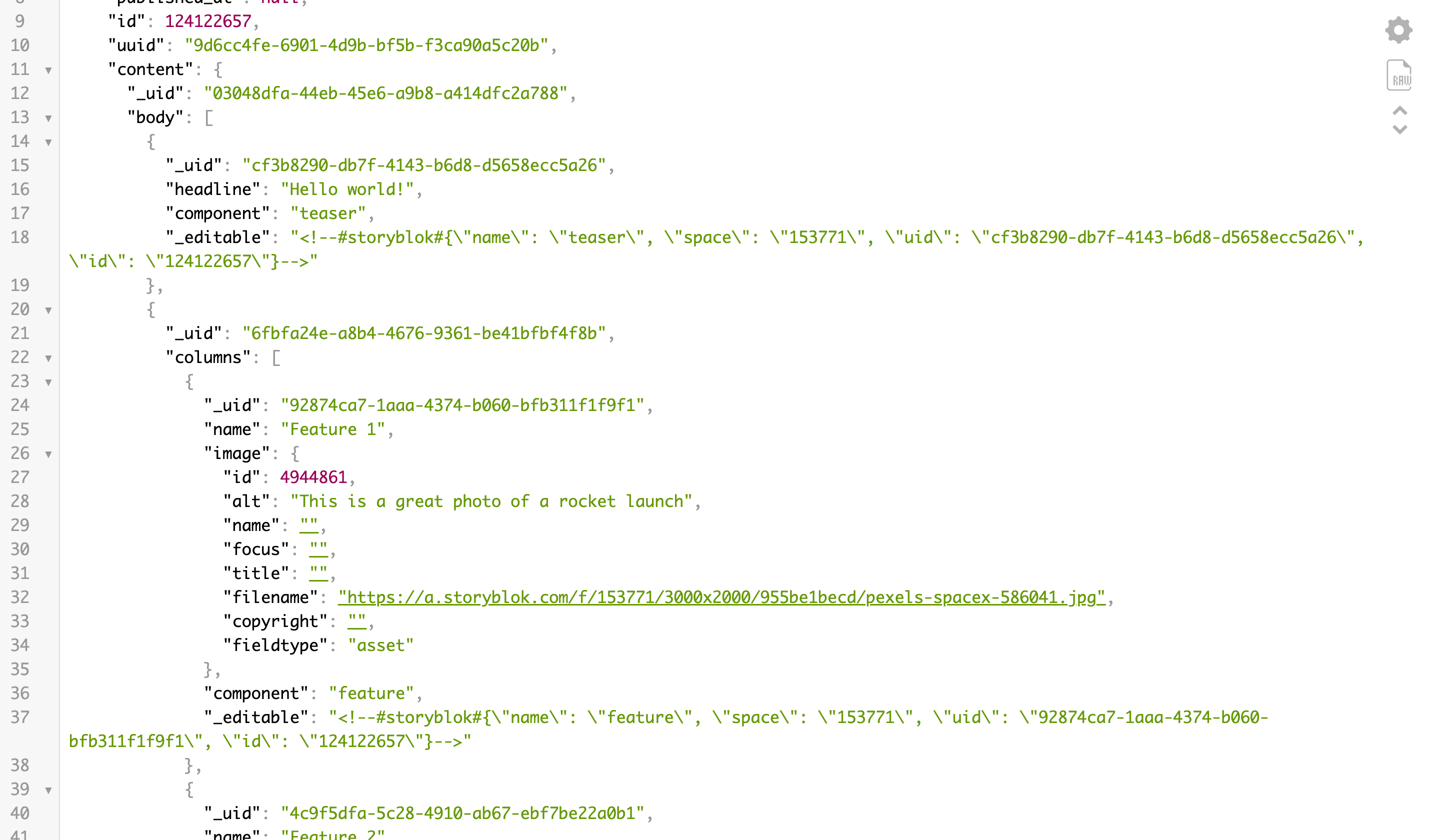
If you search for the term feature now, you’ll find the image field and all the data it provides {1}. We need the filename {2} and the alt {3} values.
Getting the right properties from the Draft JSON
Perfect. Let’s use those in Laravel by updating the resources/views/components/feature.blade.php component:
{!! Arr::get($blok, '_editable', '') !!}
<div class="w-full bg-[#f7f6fd] rounded-[5px] text-center overflow-hidden">
  <img
    src="{{ Arr::get($blok, 'image.filename', '') }}"
    alt="{{ Arr::get($blok, 'image.alt', '') }}"
    class="w-full h-48 xl:h-72 object-cover"
/>
  <div class="px-12 py-6">
    <h3 class="text-2xl text-[#1d243d] font-bold">
      {{ Arr::get($blok, 'name', '') }}
    </h3>
  </div>
</div>
What’s happening here? The $blok array contains all of the information that we need, so the image field and its nested properties filename and alt are easily accessible via the Arr::get() helper provided by Laravel. In Blade view, we can then very easily bind these values to any HTML tag, in this case, an img.
That already looks much better, doesn’t it?
Refined feature components with images
Make sure to check out the Storyblok Image Service to optimize your images on the fly.
Creating New Components
Having successfully modified an existing component, let’s now create a completely new block from scratch. Something that our website could really need is a nice-looking hero component, wouldn’t you agree?
Creating a Hero Component
Before creating the schema for this new block, let’s first of all consider what we would like it to look like and what options we want to provide. I would say that a headline, a subheadline and a background_image field would be a great place to start. However, let’s kick it up a notch and provide the option to make this hero component use the full width of the screen.
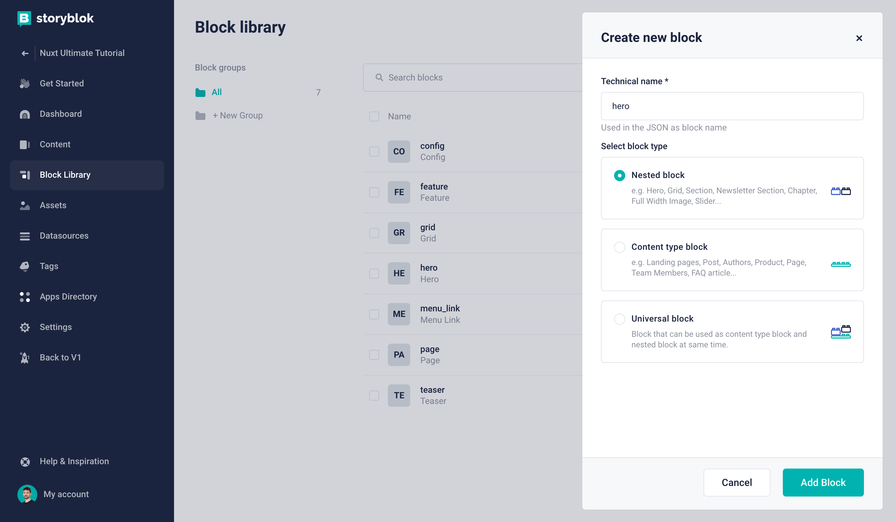
First, go to the Block Library {1} and create a New Block {2}.
Creating a new block in the Block Library
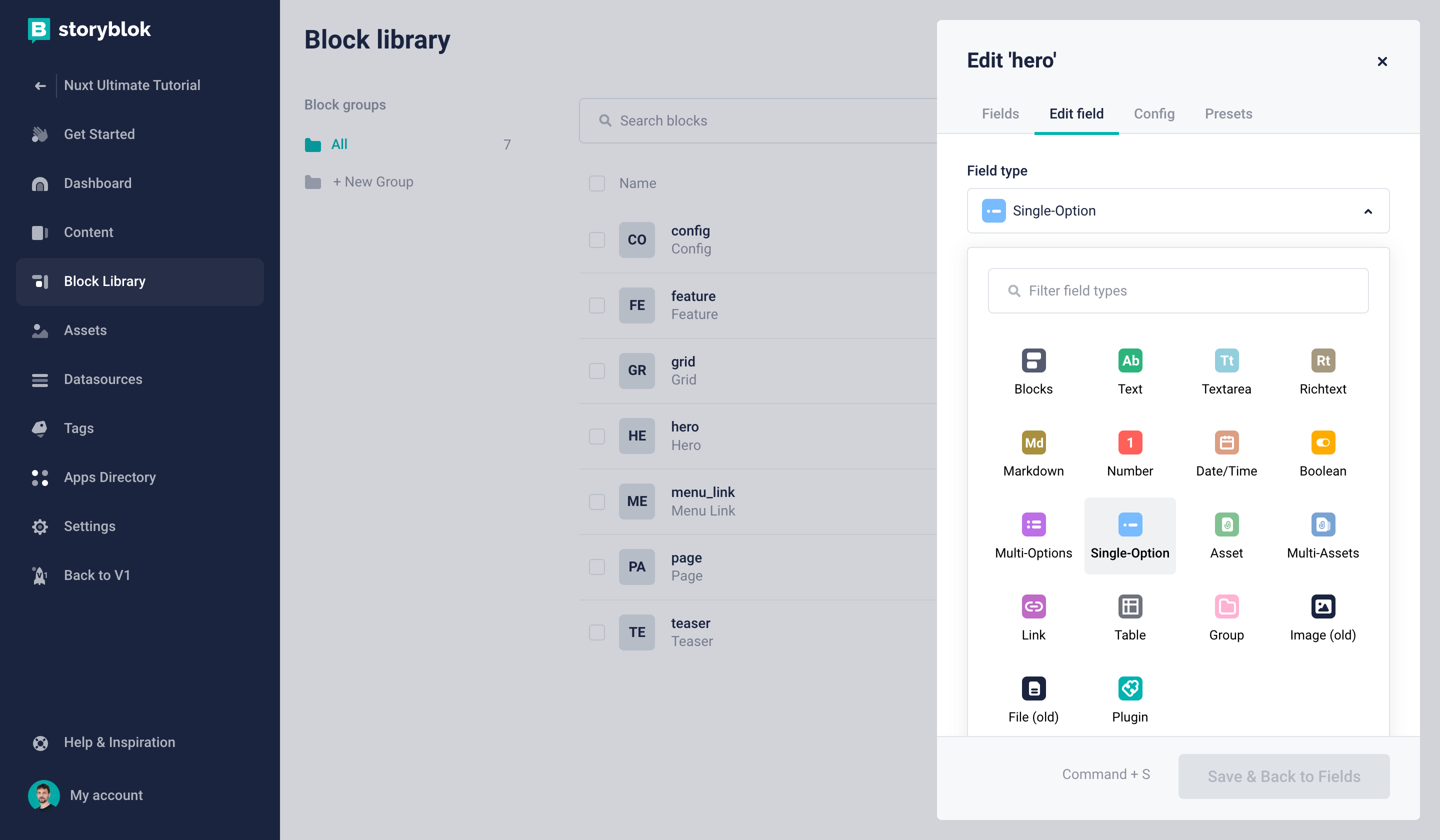
It should be a Nested block {1} with the name hero {2}.
Creating a new nested block
Now we can create our first three fields:
headline: field type Textsubheadline: field type Textbackground_image: field type Image
The required steps for this are exactly the same as we have taken to add an image field to the Feature component earlier in this tutorial.
Once these fields are ready, we can create the layout field to make it possible to choose between two different layouts. Let’s add the field and choose Single-Option as its type {1}.
Creating a single-option field
Let's add two key-value pairs which represent the possible choices {1}, hide the empty option {2}, and set the default value to constrained {3}:
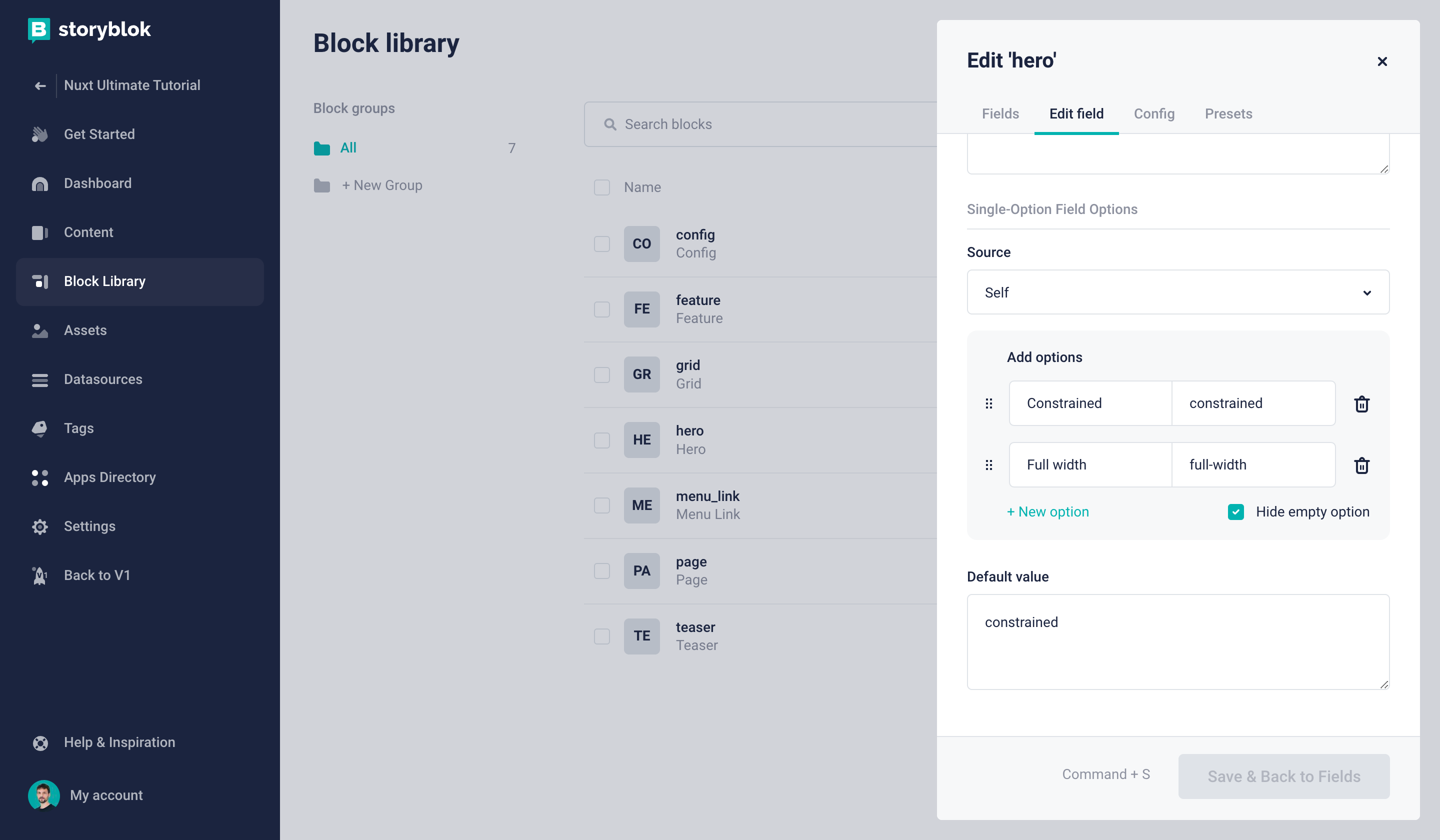
Defining the layout options for the hero component
Finally, save the component and add it to our Home story, right above the Teaser. You can already add some sample content to the fields. Of course, nothing will be shown in our frontend just yet. So let’s take care of that next, shall we?
Rendering the Hero Component in Laravel
All we have to do is create a new resources/views/components/hero.blade.php component with the following content:
{!! Arr::get($blok, '_editable', '') !!}
<div
  class="min-h-[500px] relative flex items-end justify-center my-6 rounded-[5px] overflow-hidden
  {{ Arr::get($blok, 'layout', '') === 'constrained' ? 'container mx-auto': ''  }}"
>
  <div class=" relative z-10 w-full text-center bg-gradient-to-t from-black/70 via-black/50 to-transparent py-6">
  <h1 class="text-6xl text-white font-bold mb-3">
    {{ Arr::get($blok, 'headline', '') }}
  </h1>
  <h2 class="text-4xl text-white font-light">
    {{ Arr::get($blok, 'subheadline', '') }}
  </h2>
</div>
<img
    src="{{ Arr::get($blok, 'background_image.filename', '') }}"
    alt="{{ Arr::get($blok, 'background_image.alt', '') }}"
    class="absolute top-0 left-0 z-0 w-full h-full object-cover"
/>
</div>
At this point, you should be familiar with most of the code. The only novelty is that we are going to determine which classes should be used depending on the value we get from the layout field we created.
If you refresh your Home story in the Visual Editor now, you’ll not only see the Hero component in all its glory – you can also change the layout and click on the Save button to see the changes!
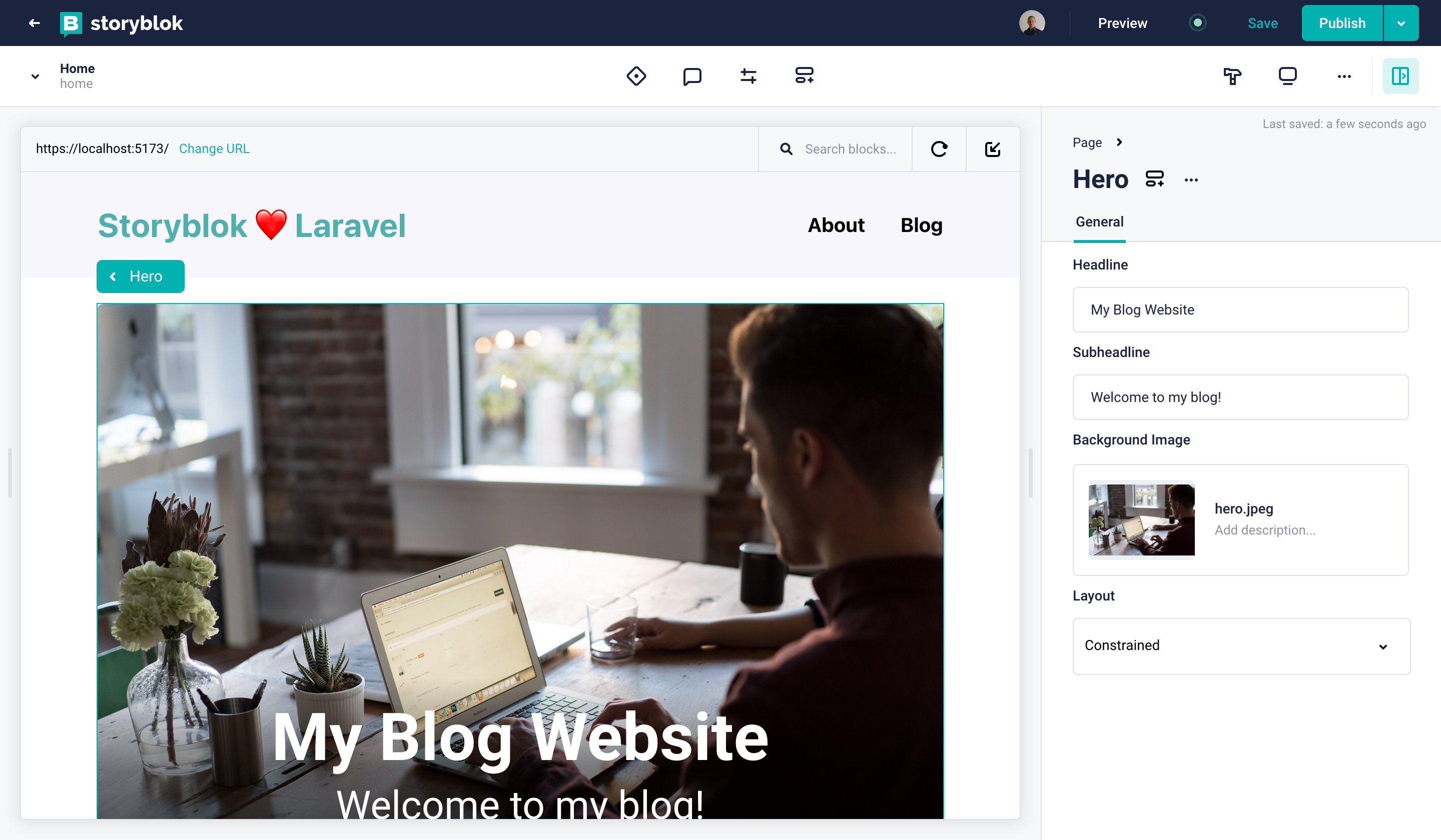
The Hero component rendered successfully
Wrapping up
Congratulations, when you reached this point you have successfully adapted the schema of existing components, created new components from scratch and incorporated all of the required code changes in your Laravel project! Great work!
The "Create Custom Components in Storyblok and Laravel" tutorial is part 4 of the Ultimate Tutorial Series for Laravel. If you are interested in the other parts, here the index page of The Storyblok Laravel Ultimate Tutorial.
| Resource | Link |
|---|---|
| Storyblok Laravel Ultimate Tutorial | https://www.storyblok.com/tp/storyblok-laravel-ultimate-tutorial |
| Storyblok PHP Client | https://github.com/storyblok/php-client |
| Storyblok Content Delivery API | https://www.storyblok.com/docs/api/content-delivery/v2 |
| Laravel | https://laravel.com/ |
