Add a headless CMS to Gatsby.js in 5 minutes
Storyblok is the first headless CMS that works for developers & marketers alike.
If you'd like to build a multilanguage website with Gatsby, please follow this tutorial to continue the rest. If you'd like to build a website without internationalization logic, please keep following the rest of this article and the Ultimate Tutorial articles.
This short tutorial will explore how to integrate Storyblok into a Gatsby.js site and enable the live preview in the Visual Editor. We will use the gatsby-source-storyblok plugin to load our data from Storyblok and enable the Storyblok Bridge to preview our changes.
You can find all the code for this tutorial and commits in our Gatsby Ultimate Tutorial repo.
Requirements
To follow this tutorial, there are the following requirements:
- Basic understanding of Gatsby.js and React
- Node, yarn (or npm) and Gatsby installed
- An account on Storyblok to manage content
- A new Storyblok space
The project in this article was developed using the following versions of these technologies:
- Gatsby ^5.10.0
- Nodejs v18.12.1
- npm v8.19.2
Keep in mind that these versions may be slightly behind the latest ones.
Setup the project
Let's start by creating a new Gatsby.js application. This time, we use Gatsby's default starter (opens in a new window).
npx gatsby new storyblok-gatsby-boilerplate https://github.com/gatsbyjs/gatsby-starter-defaultNext, we need to install a Gatsby SDK, gatsby-source-storyblok.
cd storyblok-gatsby-boilerplate
npm install --save gatsby-source-storyblok
Then let's start the development server.
npm run developOpen your browser in http://localhost:8000 (opens in a new window). You should see the following screen.

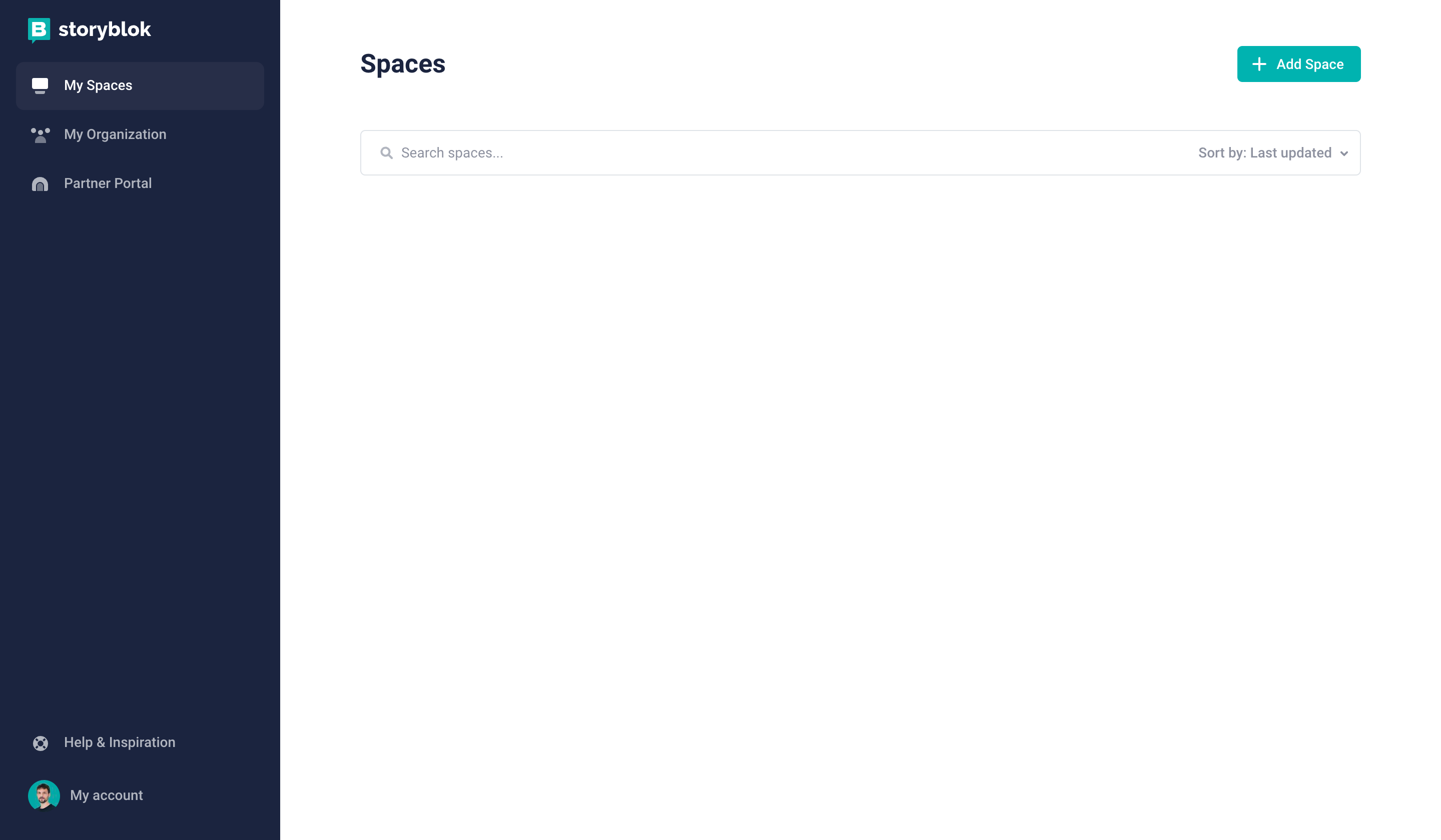
Configuration of the space
You can easily configure a new space by clicking Add Space {1} after having logged in to Storyblok.
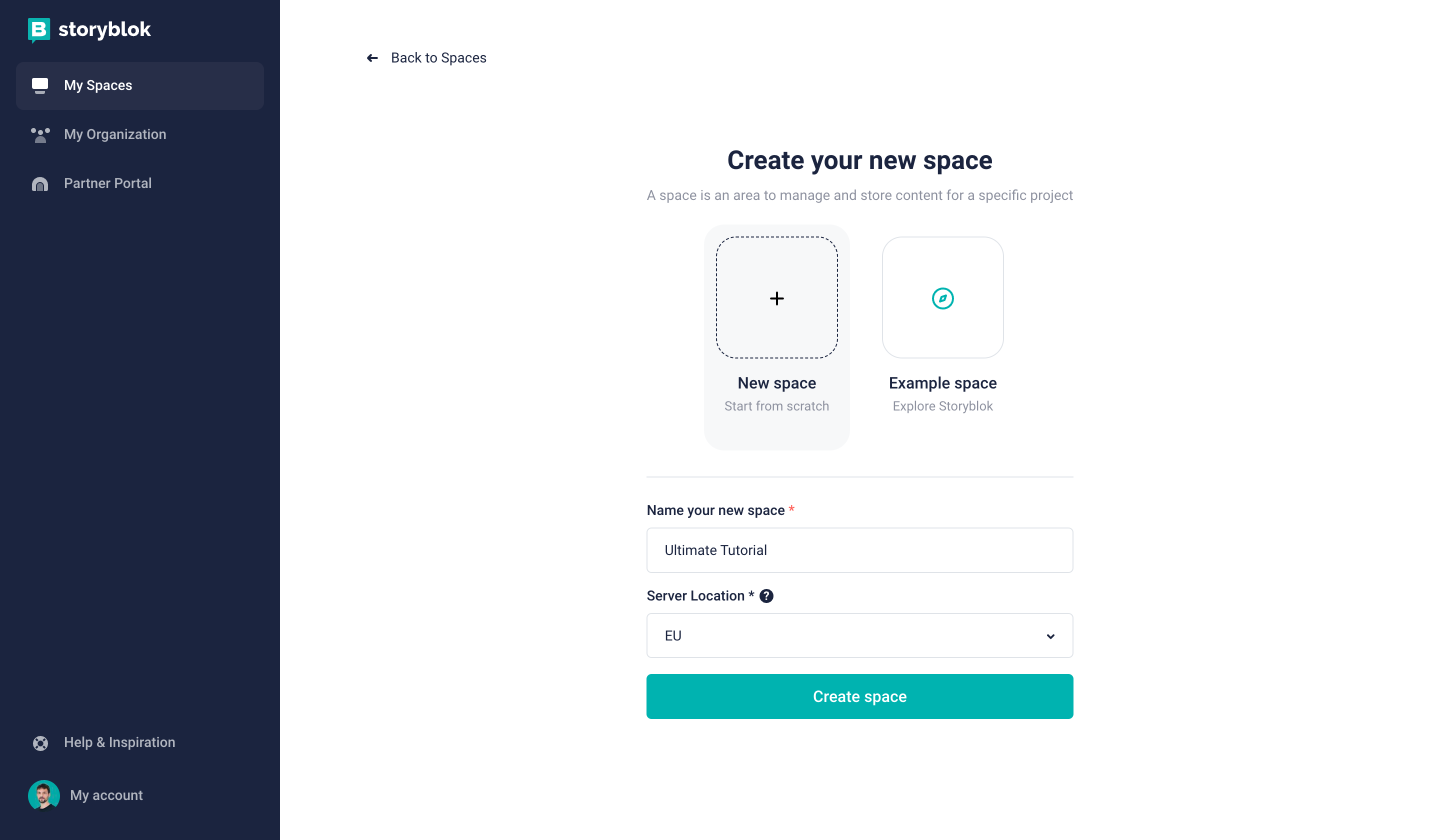
Creating a new space in Storyblok
Create a new space in the Storyblok app by choosing the Create space {1} option. Pick a name for it {2}. Optionally, you can choose between different server locations for your space {3} (if you choose the United States or China, please be mindful of the required API parameter explained hereinafter).
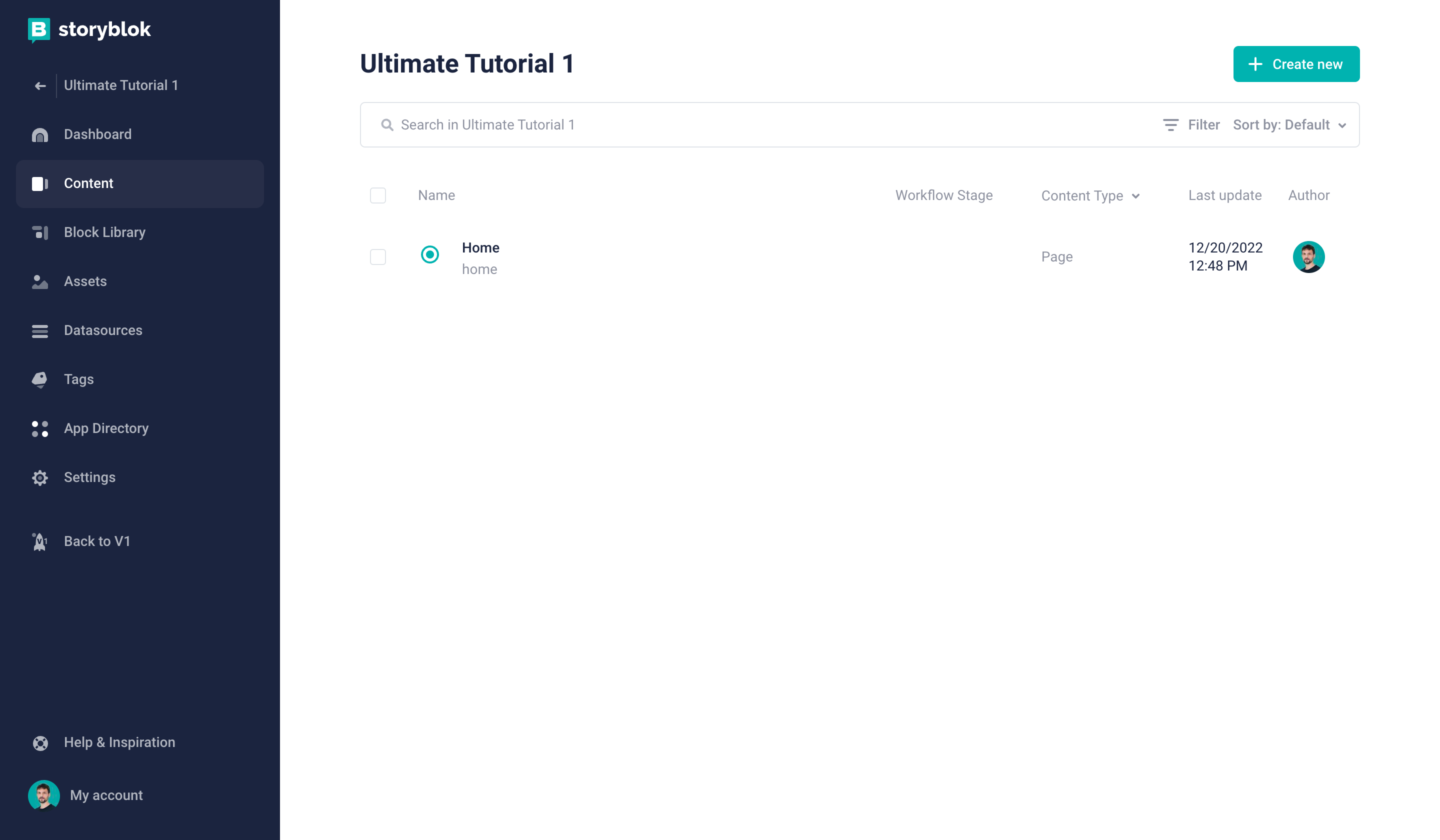
Creating a new space in Storyblok
Shortly afterward, a Storyblok space with sample content has been created for you. Let’s open the Home story by first clicking on Content {1} and then on Home {2}:
Opening the Home story
Now you’ll see the default screen and the Visual Editor:
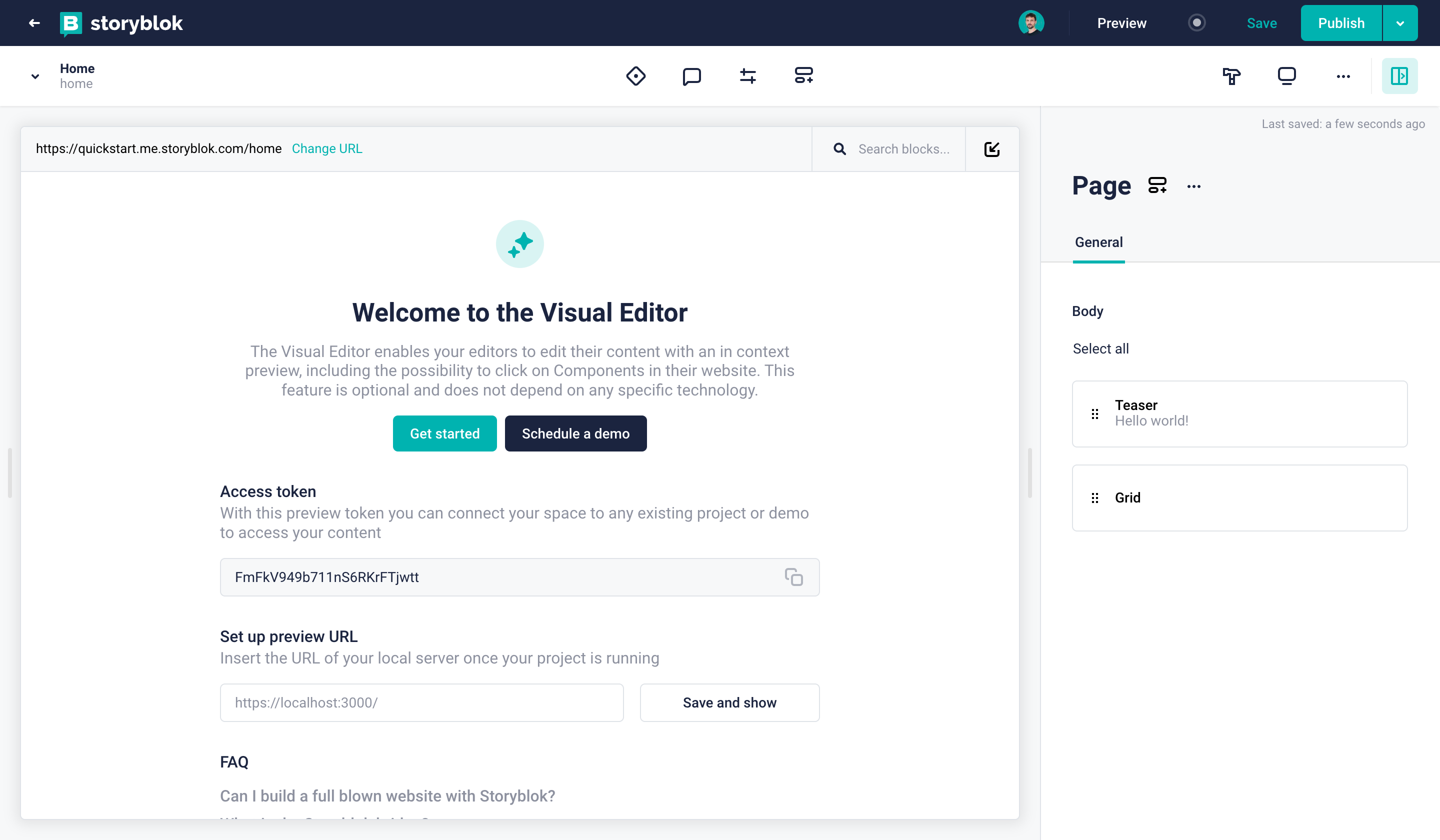
Visual Editor representing your Home story
Adding the development server to Storyblok
Create a new space and click on Settings {1} in the sidebar. At Visual Editor {2}, add your http://localhost:8000/ (opens in a new window) server as the default environment {3}. Or, with our Storyblok V2, add SSL certified localhost https://localhost:3010/ (opens in a new window) and run commands below.
// Install mkcert for creating a valid certificate (Mac OS):
$ brew install mkcert
$ mkcert -install
$ mkcert localhost

// Then install and run the proxy
$ npm install -g local-ssl-proxy
$ local-ssl-proxy --source 3010 --target 8000 --cert localhost.pem --key localhost-key.pem
Setting the real path
Next, click on Content and open the Home story. Since Storyblok will automatically attach the slug for any story entry, we need to set the real path on our home entry since the slug is home. Click on Entry Configuration icon {1} and enter / {2} as the Real Path. Now you should see your development server inside of Storyblok.

Using gatsby-source-storyblok
To connect to the Storyblok API, we have already installed the gatsby-source-storyblok plugin. Now it's time to add it to our project. Add the following to your gatsby-config.js file (Line 17).
import type { GatsbyConfig } from "gatsby"

const config: GatsbyConfig = {
  flags: {
    PARTIAL_HYDRATION: true
  },
  siteMetadata: {
    title: `test-v5`,
    siteUrl: `https://www.yourdomain.tld`,
  },
  // More easily incorporate content into your pages through automatic TypeScript type generation and better GraphQL IntelliSense.
  // If you use VSCode you can also use the GraphQL plugin
  // Learn more at: https://gatsby.dev/graphql-typegen
  graphqlTypegen: true,
  plugins: [
    {
      resolve: 'gatsby-source-storyblok',
      options: {
        accessToken: 'your-access-token',
        version: 'draft',
        localAssets: true,
      }
    },
  ],
}

export default configPartial Hydration Line 5 enables you to selectively add interactivity to decide which components acts as client side component.”
Retrieve your preview token {3} from your space Settings {1} under API-Keys {2}. Add the token to your source plugin in gatsby-config.js as the accessToken on Line 19. Or, store the preview token in .env.development and .env.production files to use environment variables.
You'll need to prefix the Access token with GATSBY_ for accessing it on the browser. Also, you need to add dotenv or require gatsby-config.js to read environment variables. Find more details on Gatsby's documentation.

Using the GraphiQL Explorer
Gatsby 5 removed GraphQL playground. See more details in Gatsby documentation here.
If you're working with Gatsby.js, whenever you start the development, it will also begin the GraphiQL Explorer on the following URL: http://localhost:8000/___graphql (opens in a new window). As soon as you add the source plugin, you will explore the Storyblok API endpoints there. Read the following tutorial (opens in a new window) to learn more about the explorer.
It's helpful to enable the refresh feature described in the how-to refresh content (opens in a new window)tutorial. You can do that by pretending the develop command in your package.json file:
  "scripts": {
     ...
    "develop": "ENABLE_GATSBY_REFRESH_ENDPOINT=true gatsby develop",
     ...
}
If you're connected to the Storyblok API through the source plugin, you should be able to see multiple query options in the Explorer. You can select, for example, allStoryblokEntry {1} and get specific information from Storyblok like the full_slug {2} of a story. By clicking around the explorer, your query will automatically be built on the right {3}. If you enable the refresh endpoint, you will also see a Refresh Data {4} button to reload the data. Finally, if you got the query you want, you can click the Code Exporter button {5} to get the Javascript code you need inside of Gatsby.

Using gatsby-source-storyblok on a page
By default, Storyblok provides three components (Teaser, Feature, and Grid) and one content-type (Page). Let's create a collection route inside src/pages.
|-- src
   |-- pages
|-- index.jsYou can create components instead of using default components. These components are defined to show you examples of components.
Now that we’ve made sure that we have default components provided from Storyblok. Let's update components/layout.js, a global layout component to help initialize Storyblok API only once instead of several times.
"use client";
import React from "react"
import PropTypes from "prop-types"
import { storyblokInit, apiPlugin } from "gatsby-source-storyblok"

storyblokInit({
  accessToken: process.env.GATSBY_PREVIEW_STORYBLOK,
  use: [apiPlugin],
  components: {
     //components
  }
});

const Layout = ({ children }) => {
  return (
    <div>
      <main>{children}</main>
    </div>
  )
}

Layout.propTypes = {
  children: PropTypes.node.isRequired,
}

export default Layout"use client" is required for Partial Hydration to make components act as client components (RSC)
Let's update pages/index.js, our homepage, with the code below. We're loading our home content through the gatsby-source-storyblok plugin. Keep in mind that by default, the Gatsby.js source plugin is loading content at build time because Gatsby serves pages with SSG by default. So, whenever you change the content inside Storyblok with Gatsby’s SSG, you will need to restart your server or use the refresh data feature described above. Read this article (opens in a new window) to understand the difference between build and client time in Gatsby.
import * as React from "react"
import { graphql } from "gatsby"

import { StoryblokStory } from "gatsby-source-storyblok"

import Layout from "../components/layout"

const IndexPage = ({ data }) => {
  if (typeof data.storyblokEntry.content === "string") data.storyblokEntry.content = JSON.parse(data.storyblokEntry.content);

  return (
    <Layout>
      <StoryblokStory story={data.storyblokEntry} />
    </Layout>
  )
}

export default IndexPage

export const query = graphql`
  query HomeQuery {
    storyblokEntry(full_slug: { eq: "home" }) {
      content
      name
      full_slug
      uuid
      id
      internalId
    }
  }
`
Since gatsby-source-storyblok returns the content as a string, we will need to parse the story content with JSON.parse().
StoryblokStory handles and listen to events that happen on the visual editor and load the Storyblok JS Bridge as well. We'll have a closer look at more details on the further steps.
Setting the correct region
Depending on whether your space was created in the EU, the US, Australia, Canada, or China, you may need to set the region parameter of the API accordingly:
eu(default): For spaces created in the EUus: For spaces created in the USap: For spaces created in Australiaca: For spaces created in Canadacn: For spaces created in China
Here's an example for a space created in the US:
apiOptions: {
  region: "us",
},Note: For spaces created in any region other than the EU, the region parameter must be specified.
Adding & Loading Dynamic Components
Now that we kickstarted our project and have a simple connection to Storyblok, we want to load components dynamically. We will create two component files in the component folder: page.js & teaser.js
import React from "react";
import { storyblokEditable, StoryblokComponent } from "gatsby-source-storyblok";

const Page = ({ blok }) => (
  <main {...storyblokEditable(blok)}>
    {blok.body.map((nestedBlok) => (
      <StoryblokComponent blok={nestedBlok} key={nestedBlok._uid} />
    ))}
  </main>
);

export default Page;import * as React from "react"
import { storyblokEditable } from "gatsby-source-storyblok";
const Teaser = ({ blok }) => {
return (
<div {...storyblokEditable(blok)} data-test="teaser">
<h1>{blok.headline}</h1>
</div>
)
}
export default Teasercomponents/page.js and components/teaser.js are component files dynamically loaded through the dynamic component loader. Let's import and add dynamic components to components/layout.js.
import * as React from "react"
import PropTypes from "prop-types"
import { storyblokInit, apiPlugin } from "gatsby-source-storyblok"
import Page from './Page'
import Teaser from './Teaser'


storyblokInit({
  accessToken: process.env.GATSBY_PREVIEW_STORYBLOK,,
  apiOptions: {
    region: "us", // Pass this key/value if your space was created under US region
  },
  use: [apiPlugin],
  components: {
    page: Page,
    teaser: Teaser
  }
});

const Layout = ({ children }) => {
  return (
    <div>
      <main>{children}</main>
    </div>
  )
}

Layout.propTypes = {
  children: PropTypes.node.isRequired,
}

export default LayoutFor spaces created in the United States, you have to set the region parameter accordingly: { apiOptions: { region: 'us' } }. You can see that in line {11} of components/layout.js
Next up, let's call an API, StoryblokStory to handle loading dynamic components.
import * as React from "react"
import { graphql } from "gatsby"
import { StoryblokStory } from "gatsby-source-storyblok"

import Layout from "../components/layout"

const IndexPage = ({ data }) => {
  if (typeof data.storyblokEntry.content === "string") data.storyblokEntry.content = JSON.parse(data.storyblokEntry.content);

  return (
    <Layout>
      <StoryblokStory story={data.storyblokEntry} />
    </Layout>
  )
}

export default IndexPage

export const query = graphql`
  query HomeQuery {
    storyblokEntry(full_slug: { eq: "home" }) {
      content
      name
      full_slug
      uuid
      id
      internalId
    }
  }
`
In Line 8, we check if the property "content" is a string, then parse it to become an object so we can display it dynamically.
<StoryblokStory/> keeps the state for the story behind the scenes and use StoryblokComponent to render the route components dynamically, using the list of components loaded during the initialization inside the storyblokInit function. You can use the StoryblokComponent inside the components to render the nested components dynamically. The teaser component is a component that already exists in your Storyblok space whenever you create a new space.
You can load grid and feature components like teaser component. However, keep in mind that the grid component is mapping the other components that will be nested inside. In short, the grid component is a parent component that contains other components inside.
import React from "react";
import { StoryblokComponent } from "gatsby-source-storyblok";

const Grid = ({ blok }) => (
  <ul key={blok._uid}>
    {blok.columns.map((blok) => (
      <li key={blok._uid}>
        <StoryblokComponent blok={blok} />
      </li>
    ))}
  </ul>
);

export default Grid;
You can visually check the nested component layout from the Visual Editor.
You can click the Show form view icon in the top right corner in the Visual Editor area to minimize the Visual Editor and select the Search blocks magnifying glass icon.
|-- page
   |-- teaser
   |-- grid
      |-- feature
      |-- feature
      |-- feature
Components should be loaded automatically and you can see rendered components on the visual editor. If the component is not defined in your component/layout.js file, you will see the components won't be loaded.

Enabling the Visual Editor & Live Preview
For 'live loading' content, a little limitation is the cache forces to load the previous content by only hitting a save button on the visual editor. To solve it, after hitting a save button, hit reload button on the visual editor to load the most updated content.
So far, we have loaded our content from Storyblok, but we cannot directly select the different components. To enable Storyblok's Visual Editor, we need to connect the Storyblok Bridge. For this tutorial, we will use the new Storyblok Bridge Version 2 (opens in a new window). After loading the bridge, we will need to add a React hook to enable live updating of the story content. But not to worry. You have already handled the logic to listen to events on the visual editor and load Storyblok JS Bridge by calling an API called <StoryblokStory/> in the previous steps.
The Logic to adding the Storyblok Bridge
Technically, we have completed loading the Storyblok JS Bridge but let's understand the fundamentals from behind the scene. We need to add a specific <script> tag to the end of our document whenever we want to enable it. It's mostly the case when you're inside the Storyblok editor. By wrapping the page in a storyblokEditablecomponent, we also make the page fields like the teaser clickable.
<script src="//app.storyblok.com/f/storyblok-v2-latest.js" type="text/javascript" id="storyblokBridge">
</script>
gatsby-source-storyblok adds the React custom hooks code after the client. Inside this hook, we have a function that adds the script tag if it's not already present. Once the loading of the bridge is completed, it will call another function to enable input , published , and change events inside Storyblok.
Call storyblokEditable
Based on this logic, we need to load this hook in our pages/index.js file on Line 5. Also, to make dynamic components editable, we call storyblokEidtable from gatsby-source-storyblok and wrap the components with storyblokEditable in the scope of JSX (Line 16).
import React from "react";
import { storyblokEditable, StoryblokComponent } from "gatsby-source-storyblok";

const Page = ({ blok }) => (
  <main {...storyblokEditable(blok)}>
    {blok.body.map((nestedBlok) => (
      <StoryblokComponent blok={nestedBlok} key={nestedBlok._uid} />
    ))}
  </main>
);

export default Page;
If the connection with the Storyblok hook is working from useStoryblokState, you should be able to select the component directly. Let's apply storyblokEditable to the rest of the dynamic components.
import * as React from "react"
import { storyblokEditable } from "gatsby-source-storyblok";

const Teaser = ({ blok }) => {
  return (
    <div {...storyblokEditable(blok)}>
      <h1>{blok.headline}</h1>
    </div>
  )
}

export default Teaserimport React from "react";
import { StoryblokComponent, storyblokEditable } from "gatsby-source-storyblok";
const Grid = ({ blok }) => (
<ul {...storyblokEditable(blok)} key={blok._uid} data-test="grid">
{blok.columns.map((blok) => (
<li key={blok._uid}>
<StoryblokComponent blok={blok} />
</li>
))}
</ul>
);
export default Grid;import React from "react";
import { storyblokEditable } from "gatsby-source-storyblok";
const Feature = ({ blok }) => {
return (
<div {...storyblokEditable(blok)} key={blok._uid} data-test="feature">
<h2>{blok.name}</h2>
<p>{blok.description}</p>
</div>
);
};
export default Feature;
Automatic Page Generation with File System Route API
If you'd like to build a multilanguage website with Gatsby, please follow this tutorial to continue the rest. If you'd like to build a website without internationalization logic, please keep following the rest of this article and the Ultimate Tutorial articles.
In most cases, you would want to automatically generate the pages from the content set up in Storyblok. To do that with Gatsby, we can follow this tutorial (opens in a new window). What we need to do is to create a page file: pages/{storyblokEntry.full_slug}.js , and that's it! By creating {storyblokEntry.full_slug}.js file, Gatsby will use this page template for each storyblokEntry. The full_slug query will also recognize the nested entries inside the folders.
|-- src
   |-- pages
      |-- index.js
      |-- {storyblokEntry.full_slug}.js
With Gatsby's File System Route API, we don't have to configure gatsby-node.js file anymore, and no need to create template files. Easy and more performant. Let’s import dynamic components and load JS Bridge as well as JS Client in pages/{storyblokEntry.full_slug}.js file.
import * as React from "react"
import { graphql } from "gatsby"

import { StoryblokStory } from "gatsby-source-storyblok"

import Layout from "../components/layout"

const IndexPage = ({ data }) => {
  if (typeof data.storyblokEntry.content === "string") data.storyblokEntry.content = JSON.parse(data.storyblokEntry.content);

  return (
    <Layout>
      <StoryblokStory story={data.storyblokEntry} />
    </Layout>
  )
}

export default IndexPage

export const query = graphql`
  query ($full_slug: String) {
    storyblokEntry(full_slug: { eq: $full_slug}) {
      content
      name
      full_slug
      uuid
      id
      internalId
    }
  }
`Gatsby officially recommends File System Route API for better performance and minor complications to set up page generations. If you still prefer Gatsby's createPages API, check our How to generate pages by createPages API with Gatsby.js tutorial with createPages API.
Adding a fallback page
Since the production build will only have the content and data available during build time, we need to add a fallback to our 404 page to display Storyblok content via a client-side request. Add the following to the pages/404.js:
import * as React from "react"
import Layout from "../components/layout"
const NotFoundPage = () => (
<Layout>
<h1>404: Not Found</h1>
<p>You just hit a route that doesn't exist... the sadness.</p>
</Layout>
)
export default NotFoundPageWe're calling our Storyblok hook with no given story. However, suppose we're inside the Storyblok editor. In that case, we can access the editor story and update the page dynamically on the input event, which will give us a preview of the page. If you're on the development server, you have to click the Preview custom 404-page button {1} to see this fallback page.


Using Storyblok's GraphQL API
If you want to use our GraphQL API directly instead of the gatsby-source-storyblok (opens in a new window) plugin, we recommend using the gatsby-source-graphql (opens in a new window) plugin. It can be helpful to query the content object instead of a stringified version. Add the following to your gatsby-config.js file:
module.exports = {
  /* Your site config here */
  plugins: [
    ...
    {
      resolve: `gatsby-source-graphql`,
      options: {
        fieldName: `Storyblok`,
        typeName: `storyblok`,
        url: `https://gapi.storyblok.com/v1/api`,
        headers: {
          Token: `YOUR_PREVIEW_TOKEN`,
          Version: `draft`,
        },
      },
    },
  ],
}gatsby-source-graphql is a Gatsby plugin. gatsby-source-graphql doesn't have an API to enable the real-time visual editor feature.
If you'd like to speed up GraphQL API performance, you can read the "GraphQL speed improvements" changelog article.
Optional: Changing Styles
Let’s add TailwindCSS (opens in a new window) to our project for the ease of adding styles. You can refer to this guide (opens in a new window) for adding TailwindCSS to Gatsby.js .
After adding TailwindCSS, let’s add a couple of classes to the Page, Teaser and Grid components.
The Page.js file should look something like this -
import React from "react";
import { storyblokEditable, StoryblokComponent } from "gatsby-source-storyblok";

const Page = ({ blok }) => (
  <main className="text-center mt-4" {...storyblokEditable(blok)}>
    {blok.body.map((nestedBlok) => (
      <StoryblokComponent blok={nestedBlok} key={nestedBlok._uid} />
    ))}
  </main>
);

export default Page;
Change the Grid.js code to the following -
import React from "react";
import { StoryblokComponent, storyblokEditable } from "gatsby-source-storyblok";

const Grid = ({ blok }) => (
  <ul className="grid grid-cols-3" {...storyblokEditable(blok)} key={blok._uid} data-test="grid">
    {blok.columns.map((blok) => (
      <li key={blok._uid} className="text-center flex-auto px-6">
        <StoryblokComponent blok={blok} />
      </li>
    ))}
  </ul>
);

export default Grid;
Change the Teaser.js code to the following -
import * as React from "react"
import { storyblokEditable } from "gatsby-source-storyblok";

const Teaser = ({ blok }) => {
  return (
    <div className="text-2xl mb-10" {...storyblokEditable(blok)} data-test="teaser">
      <h1 className="text-center">{blok.headline}</h1>
    </div>
  )
}

export default Teaser
Change the Feature.js code to the following -
import React from "react";
import { storyblokEditable } from "gatsby-source-storyblok";

const Feature = ({ blok }) => {

  return (
    <div className="py-2" {...storyblokEditable(blok)} key={blok._uid} data-test="feature">
      <h2 className="text-lg">{blok.name}</h2>
      <p className="text-lg">{blok.description}</p>
    </div>
  );
};

export default Feature;
After adding the styles in your components the home story now should look something like this

Conclusion
Congrats! You just completed the first step of our Gatsby ultimate tutorial! We learned how to integrate Storyblok into a Gatsby.js project. We saw how to manage and consume content using the Storyblok API, GraphQL from Gatsby, and GraphQL API from Storyblok. Also, we learned how to enable a real-time visual experience using the Visual Editor. We went through different features that Gatsby.js offers to create great user experiences: GraphQL, File System Route API to generate performant pages, etc.
In the next part of this series, we will see how to start making a real website with Gatsby.js and Storyblok.
| Resource | Link |
|---|---|
| Gatsby Ultimate Tutorial repo | https://github.com/storyblok/gatsby-ultimate-tutorial |
| Storyblok Gatsby.js Ultimate Tutorial | https://www.storyblok.com/tp/storyblok-gatsby-ultimate-tutorial |
| Gatsby.js Technology Hub | https://www.storyblok.com/tc/gatsbyjs |
| Storyblok Gatsby SDK | https://github.com/storyblok/gatsby-source-storyblok |
| Gatsby Documentation | https://www.gatsbyjs.com/docs/ |
Question or Feedback?
Author
