eCommerce UX/UI in 7 minutes
Storyblok is the first headless CMS that works for developers & marketers alike.
eCommerce is in constant motion as the industry and world around us consistently and actively changes. Some things stay, while others move on, fading with time. The way we consume, react, and behave to brands through the overall purchasing experience lends to a deeper root of customer expectation and transformation within the eCommerce industry. The industry moves with the way we consume, the way we think, and arguably interact and gain an impression with each brand, and website. By 2021, it is predicted that the global eCommerce market is projected to grow to more than 4.48 trillion US dollars, double the amount since 2017.
More than ever, consumers have become more attentive to the eCommerce websites they browse, making it a make-or-break ultimatum for businesses of whether a customer will choose to continue interacting with that eCommerce site, or simply, ‘bounce’, leading to the fact that:
- 94% of first impressions on an eCommerce site are design-related
- 88% of online consumers are less likely to return to a website with a bad user experience
- 32% of customers are willing to walk away from a loved brand after one bad website user experience
What is eCommerce UX/UI?
First and foremost before getting into eCommerce UX/UI, we need to understand what is user experience (UX) and the user interface (UI) that accompanies it. In simple terms, from the creation of a product, user experience (UX) is the person’s emotions and behavior towards that specific product, system or service based on how they interact with it, and experience it. Meanwhile, user interface (UI) is the specific design or asset that a user will interact with based on the design that is created. Think of it as the intersection between design and functionality - creating a product that is both usable and accessible, while being designed to capture the eye and invoke a pleasant experience while using the product.
With eCommerce UX/UI, the designer aims to explore and create an experience that will provide a user (customer) an enjoyable shopping experience while logically placing different site elements from the customer journey stages and sales funnel into the experience. These can be considered touchpoints that turn into conversions that a brand can optimize to raise brand awareness and engage customers.
Have you read our article on Customer Journeys yet? Find out more about how to understand your customers and optimize each stage of their purchasing journey through your eCommerce website.
Why is UX/UI Design important for eCommerce Websites?
It’s all about first impressions and the ability your site has in becoming a catalyst within a customer’s purchasing journey. Specifically, eCommerce retailers and designers who specially curate their user experience, adapting to the behaviors and to the standard set of eCommerce design principles according to the customer’s journey. When implemented correctly, you will be able to reap the opportunities of increasing your conversions, with results of gaining more return customers, less cart abandonment, and higher conversions for your brand and thus, higher market growth and sales.
Check out our article on Optimizing your eCommerce conversions and Site Performance for an overview of the prime conversions and site performance expectations to apply to your eCommerce site.
Designing for the five types of eCommerce customers
According to a research user experience study by Nielsen Norman, there are five types of eCommerce customers - when designing and mapping out the customer journey to better understand the stages that a customer goes through. Knowing each buyer persona’s different motivations and habits will help your brand and designers to improve the overall site usability curated to different types of customers. The five types of eCommerce customers are:

| eCommerce Customer Type | Customer Description & Persona |
|---|---|
| Product-Focused | They know exactly what they want and the key is speed. They want a quick and streamlined experience that will locate their desired product and check out as seamlessly as possible. |
| Browsers | They want to see what’s new, what’s on offer/sale, and what products are popular on your site. They will want easy access and browsing through your product pages while having the ability to share information about any products they like through social media, to a friend, etc. |
| Researchers | They want details about every bit of information on your product, reviews, comparisons between products, and easy to edit shopping carts that hold their products between each visit. |
| Bargain Hunters | They’ll be looking for anything on offer/sale and on discount. This will involve displaying sale items alongside full-priced products, a CTA towards a special offer/sales page, clear discount redemption at checkout, and sign-up to newsletters for instant discount/offers. |
| One-time shoppers | Similar to Product-Focused shoppers, they want clear site navigations, product descriptions, transparent user reviews, and brand information, and the ability to purchase as a guest. They have a one-time purchasing need and may not necessarily know the site they will visit/shop on. They are often gift-card recipients or gift buyers. |
With this, your design team can move on to creating the best optimal design to accommodate the different types of customer personas and journeys to drive conversions.
Optimizing your design to drive conversions
It is a fact that design has the ability to drive conversions through different touchpoints of the customer journey/sales funnel - yet, when unoptimized, remains incognito to the eye of the customer. By breaking down the different design touchpoints that a customer interacts with (such as with a customer journey), your brand can better understand different motivational points that drive different types of potential customers to your site, and thus, drive a higher conversion rate, leading to a reduced bounce rate.
Inspired by Toptal’s UX design principles, a simple structure to view the customer journey stages to touchpoint to conversions are through:
1. Introduction (Awareness) Landing Page:
Your landing page is the first impression and the prime opportunity to position your brand clearly and correctly. At a first glance, your brand must already grab your potential customer’s attention while showing them what your brand sells and the fit your brand has in the overall market:
- Design your landing page with a focus on the font, graphics (photography or video), and the copy to go along with it
- Find a good call to action (CTA) to not only welcome them to your page but to urge and direct them to the next step of the customer journey
- Make sure your landing page is geared using a copy that connects with a customer’s search term on search engines such as Google. When a customer searches for a specific word or product, relevant keywords are key for Google bots to determine the relevancy of your site amongst others, therefore ranking it higher in a search
An example of a great landing page that unifies on-point branding and a call to action is Away, and search-specific landing pages optimized for specific keywords being ASOS (when searching for ‘Wedding Party Dresses’, ASOS’s search-specific page of dresses for guests that can be worn at a wedding is ranked highly on Google).


2. Education (Interest) - Product Search:
When customers know what they want, they need the most straight-forward way of getting to their product:
- A useful tool to have is by providing an on-site search option. Customers can type in the product name, category, or even model (SKU) number, providing a direct route to where and what they want
- If a customer is still browsing with a general idea of what they are looking for but not specifically, your brand can inspire them. By providing a discovery or inspiration page, showing popular or new products, as well as those geared towards a specific theme (such as Christmas, Valentine’s Day, Wedding Season), allows customers to easily see what is on offer, and aid them into the next stage of the customer journey of finding what they want
- Include a filter system on your product page to allow your customers to choose different categories and criteria in their searches to find what they are looking for. This can include size, fit, clothing type, pricing, or color if you are a clothing eCommerce store for example
An example that uses all three elements of on-site search and a filter system is Adidas, while a great example of an inspiration or discovery page is Etsy.


3. Evaluation (Analysis) - Product Page:
Sometimes stating the obvious is not so obvious to the eye of a customer:
- Making primary display actions prominent to the eye, such as “Add to Cart” or “Buy Now”, needs to be in a location relative to your product and description
- Accompany high-quality photos and detailed descriptions that aid your customers to better understand the product
- Include clear and transparent indications on shipping options, product availability, and return policies aids in instilling trust and reliability of getting your product to your customer as easy as possible
Using progressive navigation and visual organization of your product page (between your product image, description, display action buttons, user reviews, additional information), allows your customers to access the most important information and consume that information in an organized way of their customer journey. Such elements of a product page can be seen with Uniqlo.


4. Decision (Engagement) - Shopping Cart Page:
Your customer has made it this far and is about to complete their purchase. Here are some things to consider when designing your shopping cart page:
- Show your customer a clear order summary of what is in their shopping cart with the item name, image, quantity, price, and order total
- Make sure to allow your customers the chance to edit any items within the order summary easily, whether they want to add or delete an item, move it to their wishlist, choose a shipping option, as well allow the chance to add a discount code if offered
An example here is with Storyblok-built eCommerce site, Happy Socks:

5. Purchase - Checkout Process:
The most frustrating part for a customer just about to finish their purchase is to add another hurdle. At least 40% of purchases made on eCommerce sites are impulse buys - adding another hurdle in the checkout such as making your customer have to create an account or sign up, will only add more barriers to the process.
- Allow your customers to check out as a guest, while additionally giving them the option to think about signing up or creating an account with your brand. An example is with Apple's check-out page
- By providing multiple options for your customer to choose, does not limit them to just one track, but allows them the space to choose and consider whether they would rather check out quicker as a guest, or slow down and create an account with your brand
- An incentive to get your customers to sign up with your brand is through the means of a newsletter or through email marketing, that updates customers with the latest offers, sales, new/back-in-stock products, and discount codes

Throughout the entire checkout process, an additional design factor to spur your customer on their purchasing journey is:
- Including a progress bar to show where the customer is on the checkout journey to see what are the next steps. This additionally allows customers to take a step back in the checkout journey to double-check their order, while not losing any progress itself
- Likewise to further simplify the checkout, including everything on one scroll-down page
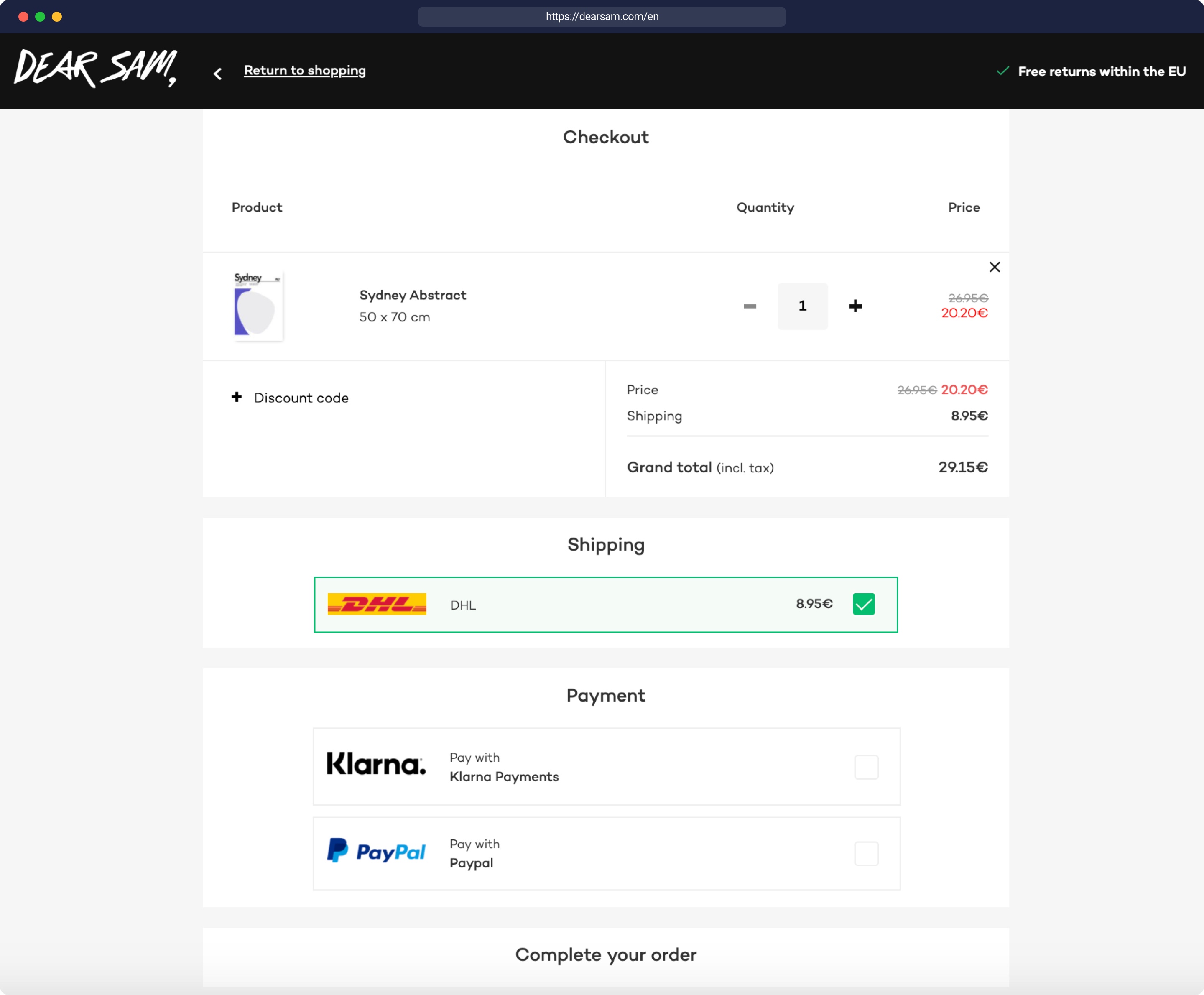
A great example of a one-page checkout is with a Storyblok-built eCommerce site, Dear Sam:
Finally, the usage of common payment methods takes down one extra hurdle. Most commonly, payment is conducted through major credit cards, yet different countries and regions of the world may use different types of payments. According to a study, 56% of customers expect a variety of payment options in the checkout journey. When considering expanding your eCommerce store internationally:
- Allow major payment methods such as PayPal, as well as regionally-focused methods of payments. For example in South East Asia, bank transfers, cash through ATM as well as cash collection on delivery (COD) are favored over using payment via credit cards such as the example of Uniqlo Thailand below that offers both credit card payment and cash on delivery

6. Retention (Repeating the experience) - Confirmation Page & Customer Service:
With the purchase complete, a detailed order summary or confirmation through email allows an additional reiteration of the overall purchasing journey - including delivery details, method, expected delivery date, and a confirmation of payment, as well as the chance to add a section to recommend any further products that can spur additional purchases with your brand.
Along the way, customers will expect to be informed of their post-purchasing experience, with updates on when their purchase was shipped as well as tracking information.
- Include in your email order summary possible ways of contacting customer service if there may be an issue, easy communication of how to conduct exchanges or returns, as well as a CTA to follow your brand through social media for the latest updates, offers, and content that resonates with your customer
- Similarly, email marketing, as mentioned in the purchase stage, can be a prime tool in communication to current customers and re-addressing past customers with different incentives and a level of personalization like the example below from the brand, Function of, (author’s own received email from the brand)

Key Takeaways
With over 20 million commerce sites currently in the realm of the ‘World Wide Web’ in 2020, first impressions of your website’s design make a difference. This article provided a baseline in what is needed in the overall customer journey of going through your brand’s website, with the incentive of generating conversions and a user-friendly site that performs and meets the expectations of your customers.
Customers are constantly on the move, with the way your brand communicates and tells your story consequently needing to move as well through omnichannel marketing - adapting your brand experience and design accordingly to different mediums and channels while unifying under the same storyline and experience in driving conversions. With a headless CMS like Storyblok, create, orchestrate and publish your content all in one place to multiple platforms - from the web, IoT, mobile, VR, and much more.
What’s omnichannel marketing? Make sure to check out our article on Omnichannel Marketing in 7 minutes
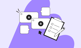
Some best practices to keep in mind here as a design team or designer is to continuously test your ideas to practice when mapping out your customer’s journey, and thus designing your website around it. A way to do this is through A/B testing, where you can compare two or more versions of your webpage against each other depending on your customer audience, testing to see which has a better conversion rate and response to the usability of your design. Simple things to test are different images, layouts, heading copy, as well as where you place certain CTAs and when they appear.
In the meantime, Storyblok helps eCommerce businesses with live brands using Storyblok’s interface to design stunning eCommerce websites such as HappySocks, Silhouette, Asket, and Aubade. To learn more about telling your brand’s story and designing the best possible eCommerce site tailored to your customer’s needs, check out Storyblok!