Build a Link In Bio page using Storyblok and Next.js
Storyblok is the first headless CMS that works for developers & marketers alike.
These days, many companies have a strong presence on multiple social media platforms. In the creator economy, creativity can be outputted as an Instagram story, a video on YouTube, or even as a post on a blogging platform. However, with all these platforms being spread around, there is also a need for consolidation, and this is where Link in Bio pages come into the picture. These pages are essentially websites displaying and linking to various other places on the internet.
A lot of platforms have come up to create these Link in Bio pages, but today, we will use Storyblok to build one. Storyblok provides a variety of features that make building our Link in Bio page much easier and more efficient. Here are some ways in which Storyblok will help us:
- The Visual Editing feature in Storyblok makes editing pages a breeze.
- If you're using Storyblok in other parts of your website, you can link to already existing internal links.
- When you use Storyblok, you can use a custom domain, and both your code and output are entirely under your control. This is very beneficial for enterprises, as they want tighter control over the output, and their data won't be hosted on an external system.
- Since Storyblok is headless, you will provide the code responsible for rendering the page. This means you can ensure the pages adhere to your brand identity by reusing your preexisting design system.
Requirements
- A basic understanding of JavaScript, React.js, and related web technologies
- Basic knowledge of Storyblok
- A Storyblok space preconfigured with the Next.js demo application (Check out Storyblok's Technologies page to create a new project within minutes)
Setting up the Space
Let us get started now. First, let's create a new Storyblok space and initialize it with a Next.js demo application. You can do so by following the steps described here.
Once you have successfully initialized the space and enabled visual editing, you should be able to see the sample page load successfully on the Storyblok dashboard.
Let us now try to understand the current structure of the content. On the Home page, we are loading a Storyblok story with the slug of home. This story of the content type Page is preconfigured with two nestable blocks, Teaser and Grid. Teaser and Grid are also pre-existing components in our code, and you can look at their source code in the components folder of our code.
We should start from a clean slate, so select all components under the body option and click on the Delete icon. You can now click Save from the top right to save your changes.
Adding our first block
Now we are all ready to add our first block. Generally, in a Link in Bio type of page, you would want to add links to various kinds of resources, internal or external, or even link to an email so visitors can easily email you. Let us try to add one such component.
In the Storyblok dashboard, click on Blocks and then New Block. Since we're planning to make this link accept a variety of inputs, let's give it the technical name of MultiDimLink. Keep the type as nestable block, and then click on Add Block.
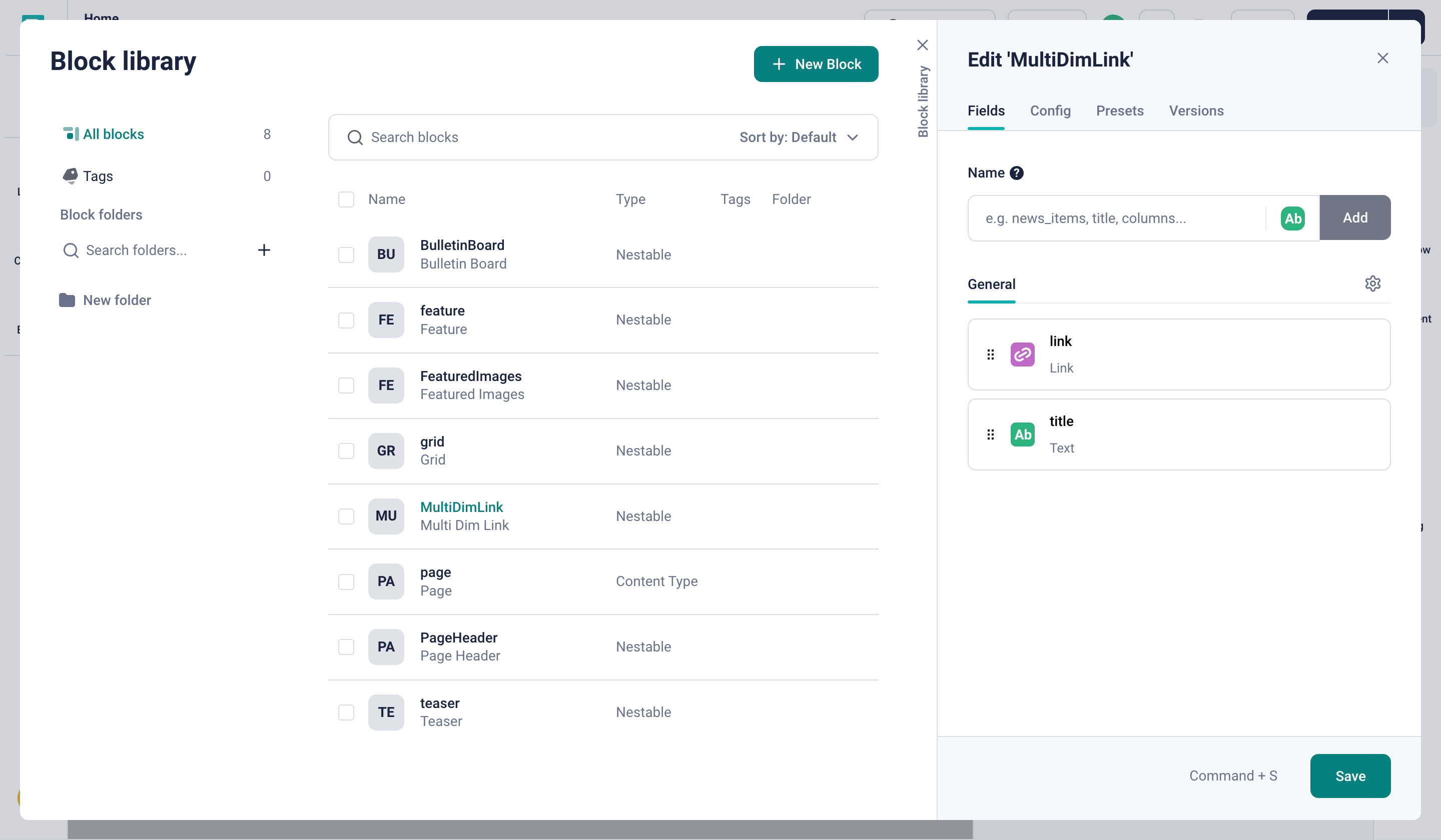
Adding a new block for the MultiDimLink component
Now let's add a field to this block. This field would hold the location where the link should point to, but we want to allow the content creators who are using this block to choose the type of link. Under the Name field, type "link" and click on Add. This has created the link field of type text, but instead, we want it to accept a link of multiple types. Let's change the type of the field to ensure this. Click on the Field type option and Select Link. In the link field options, make sure to check the Enable email field option. Let’s also add a title field of text type to the block schema. Now, let's click on Save.
Having configured the component schema, let's now create the accompanying code. In the components folder, create a new file called MultiDimLink.js and add the code.
Firstly, we are going to import some icons You can use any icons or icon library. Let's use heroicons for the purpose of this tutorial. Then, we define the MultiDimLink component. Right now, the component renders all 3 types of links in a list layout, not taking into account the link type selected in Storyblok at all.
import React from "react";
import { storyblokEditable } from "@storyblok/react";
import { LinkIcon as InternalLinkIcon } from "@heroicons/react/24/outline";
import { ArrowTopRightOnSquareIcon as ExternalLinkIcon } from "@heroicons/react/24/outline";
import { InboxIcon as EmailIcon } from "@heroicons/react/24/outline";


export default function MultiDimLink({ blok }) {
  return (
    <div
      className="flex flex-col items-center justify-center mx-auto p-4"
      {...storyblokEditable(blok)}
    >
      <div className="grid grid-cols-1 gap-6 min-w-[350px] max-w-[350px]">
        <a
          className="rounded-lg border border-[#d4d4d4] bg-[#fff] p-4 shadow-sm transition-colors hover:bg-[#f5f5f5]"
        >
          <div className="flex items-center gap-4">
            <div className="rounded-full bg-[#062121] p-3">
            <EmailIcon className="h-6 w-6" stroke="#fff" />
            </div>
            <div>
              <h3
                className="text-lg font-medium max-w-[250px] truncate"
                title="Email"
              >
                Email
              </h3>
            </div>
          </div>
        </a>
        <a
          className="rounded-lg border border-[#d4d4d4] bg-[#fff] p-4 shadow-sm transition-colors hover:bg-[#f5f5f5]"
        >
          <div className="flex items-center gap-4">
            <div className="rounded-full bg-[#062121] p-3">
              <InternalLinkIcon className="h-6 w-6" stroke="#fff" />
            </div>
            <div>
              <h3
                className="text-lg font-medium max-w-[250px] truncate"
                title="Internal Link"
              >
                Internal Link
              </h3>
            </div>
          </div>
        </a>
        <a
          className="rounded-lg border border-[#d4d4d4] bg-[#fff] p-4 shadow-sm transition-colors hover:bg-[#f5f5f5]"
        >
          <div className="flex items-center gap-4">
            <div className="rounded-full bg-[#062121] p-3">
              <ExternalLinkIcon className="h-6 w-6" stroke="#fff" />
            </div>
            <div>
              <h3
                className="text-lg font-medium max-w-[250px] truncate"
                title="External Link"
              >
                External Link
              </h3>
            </div>
          </div>
        </a>
      </div>
    </div>
  );
}
Let's add the newly added MultiDimLink component in _app.js to connect this React component to a block.
...
import MultiDimLink from "../components/MultiDimLink";

const components = {
  feature: Feature,
  grid: Grid,
  teaser: Teaser,
  page: Page,
  MultiDimLink: MultiDimLink,
};
...
Great! Now we can add this component to our page. In the body field, click on Add block and then select MultiDimLink from the list of the available components.
Once you do that, you should now be able to see the component visually rendered.
All 3 types of links rendering
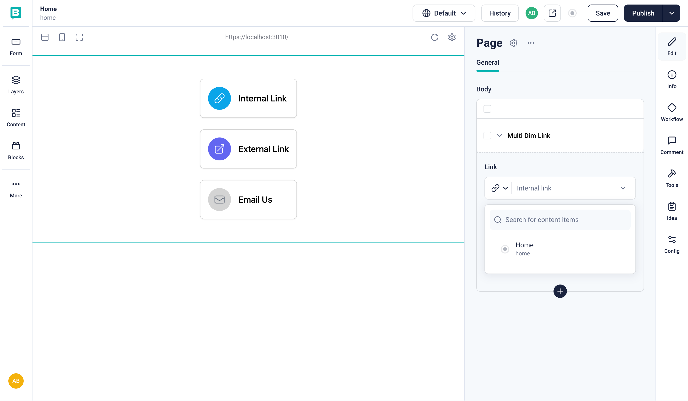
As discussed earlier, our component currently is rendering all 3 possible variations of it and is not even relying on the input that we pass to the block component. This is because we have yet to understand how, in our code, we will determine the link type. In order to do that, let's first change the type of our link to an external link and type in a URL in the link field. Choose an appropriate title as well and click on Save. This saves our content changes in a draft.
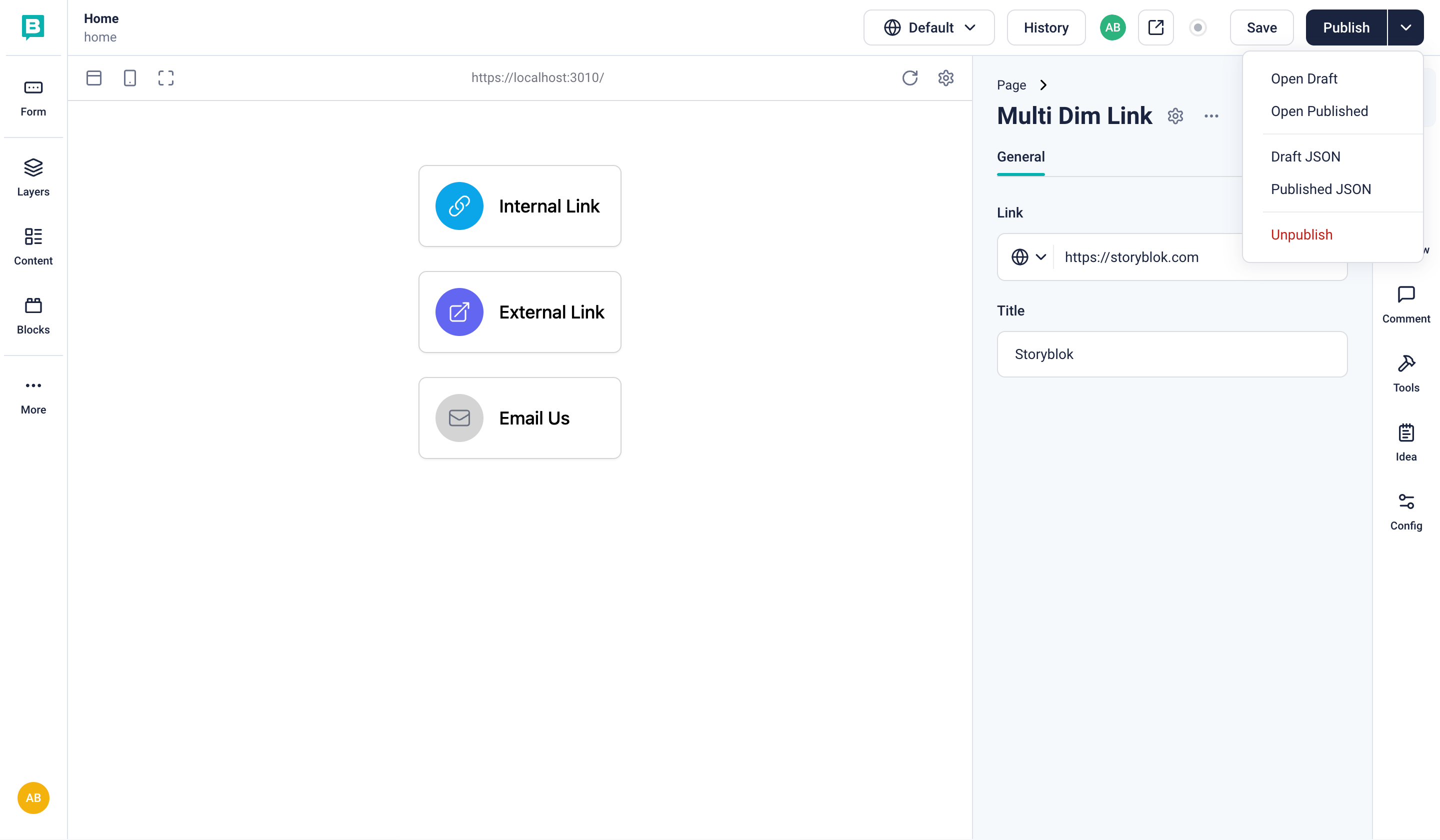
From the top right, in the Publish dropdown, click on Draft JSON.
Here is what the body field of the JSON currently looks like:
"body": [
  {
    "_uid": "5ade21c2-4db8-4a8f-8cac-5d42058b1292",
    "link": {
      "id": "",
      "url": "https://storyblok.com",
      "linktype": "url",
      "fieldtype": "multilink",
      "cached_url": "https://storyblok.com"
    },
    "title": "Storyblok",
    "component": "MultiDimLink",
    "_editable": "\u003C!--#storyblok#{\"name\": \"MultiDimLink\", \"space\": \"296898\", \"uid\": \"5ade21c2-4db8-4a8f-8cac-5d42058b1292\", \"id\": \"522672112\"}--\u003E"
  }
]
If you inspect the linktype field under link , you will see that it is url. The value will be different depending on the link type selected in the Visual Editor.
The JSON data of this particular instance of the MultiDimLink component is also available in our code via the blok property. Now, let's modify the code in our MultiDimLink component to check this field and render the link card accordingly.
import React from "react";
import { storyblokEditable } from "@storyblok/react";
import { LinkIcon as InternalLinkIcon } from "@heroicons/react/24/outline";
import { ArrowTopRightOnSquareIcon as ExternalLinkIcon } from "@heroicons/react/24/outline";
import { InboxIcon as EmailIcon } from "@heroicons/react/24/outline";

export default function MultiDimLink({ blok }) {
  const linkType = blok.link.linktype;
  const getIcon = (linkType) => {
    switch (linkType) {
      case "email":
        return <EmailIcon className="h-6 w-6" stroke="#fff" />;
      case "url":
        return <ExternalLinkIcon className="h-6 w-6" stroke="#fff" />;
      default:
        return <InternalLinkIcon className="h-6 w-6" stroke="#fff" />;
    }
  };
  return (
    <div
      className="flex flex-col items-center justify-center mx-auto p-4"
      {...storyblokEditable(blok)}
    >
      <div className="grid grid-cols-1 gap-6 min-w-[350px] max-w-[350px]">
        <a
          href={
            linkType === "email" ? `mailto:${blok.link.url}` : blok.link.url
          }
          className="rounded-lg border border-[#d4d4d4] bg-[#fff] p-4 shadow-sm transition-colors hover:bg-[#f5f5f5]"
        >
          <div className="flex items-center gap-4">
            <div className="rounded-full bg-[#062121] p-3">
              {getIcon(linkType)}
            </div>
            <div>
              <h3
                className="text-lg font-medium max-w-[250px] truncate"
                title={blok.title}
              >
                {blok.title}
              </h3>
            </div>
          </div>
        </a>
      </div>
    </div>
  );
}
Afterward, let’s go back to Storyblok and add one of each type of link to our page canvas. Once you fill in all the details and press Save, your UI should look similar to this, rendering the correct icon depending on the selected link type:
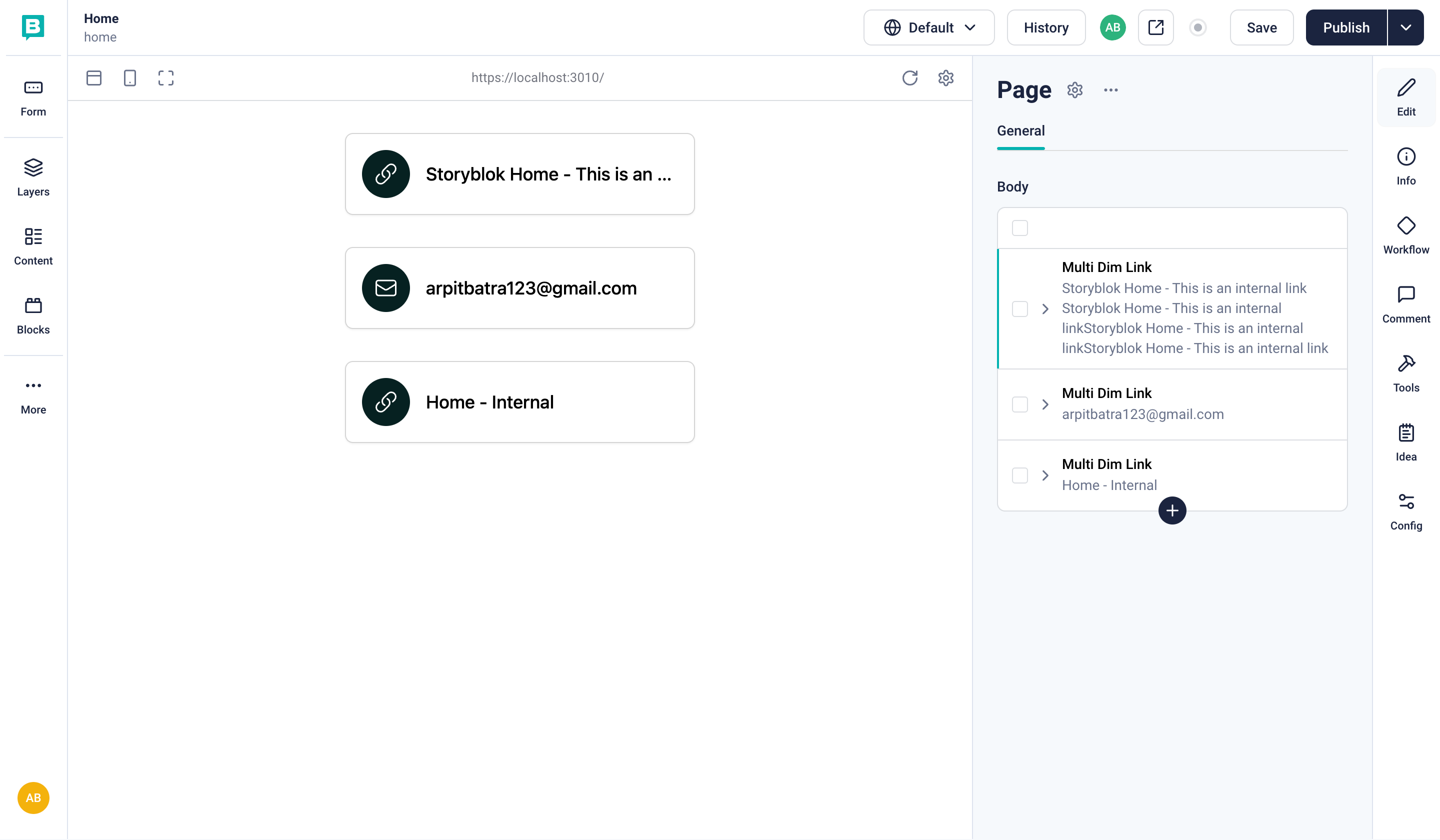
The correct link rendering based on type
Nice, now you add as many types of link cards as possible.
Adding the page header component
The page looks good so far. It has the basic functionality of rendering the links and thus functions like a Link in Bio page already. However, the page definitely lacks a header. Let's quickly add it. First, let’s create a new nestable block in Storyblok with the technical name PageHeader. This component will need two text fields: title and subtitle.
Now, we can go ahead and add the code for the component. Create a new file called PageHeader.js in the components folder and paste the following content:
import { storyblokEditable } from "@storyblok/react";
import React from "react";

export default function PageHeader({ blok }) {
  return (
    <div
      className="mb-8 flex flex-col items-center"
      {...storyblokEditable(blok)}
    >
      <h1 className="text-3xl font-bold font-mono">{blok.title}</h1>
      <p className="text-muted-foreground font-mono">{blok.subtitle}</p>
    </div>
  );
}
Make sure to register this component in _app.js as well.
Finally, let's return to the Storyblok dashboard. Let’s hover over the list of our components, click on the Plus icon, and then add the PageHeader component to our page. Once you've added a title and subtitle, you should see the rendered result.
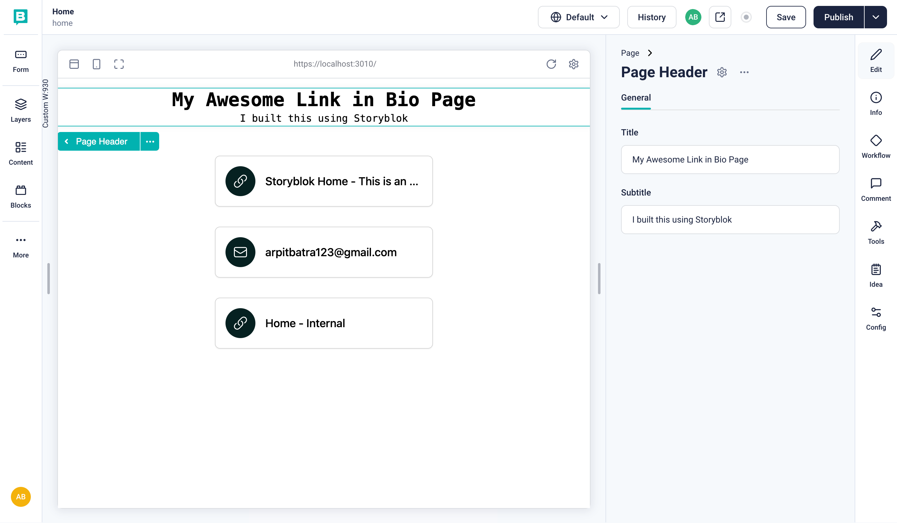
The Header component rendering on the page
Adding a Richtext block
In our previous component, the content was controlled by the content creator, and the styling of the content itself is in our code. However, not all components will have similar requirements. For example, in our Link in Bio, maybe we want to include a famous quote, or we would like to add an additional card with details about a current project. Now for both of these, the text and style would be different.
Consider this similar to a bulletin board in a university. One day, it could be displaying a notice regarding an upcoming exam; another day, it could show a flyer about a competition. The component that we are going to add is somewhat like a digital bulletin board for our page. However, since the styling of the text is going to be controlled by the creator, we can’t tightly couple it with the frontend. Luckily, Storyblok has what we need, a Richtext component field.
Let’s add a new block called BulletinBoard and also add a field content of type Richtext to it.
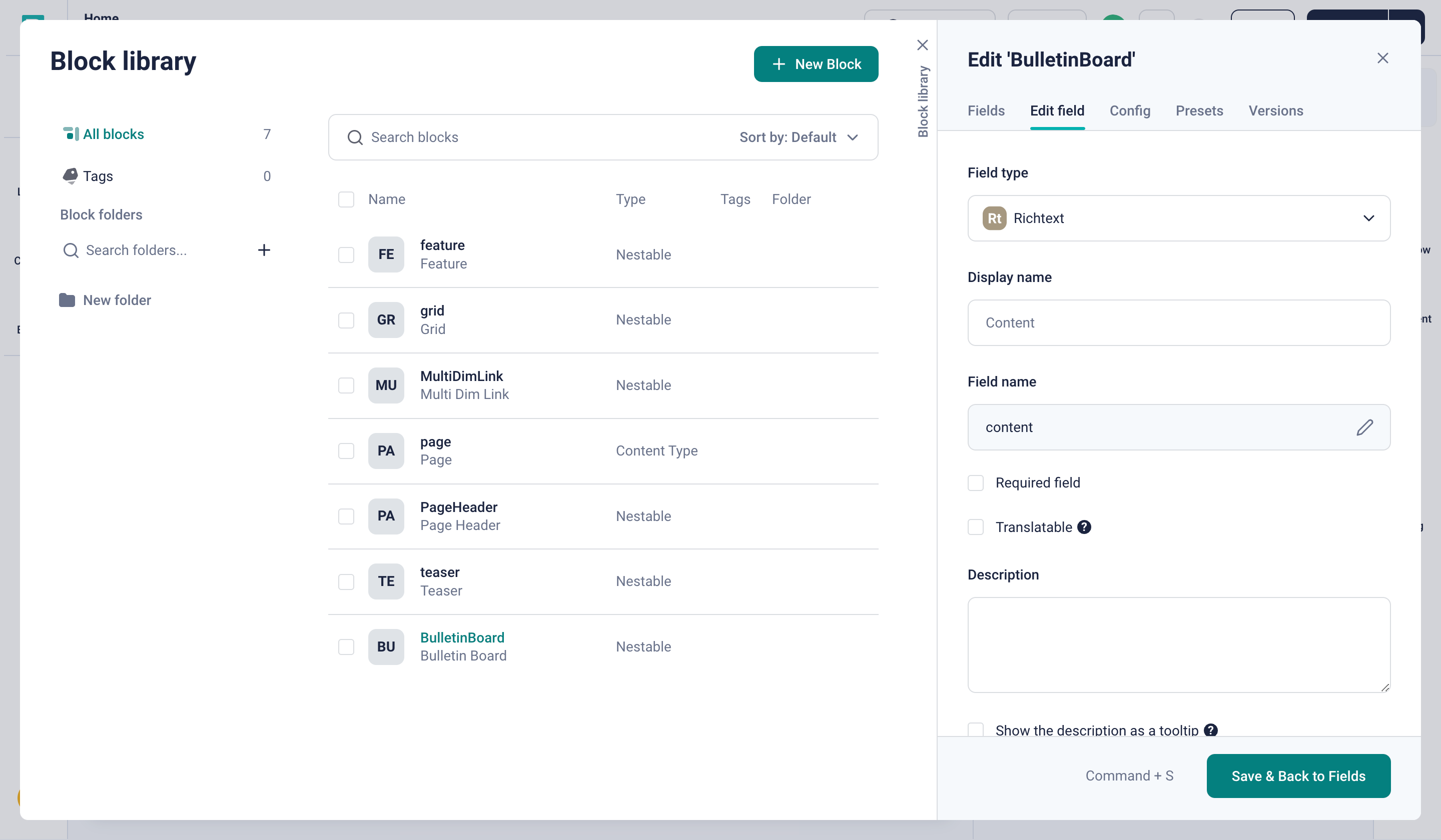
Adding a Richtext field to the bulletin board component
Before adding the block and it’s content to our page, we need to add accompanying code as well to make the content actually render. Let's create a new component called BulletinBoard.js in our code.
import React from "react";
import {
  storyblokEditable,
  RichTextSchema,
  renderRichText,
} from "@storyblok/react";

export default function BulletinBoard({ blok }) {
  const renderedRichText = renderRichText(blok.content, {
    schema: RichTextSchema,
  });

  return (
    <div
      className="mt-8 mx-auto max-w-2xl rounded-lg border border-[#d4d4d4] bg-[#fff] p-6 shadow-sm"
      {...storyblokEditable(blok)}
    >
      <div dangerouslySetInnerHTML={{ __html: renderedRichText }} />
    </div>
  );
}
Let’s also add this component to _app.js.
Go ahead and add the BulletinBoard component to our page and add some Richtext content. You can use the various formatting options available to you, such as changing the text formatting and color. Once you do that, you can see that the component renders your Richtext with the formatting that you have applied to it.
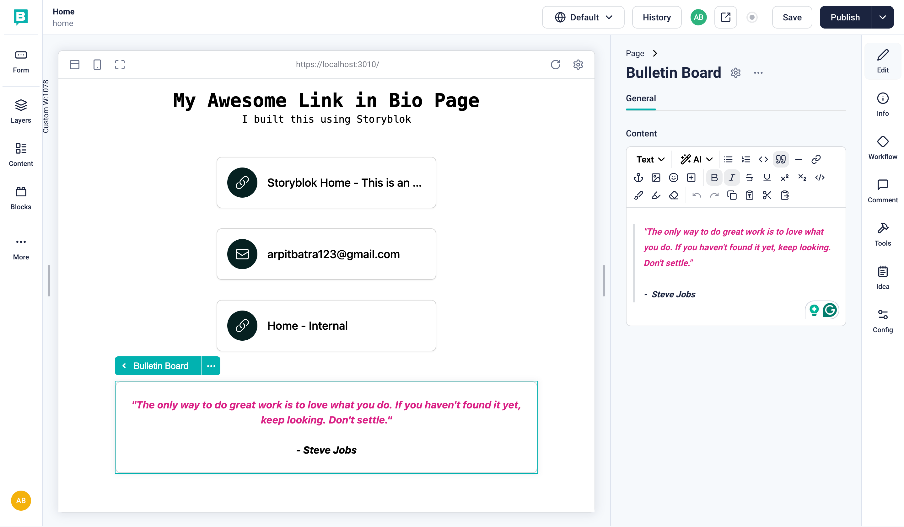
Bulletin Board component rendering with provided Richtext
Feel free to add multiple BulletinBoard components to your canvas and experiment with different formatting options for each of them.
Adding an image block
Sometimes, text is not enough to build a narrative. What if, on my Link in Bio page, I want to display some photos from a recent event or screenshots from a recent project? Well, fortunately, Storyblok also provides an asset field. Let’s now create a new FeaturedImages block.
Once done, let's a field for images to it and make sure the type is Multi-Assets. This allows us to choose multiple images in one go. Also, scroll a bit below and check Images under Filetypes. This ensures we can only select images as valid assets.
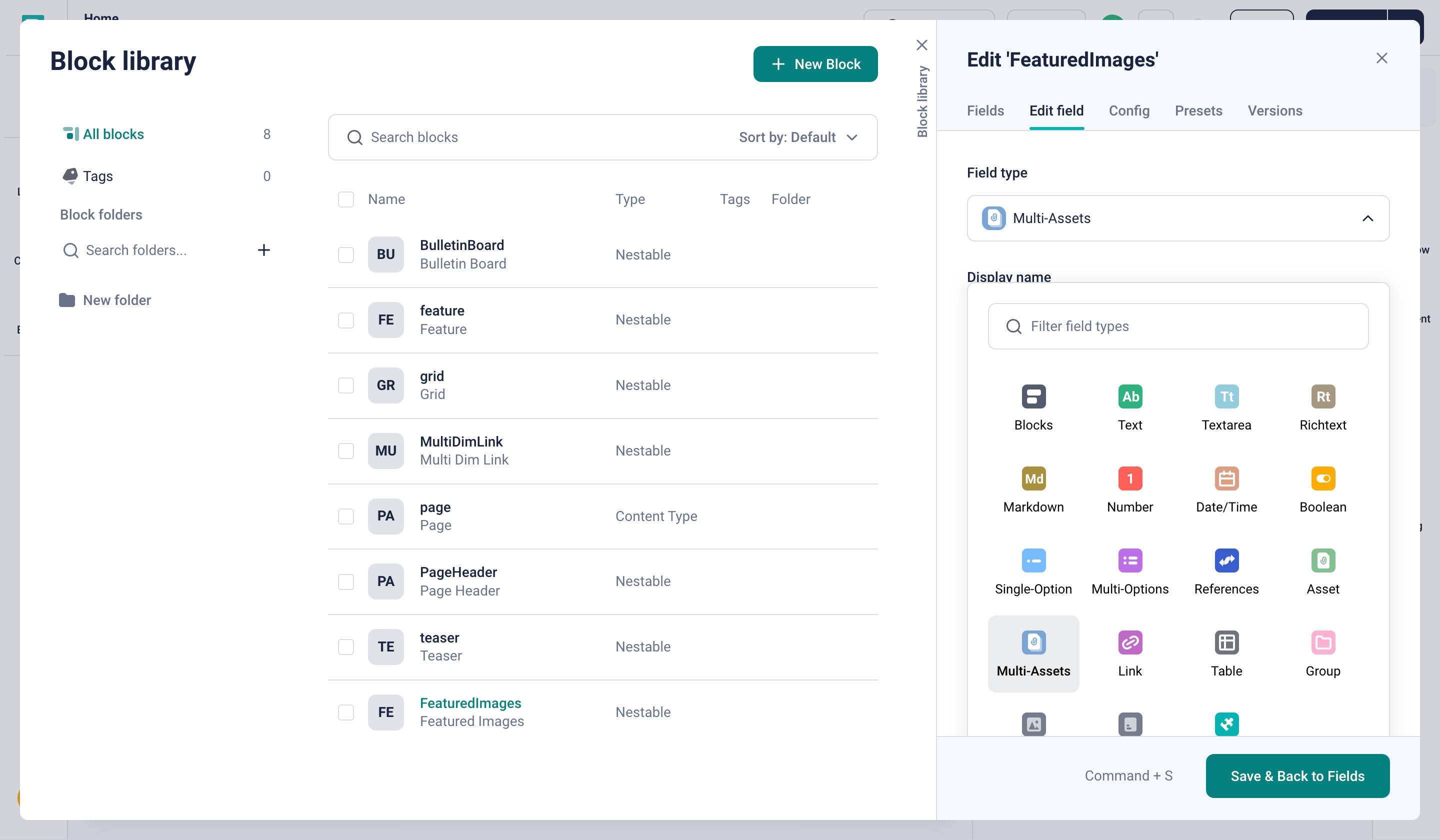
Adding a Multi Assets block to Featured Images component
Having completed this step, we can add the FeaturedImages block to our page and upload some images.
Finally, let’s also add the accompanying code to render this component in components/FeaturedImages.js
import React from "react";
import { storyblokEditable } from "@storyblok/react";

export default function FeaturedImages({ blok }) {
  return (
    <div className="rounded-lg border border-[#d4d4d4] bg-[#fff] p-6 shadow-sm m-8 max-w-[40rem] mx-auto" {...storyblokEditable(blok)}>
      <div className="grid grid-cols-2 gap-4">
        {blok.images.map((image) => {
          return (
            <img
              src={image.filename}
              alt={image.alt}
              className="rounded-lg object-cover"
            />
          );
        })}
      </div>
    </div>
  );
}
All the chosen images should now render properly.
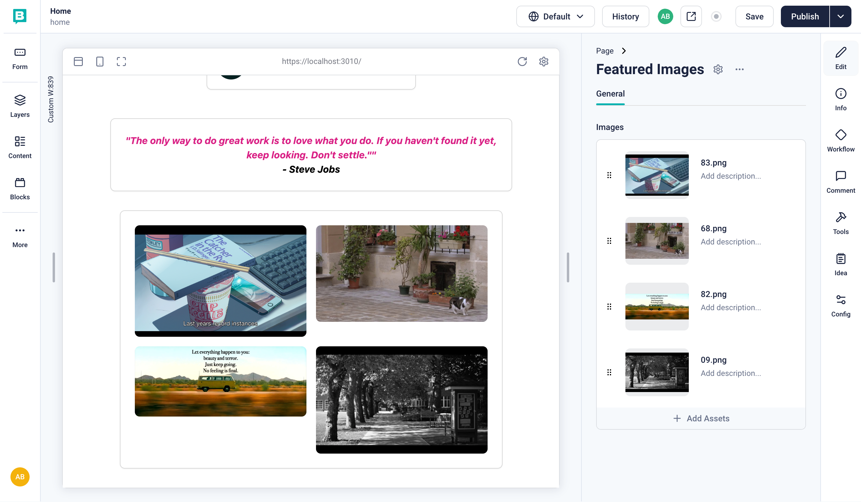
Image block rendering with 4 images in a grid layout
All done! Our Link in Bio page is ready. We can add links of various types, we can add freeform text using the rich text component, and we can include images as well!
Final thoughts
So far, we have been able to use Storyblok to build a Link in the Bio page and were able to include a variety of components. We could extend the idea of this Link in Bio page much further. For example, we could add more components, integrate data from external APIs, or add layout and styling customization options, such as making the size of the individual cards configurable. If you want to integrate a Link in Bio page in a preexisting Storyblok space, you can define a dedicated content type for the Link in Bio page and can then restrict the components that you can nest inside the page. You would also want to store the Link in Bio page on a dedicated URL other than home.
