Creating Accessible Content for Everyone
Storyblok is the first headless CMS that works for developers & marketers alike.
Making our content as accessible as possible not only opens it up to a larger audience and if you want to make a business case, potential new customers. It also shows your consideration for diverse user needs and improves search engine optimisation and overall user experience.
How do you make your content more accessible?
You have never thought about the accessibility of your content? Not to worry, you might already be doing a lot of things right without even knowing it. We will explore what it means to make content more accessible one by one, as there are many different layers and aspects, depending on the different kinds of content.
Why should you make your content more accessible?
There are many good reasons to make your content more accessible:
- Broaden your reach: Assuming you would like to reach a wide audience, the more accessible your content is, the more folks will be able to find and enjoy it. According to a survey by the World Health Organization, over 15% of the global population will experience some form of disability throughout their lifetime - and that’s roughly one billion people, and already a very good reason to consider accessibility.
- Web Accessibility benefits all: Going a step further and approach disability rather as a spectrum, the amount of people affected by making our content more accessible gets even larger. Making content accessible actually benefits all of us: there are many situations in which we might have temporary limitations, such as a bad internet connection, maybe we can only use one hand to navigate a page, or being in an environment where we can’t turn up the volume or have a bad ear infection. Many cases in which making content accessible will massively enhance the user experience.
- Search Engine Optimisation: as a positive side effect, many practices of accessibility will improve your SEO score. Win-win-win, right?!
- Accessibility Guidelines & Laws: Depending on the market that you are trying to reach, there might even be legal consequences for creating inaccessible experiences on the web.
POUR Principles
There are 4 guiding principles to keep in mind when trying to make content more accessible. You want your content to be:
- Perceivable
- Operable
- Understandable
- Robust
While this might sound abstract at first, let’s explore each of these principles in a little more depth:
Perceivable
Information and your user interface should be presented in ways that the users can perceive, regardless of how they consume it. One example of this is alternative text. By adding alternative text to non-text content, like images, users can convert these images to speech, simpler language, or braille, for example.
Operable
Not everyone uses a trackpad or mouse - some users rely on assistive tech or the keyboard. Therefore it’s important that your content can be navigated with a keyboard and there are no actions that people require to use a mouse for.
Understandable
Your interface should be understandable. This can for example mean including labels and instructions where needed.
Robust
Content should be robust enough to be interpreted by a variety of user agents, including assistive technologies.
Let’s look at different kinds of content…
Making All Content Inclusive
Written Content
Headline Hierarchies
Use the different headline hierarchies (h1-h6) wisely: use them in a logical order to structure your content. Screen reader users will browse through the headlines to decide what kind of content is relevant for them - so be clear and concise, don’t skip any of the levels, and do not use more than one h1. This also helps with SEO as search engine crawlers work very similarly to a screen reader.
Meaningful Links
It might seem practical and more casual to link “click here” when referencing a specific link but imagine your screen reader reading out only these kinds of instructions - when browsing through the links, you would never know where your desired content was.
Labels on User Input
If any actions are required by users, make sure you include instructions, if applicable helpful error messages and labels. Consider that not all users will be able to see for example a (complex) form - but it should still be possible for them to fill it out or read it’s contents.
Visual Content & Video
Alternative Texts
As mentioned before, we need to provide alternatives to visual content so that it can be converted to other forms of information. Make sure these alternative texts convey the important information without being too wordy - put yourself in your user's shoes: what do they need to know? What did you want to bring across with this visual? Is it only decorative? Then you can leave the alternative text empty.
Transcripts & Audio Descriptions
If you have pre-recorded videos as part of your content, you might want to consider an audio description. This is especially important if there is a lot of information that is not conveyed in the audio track of the video.
Transcripts are written versions of the audio content of your podcast or video. This is super helpful for folks who might use a Braille device to consume this kind of content or read rather than listen to it.
Accessible Infographics & Data Visualizations
Making infographics and data visualizations accessible is crucial to make sure the information you are presenting can be understood by a diverse audience. Some guidelines for making educational and informative content more inclusive, are:
- Make sure to include sufficient readable and meaningful labels - this includes working with accessible fonts and big enough sizes, making sure it’s zoomable and has enough color contrast.
- Sufficient Color Contrast is a big topic in general: this does not only go for the contrast on text vs. background but also differentiates between the different objects. if the colors are too similar, it will be difficult to see what you are referring to.
- Don’t use color as your only indicator: people see colors differently, and some might not perceive them at all. That’s why it’s a good idea to either label directly, include patterns, or another way of distinguishing other than colors.
- Where applicable, add alternative texts. You could also consider including descriptions for your charts.
- Don’t overwhelm your audience with information: Regardless of ability, with visualizations, less is most likely more.
Social Content
Unfortunately, most of our current social networks are not fully accessible. But there are things you can do to make at least your content more inclusive - even if you can’t fix the whole problem. Basically, most rules that can be applied to web content also apply to social content. This is true for adding captions to video, including alternatives to visual content, using high contrast, and making sure information is conveyed through different means. A few things might be slightly specific to social media though:
Alternative Text
A good place to start is again alternative text, which you can add to your images. As an added bonus, for example on Twitter, images with an alternative Text have a little “alt” tag, which raises awareness for folks who didn’t know this was important.
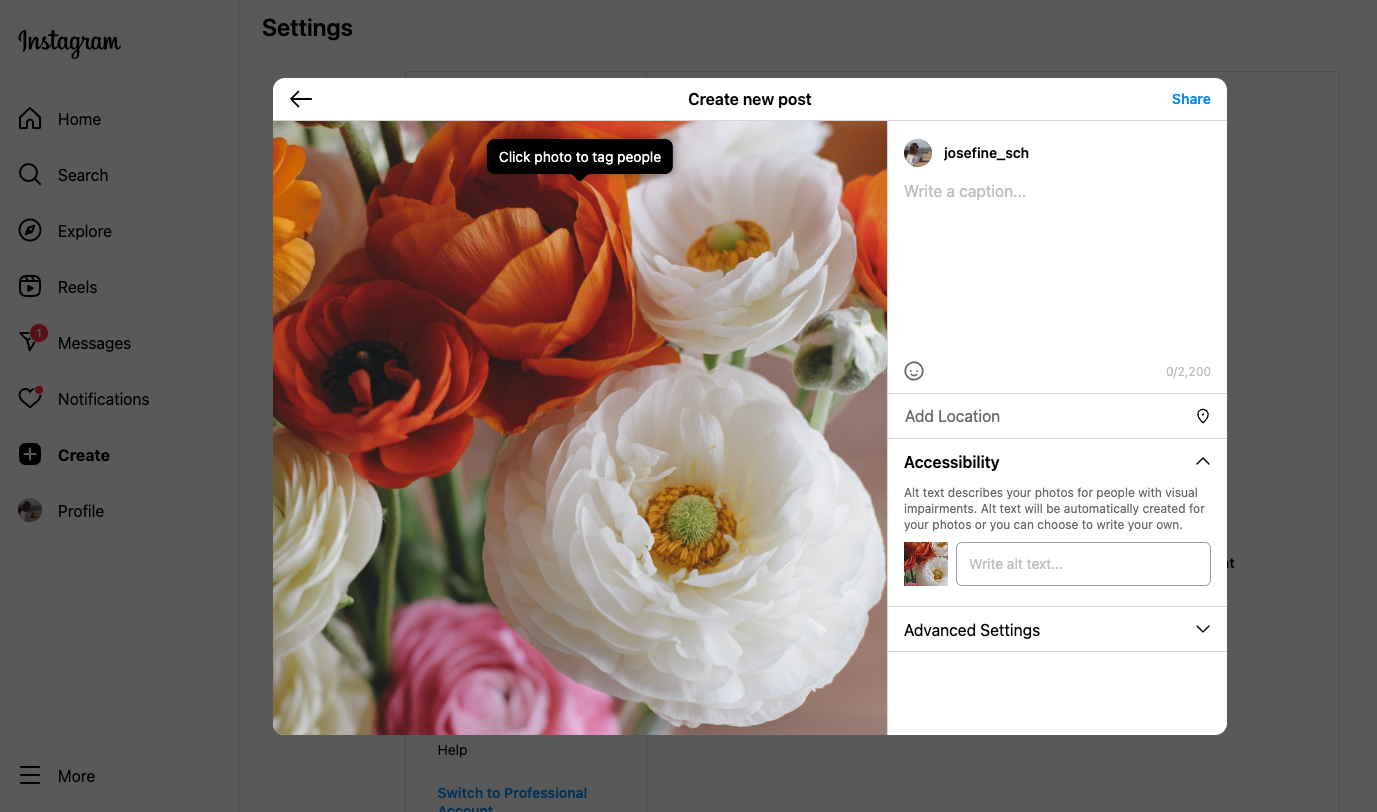
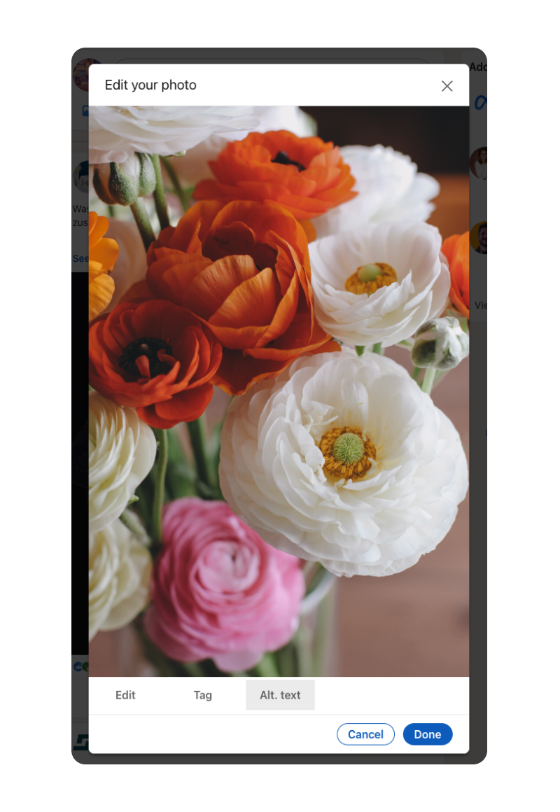
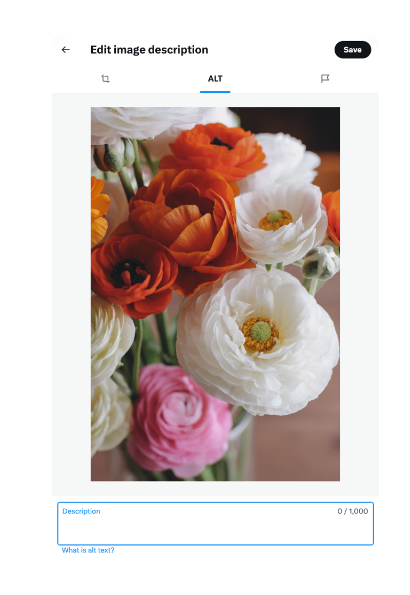
Adding Alternative Text on Instagram Desktop
Adding Alternative Text on LinkedIn
Adding Alternative Text on Twitter
Hashtags
If you are using hashtags, make sure they are descriptive - this way, they provide context to users, especially those who might lack the visual aspects of your content. If you use camelCase or PascalCase instead of all lower letters in a hashtag, it will be easier to pronounce for screen readers.
Avoid Excessive Use of Emojis
While emojis can add personality and fun to your posts, using too many of them can be confusing for screen reader users. If you use emojis, ensure that they enhance the meaning of your content.
Emojis are represented by a Unicode string, a little like alternative text. If you are curious, about what Emojis sound like when read out by a screen reader, check out this video by the amazing Molly Burke:
Tips for using Emojis
- You can use Emojis but don’t use them to replace meaning. If you are conveying that something is ironic or conveys a certain emotion, make sure there are other unambiguous ways of understanding this context.
- Don’t overdo it: imagine, every single time you use an emoji, the description is read out. That can become very verbose if you are using the emoji in question not once but 6 times to make sure people really get you
- Test visibility on light and dark mode: Some emojis, like the white heart ( 🤍 ) will be really difficult to see on a light background, others, like for example the dark moon ( 🌚 ), will be difficult to read on a darker background
- Stay away from emoticons (e.g. : ) ) - it will read out: “colon parentheses”, which will be really difficult to decipher as a smiley face.
Beyond the Web: Accessible Presentations
Consider a diverse audience when planning the content of your presentation and rehearsing it. Again, much of what is also applied to other kinds of content is applicable here: Color Contrast, captions for video, Accessible fonts, and sufficient font size - all your “Accessibility Basics”, if you will. But there are a few things that might differ slightly, or are more important when it comes to accessible presentations:
- Consider sharing your slides with your audience, for example via a QR code on your first slide - this way, they can move through it at their own pace, zoom in, and use a screen reader, braille device, or any other form of assistive technology.
- Stay away from flashy effects and transitions. They distract the audience from your key points during the presentation and might be really uncomfortable for some.
- Inclusive language: When rehearsing, think about the words you use to explain your topic. Are you including everyone in the way you speak about certain things? Are you maybe using phrases that could be adjusted? Are you describing visuals - or are you assuming everyone can see them clearly? Can you make a point of breaking down complex or abstract topics so that they are easier to understand for your audience?
- Ensure the question and answer period is accessible. If there is a microphone for questioners, make sure they use it. Otherwise, repeat the questions so everyone can hear them - this is also crucial if you are presenting in a hybrid format, as sometimes the mic for questions isn’t used for the stream.
- This is very general advice, but slides are easier to comprehend if not too much is going on there - try to stick to one point and visual per slide. If you can’t limit yourself, make sure to highlight the point you want your audience to focus on, for example by making it larger or through arrows.
Powerpoint even has an Accessibility Checker which can help you review the accessibility of your slides and adjust accordingly.
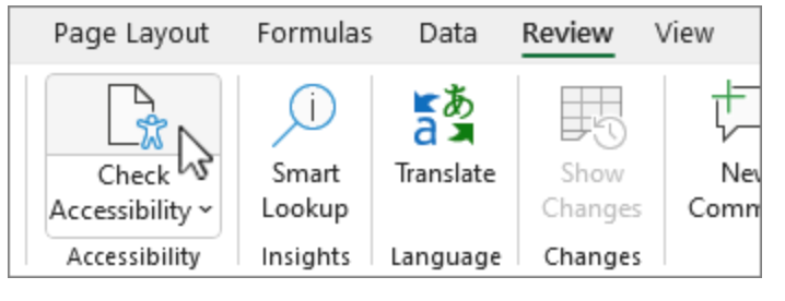
Powerpoint Accessibility Checker Tool
Conclusion
(Digital) content is everywhere - which is why it’s all the more important to make sure it is inclusive to a diverse audience. Whether it's ensuring web content meets WCAG guidelines, captioning videos for broader comprehension, or structuring presentations with screen reader users in mind, the possibilities are as vast as the impact.
As content creators, it’s within our power to lower the threshold and open our content up to a wider audience - one step at a time.
Considering Web Accessibility can be overwhelming - especially upon first learning about it, but don’t worry: small steps already have a big impact, and it’s better to get started than wait for perfection.


